Old is always gold! And with the passage of time this retro age transcends time, ages, tastes and style. The vintage and retro are becoming the new trend in the society. And as no one is behind this trend so are the web designers. They work with this style in today’s digital artwork. Since the industry has become completely digital, the use of retro and vintage style is probably the most pervasive trend in the recent times. The trend can be seen in a variety of stylish web sites which are subtle and clearly defined.
Today’s topic of discussion revolves around how the air of golden-times can be beautifully integrated in web design making it look retro.
For the designer retro is back- actually it has never left. Retro can be said as an extremely powerful tool of design constituting different important techniques to make a design stand out of the crowd.
Here are some of its popular techniques to make your website reflect the vintage era.
Shapes and illustration
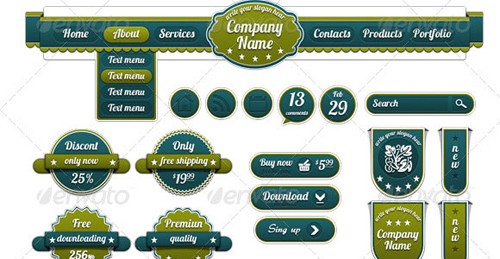
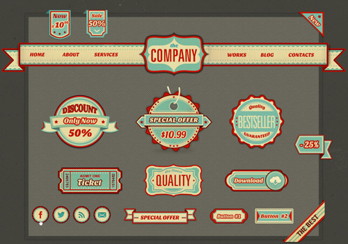
Simple shapes work the best in creating a retro look. For instance circles of different sizes can do wonders- make a lovely illustration of a sun with elliptical shapes that can be finished off with a nice typographic effect. You can also take inspiration from the vintage ink stamp and badges that might look like it has been stamped onto a piece of paper. Also you can create a simple piece of work with two circles with clean typography and blending style. It can actually demonstrate the power of simple shapes.
Typography
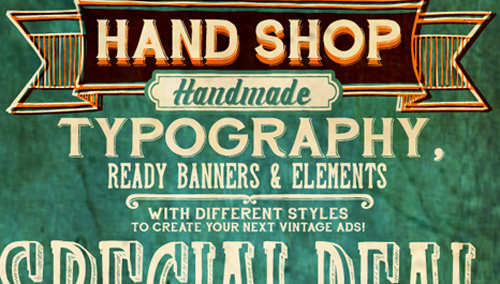
Earlier the designer used simple techniques like duplicating and pixel strokes or repositioning of fonts to add a unique flavour to a design. You can make use of some of these fantastic fonts and typeface to fit the purpose.
Pricedown: Pricedown is based on a late-Sixties font called “Pinto Flare”; famous for its use in the titles for the TV program “The Price is Right”.”
Deftone Stylus: Deftone Stylus is a structured, industrial script from the late 20th century. It was rebuilt in 2011 and now features custom letter pairs to make words flow.
Parisish:This is one of the most popular, having received over 200,000 downloads. This font is also free for both personal and commercial uses.
You can hardly manage to create the nostalgic effect with the use of right typography.
Textures

If you want to create a visually appealing retro design, use subtle texture and sound in the background and add interest to your work. Alternatively, you can also use the poster artwork with subtle color or a canvas background with a worn out look. From brush work to stained structure, vintage design can be made unique to watch. However, the list never ends with the use of textures. Drop shadows and pattern overlays can add a depth to the elegant typeface and provide that typical retro look to your web pages.
Color
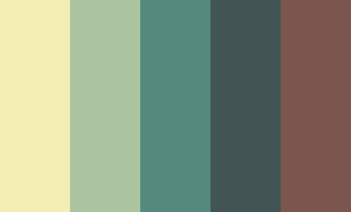
As the full color printing was an expensive task it prompted the designer to use limited color in their design. The two-toned color was popular in vintage design. For instance, the minimalist design can be made visually appealing with black and white shapes and lines or yellow and orange focal color. Even the use of three color combination such as orange, brown and white works well for the design.
Badges and Logo
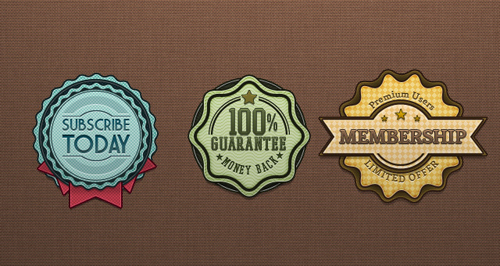
Badges and logos play an important role in designing a retro site. The use of elusive and contrasting color in badges and logos can make your design project a wonderful piece of artwork. Most of the design can be created in Photoshop.
In a nutshell, grab the typical retro elements to give your web design a vintage feel:
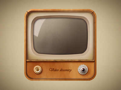
Old TV devices
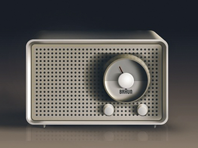
Old radio devices
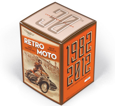
Old packaging
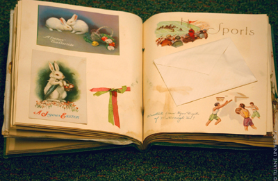
Scrapbooks
Old-style sign

Old photos
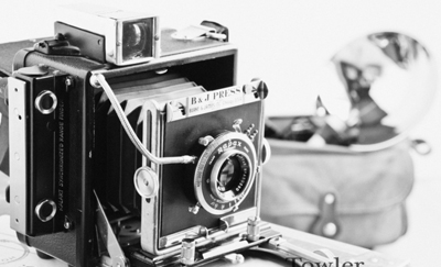
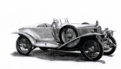
Old cars
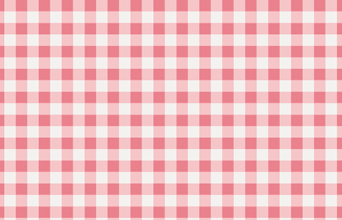
A few popular patterns for a vintage look:
Retro design makes use of different color combination. Most of them are warm shades, bright colors or exclusive color mixes. Take a look at them


Take inspirations from some of the best retro design work:
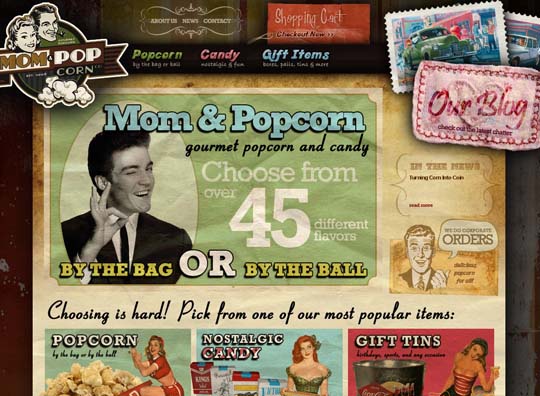
Mom and Pop Corn
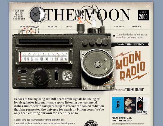
Radio-The New York Moon
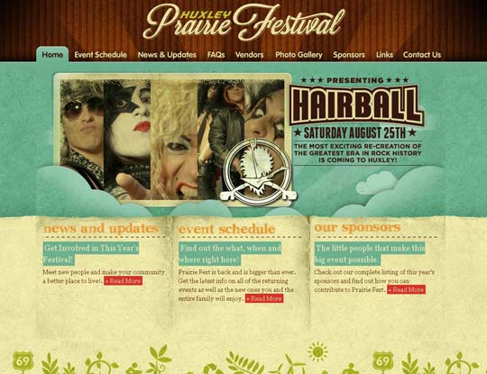
Huxley Prairie Festival
Visit 50 More Vintage Style Websites
As we associate value with old things, retro designs aim to reap this tendency and take us to those days where life was much easier.

