When I talk about perfect logos, I am referring to the memorable ones which are works of art. There is a lot more to designing perfect logos than just the creative aspect. A logo is a visual representation of a business’s value proposition, mission, values and business principles; and to showcase all these aspects within a single image takes a lot of effort. This effort takes the form of brainstorming, ideation and research, getting inspiration, creating mockups and finally getting the design green-lit by the client. The last involves convincing the client (in the event he isn’t too sure about the design) why a particular logo design will perfectly represent his business.
As can be imagined, designing a perfect logo is not easy, but if you make informed decisions at every step of the logo design process, there is a good chance that you will be able to design an enduring logo.
So, let’s take a look at a few dos and don’ts of designing a perfect logo:

The Dos of Logo Design
Follow A Comprehensive Design Process

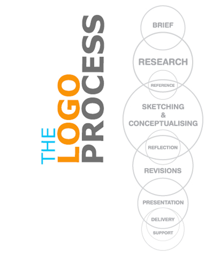
Leave nothing to chance while designing a logo. Begin with conducting research on the business you are designing the logo for, the industry it belongs to, and its competitors. Once you are done with the research, start drawing inspiration from some of the successful logo designs already out there that are in some way related to the design brief given by the client. Also start looking at current styles and trends in logo design and which one of them fits the bill for your project. While zeroing in on a trend that you want to go with, make sure it allows you to come up with a memorable logo.
The next stage of the design process involves sketching and conceptualizing your ideas, taking the logo through a series of revisions and finally presenting the logo files to the client. It is the comprehensiveness of your logo design process that ensures its success.
Adhering To The Principles Of Logo Design

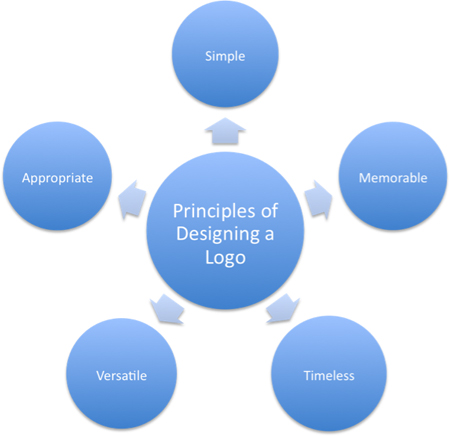
There are certain principles that must be followed if you are to design a logo that conveys the owner’s message appropriately. These principles include:
- Focus on simplicity: Your logo must be immediately relatable to the business/company/organization it represents. Don’t overdraw or overthink the design. If the logo’s simplicity gives it an instant recall value, it has done its job.
- A logo must be memorable: A logo’s simplicity automatically makes it memorable. Think of the Nike logo. As soon as you hear the name ‘Nike’, you think of the tick mark.
- A logo must be ageless: The logo you design must stand the test of time by having a long shelf life. This is why you mustn’t subscribe to a logo design trend just for the heck of it. The trend must be chosen based on its longevity.
- Make it media/application-independent: A logo must render effectively on a wall, on letterhead, on a website or even a mobile application.
- A logo must be apt: Identify a target audience and create a logo that is suitable for that audience. Create a logo keeping in mind the target audience’s expectations.
Your Logo Must Be ‘Different’

Getting inspired from existing logo designs isn’t another word for copying them. You will realize that there are plenty of logos that look very similar to other logos on the market. The problem here is that the designers haven’t made the effort to ensure their logo looks different. There is no harm in taking a look at the logos of your competitors or peers, but this is just to get a reference point for your own logo; after that you must strive to differentiate your logo from that of its competitors as much as possible. It’s pretty simple really. If they have gone left, you go right. Your logo needs to stand out in a saturated marketplace and it can only do so, if it looks different.
The Don’ts of Logo Design
Don’t Design A Logo Without Getting Client Feedback

The client is as much a part of the logo design process as the designer. Before actually implementing the design, it’s important that you get client feedback. But don’t limit feedback to your clients, try and get feedback from the target audience as well. Know what the man on the street thinks of your logo’s concept. Don’t make the mistake of designing a logo without taking note of feedback.
Don’t Tweak Existing Logos To Suit Your Purpose
A tweak doesn’t make for an original or exciting logo. In fact it can go so far as to negatively impact the credibility of the business it’s representing. Even if you are a busy designer and have a huge workload, make sure that your logo idea is original. Get inspired by all means, but don’t copy. A few minor changes to existing logos might fool your clients but it won’t fool all of the people all of the time. In such cases, your own reputation as a designer takes a beating.
Don’t Ideate Beyond Your Limitations

Plenty of graphic designers make this mistake. Their imagination takes them to a place where they conceptualize grandiose logo designs, the implementation of which is far beyond the scope of their abilities. This leads to problems during the design process. Their inability to breathe life into their concepts might lead to elementary errors that arise out of their frustration. So, why think beyond your own capabilities? You can zero in on plenty of concepts that are well within the reach of your own skillsets and proficiency.
This is just a small collection of dos and don’ts that will help you design a successful logo. Don’t overthink and overanalyze your design process. That’s the trick for creating a successful logo. Put yourself in your client’s shoes and envisage the logo through eyes of your target audience. If you do that, there is very little chance of you going wrong.


