For many years, web designers were encouraged to compress information and keep important page elements “above the fold”. However, the emergence of smartphones and tablets has led designers to rethink the way we build webpages. Interestingly, this has led to the re-emergence of an old navigational technique – vertical scrolling – though this time with a new twist. Vertically scrolling was a staple of web “navigation” in the mid-late 1990s, but this was more due to the lack of sophistication in the new field of web design, rather than as a carefully considered design element.
Over the last year, parallax scrolling has been a hot emerging trend in web design. Because it lets page elements scroll at different speeds, the result is an illusion of depth that makes the vertical scrolling experience both stimulating and practical for presenting information. While parallax scrolling isn’t suitable for every site, it’s a technique that can be used to encourage user interaction and exploration. Additionally, the vertical scrolling layout appeals to the user on a 32 inch flat screen monitor just as well as the user on their 320 pixel wide mobile phone.
Here are some examples of how parallax scrolling can be used for effective web navigation:
Bagigia
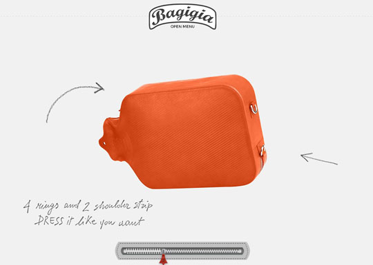
The Bagigia website shows how Parallax Scrolling can be used not only for effective navigation and encouraging user interaction, but it also demonstrates just how effective it can be for showcasing a physical product. As the user scrolls down, they’re continuously presented with new angles of the Bagigia product and information about product features. As the user continues to scroll, they’re given close-ups of the product, as well as additional detail about the history and design of the product. It allows the user to quickly become intimately familiar the product in a way that pictures or even video simply cannot accomplish.
On a broader level, the Bagigia website is a great example of how parallax scrolling can be used effectively to encourage user engagement – because every scroll produces a new angle and new information, the user is compelled to continue scrolling.
Visit Bagigia
ActivateDrinks
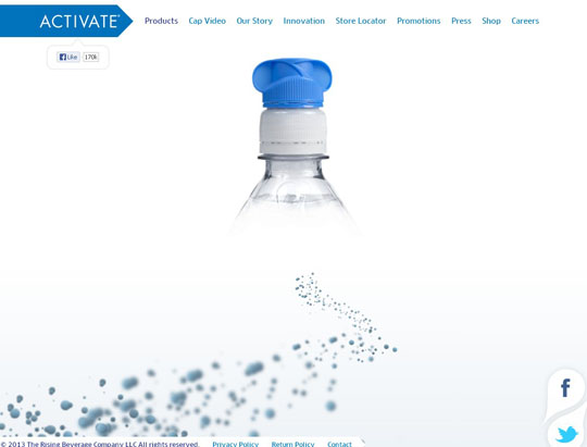
The Activate Drinks website is a great example of how parallax scrolling can be used to create a rich, interactive brand message. Parallax scrolling is not only used here as an effective way to present information, but the colorful bubbles and falling drink bottles also create a level of richness that accentuates the product’s branding.
Visit ActivateDrinks
NewZealand
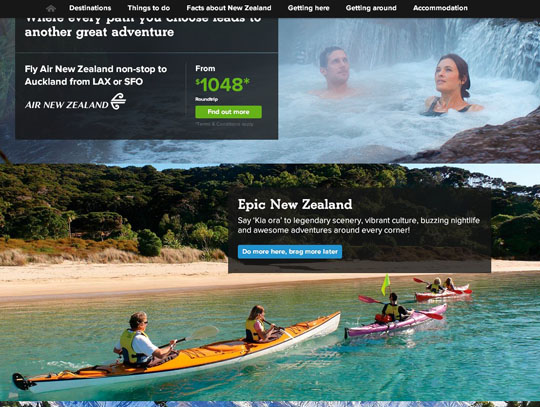
The NewZealand.com website showcases how parallax scrolling can be especially effective when presenting the user with rich, panoramic photos. As the user scrolls through the site, they not only access new information about things to do and information about booking a trip to New Zealand, but they enjoy rich, full screen photos as well which showcase the many wonders that New Zealand has to offer.
Visit NewZeland
Tokiolab
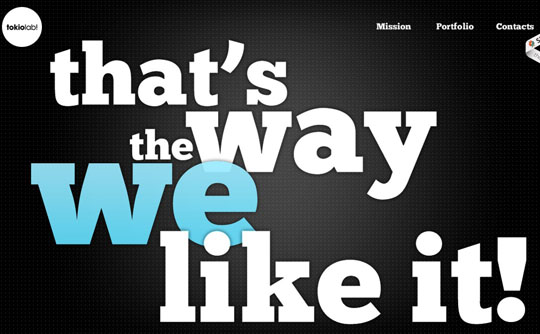
The Tokiolab website shows how effective parallax can be, even without the use of rich graphics or photos. Using only beautiful typography, tokiolab presents their brand message in a creative, engaging fashion. Parallax scrolling is used here to effectively turn the navigation experience into a slideshow.
Visit Tokiolab
Nike Air Jordan
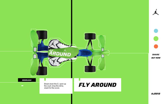
Parallax scrolling isn’t just a practical way to encourage user interaction or a unique way to present information – it can also be just plain fun, and the Air Jordan 2012 page is a great example of this. This page is also a really great illustration of how parallax’s ability to permit individual elements to scroll at different rates creates a feeling of depth and richness.
Visit Nike Air Jordan
Implementing Parallax Scrolling
While Parallax Scrolling opens up a world of new possibilities for a designer, like all techniques, it can easily be misused. When implemented effectively, parallax scrolling can produce a rich, engaging experience for the user. However, when poorly implemented, parallax scrolling can result in a confusing, unnavigable site. Here are some best practices to keep in mind when implementing parallax scrolling into your design:
Maintain continuity – have a continuous theme running through the layout to tie the design together and visually nudge the visitor along.
Present information in segments – while parallax scrolling encourages the user to continuously scroll, you still want your information presented in slide segments. This makes the information easy to digest, and also prevents overwhelming your visitor.
Be interactive – visitors need a reason to scroll, so make sure to give it to them.
Include call to actions – while the scrolling encourages user interaction, you’ll ultimately want this interaction to lead somewhere productive. Well-implemented parallax scrolling naturally funnels the visitor towards the bottom of a page, so it’s a good idea to take advantage of this phenomenon to encourage the visitor to take further action, whether that’s to buy, sign up to an email list, or simply hit “Like”.


