With the progressive advancement of technology, every designer is adopting the trend of “Flat Design” to apply it in their work. Even the renowned companies like Google and Microsoft is gradually following the trend of flat design. So the question arises whether this trend will survive or is it simply a passing phase that will get extinguished with forthcoming technology in the market?
Discover epic adventure and animation typography with One Battle After Another Font, BYD Font, Marvel Zombies Font, Up Font, How to Train Your Dragon Font, Ducati Font, and BYD Font — and more.
Why flat design?
Flat design is being used in varied fields like Windows 8, iPhone Apps, Windows phone and also in website design. Flat design is a graphic style that aims to avoid any graphical element and emphasizes on usability. It is a minimalistic design approach that features crisp edges, open and clean space, bright colours and flat illustrations.
However, this minimalist approach does not mean that the designs are boring. Minimalistic feel and layout with free space allow the users easy navigation to the site and apps and focus their attention on the elements that is important. Bright contrasting colours for illustrations and the buttons pop from backgrounds easily grab the attention of the user’s eye.
You must be wondering why to use a flat design within a website, mobile application or in any graphic design project? Using flat design not only is a stimulating break from the world that use 3D objects in flat space but it also completely changes the look of the final appearance. Simple images instead of detailed illustration convey messages more quickly. With flat design you step towards accepting the unique nature of the website.
Therefore, let us find out, why adopting flat design is a good practice?
Flat web design is quick:Flat design reflects efficiency. Without any distraction, your sight focuses on the essential parts of the site. The visitors can easily get what they are looking for.
Flat design is scalable:With the growing popularity of responsive design, it is important to get the website fit properly on different screen sizes. The elements of flat designs like colours and typography can easily get adapted to smaller screens.
Flat design is honest:Flat design always acknowledges the 2D nature of the screen design. The design doesn’t play a trick with the user as it does not attempt to add any 3D effects, shadows, patterns, gradients or any element which represent the real-world things.
Flat design is usable:As the idea with flat designs is to remove all distracting design elements, therefore, the design can focus on the user’s goal and the content. It makes optimum use of typography and colours as visual cues to help the users reach their goals.
What are the important aspects of flat design?
Typography
A good typography is the strategic foundation of flat design. Typography is one of those important things that exemplify the message of the site. To effectively communicate a message, a designer must invest time and effort on typography.
No more shadows and gradients
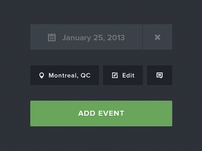

The speciality of flat design is that it removes flashy gradients, flashy shadows and textures from the visual design. Every image looks flat instead of bulged, inset or clickable. It helps the web designer to present the content in a compelling and simple way as required by the users.
Focus on colours


An important aspect of flat design is the usage of colours. The designers are experimenting with new shades such as lilac purple, black, web green or peachy red. However, an important thing to remember is not to use a colour for the sake of it. The colour should match well with the products and the company you are designing for. Find out what you want to show with the visual design and pick your colours accordingly.
Focus on words and simple UI elements


Flat design also concentrates on limited words to maintain the flow and feel of the website. Also the UI elements like the buttons should not be complicated and over-designed. As long as the elements are clearly used and are defined, they will continue to remain effective. This can be in the form of using different typeface, shape or colour.
Use of animation
Animation is the most exciting aspects of flat design. The use of animation can go a long way to make your application or website more engaging and user-friendly for the users/ visitors.
Examples of the website design that exhibit the traits of flat design trend:
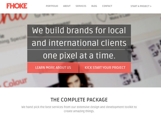
Fhoke
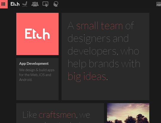
Etch
Build Windows
Interactive Advent Calendar
Fitbit
January Creative
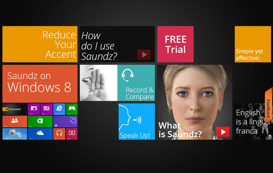
Saundz
