Great websites are an outcome of great ideas and great design combined. But it is not necessary that only experienced designers can design them. Even newbie web designers are capable of designing some of the best websites by following certain steps. Let us take a look at some of the steps which newbie designers can follow to design great websites like a pro.
Make sure that your webpage has sufficient whitespace

Avoiding clutter in your website is the first and foremost step of designing a great website. One way to avoid clutter is to make sure that your webpages have sufficient whitespace. Obviously, you wouldn’t want your users to squint to locate that one piece of content they are looking for, on the site. Hence, take care of the whitespace on your site and give it some room to breathe.
Keep the layout as simple as possible
Keep the layout of your website as simple as possible. Also, do maintain the same layout throughout all your webpages to give it a consistent look and feel which is easy to go through. In this way, your visitors can browse the site easily without making much of an effort and take the desired call-to-action.
Subtly use 3D effects
Adding various 3D effects on your site gives your site a facelift. You can use them to highlight any element on your webpages. For instance, you can use drop-shadows on menus, round up the edges of text boxes or use reflection in your icons to make them stand out from the rest of the content on the page. However, it is advisable that you use these 3D effects sparingly and subtly or your page will look dense.
Use softer shades or neutral colors in the background

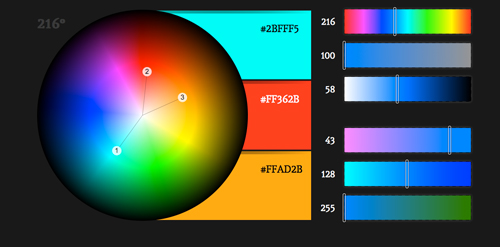
When you choose the background color for your website, try to go for plain backgrounds with softer shades or neutral colors. Doing so will allow you to experiment with strong colors in your fonts and other elements which help you to create contrast and draw the attention of your users. If you observe, almost all the minimalistic websites (which are much in vogue these days) use this same technique to attract users.
Play with your fonts

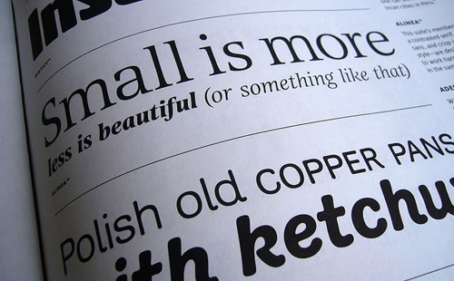
Using a different font occasionally on your webpages shouldn’t do any harm. You can use standard font type and size for the main content and heading, but you can change the fonts when you want to highlight something important. In this way, your visitors can easily find out what is important or can locate something they are looking for in split seconds.
For instance, use any handwriting font in a different color and a bigger size than the rest of the content for any call-to-action element. Additionally, you can use a different font to draw your users’ attention to specifics like “new arrivals”, “offers”, “contact us” and similar things on your webpages.
Go for a centered orientation
Placing the content on the center of the screen makes the site look more simple, clean and balanced as opposed to a left or right orientation. Additionally, it makes it easy for the visitors to focus on the content, which you want them to go through.
In conclusion:
These were some of the useful steps which newbie designers must adhere to if they want to design their websites like an expert designer.


