As Internet technology advances, it inevitably drags website developers along with it. That’s the very reason Responsive Web Design (RWD) was developed. Website creators were faced with real problems when creating sites that might be accessed by a variety of Internet capable devices. RWD takes care of those problems.
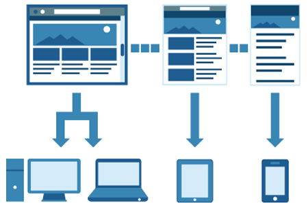
RWD is a process of developing websites that will display on any laptop, tablet, or mobile phone, automatically compensating to take into account the limits of each individual device. It is a rather new way of doing things, and one that certainly has its limitations, but it’s catching on.
Why use RWD?
The modern website is no longer just a cute little bulletin board or personal page to help keep up with friends and family. It is a complex conglomeration of static information, interactive features, and multimedia. Therefore, website creation needs to be focused on providing content to users in a way they find pleasing.
Unfortunately, the trend among web developers is to worry more about eye candy and the “wow” factor than they do about speed and usability. A website that loads slowly on a computer will be even worse on a tablet or smart phone. The idea behind RWD is to scale back on the unnecessary elements while making the necessary ones easily usable regardless of the device.
More and more, developers understand the necessity of employing RWD if they want to keep driving traffic to their sites. We are seeing this type of web development being pursued by digital news outlets, large online retailers, social networking sites, and purveyors of multimedia. At this point it’s a matter of getting on board or being left behind.
How does RWD work?
The driving force behind RWD is its use of CSS3 media queries. CSS, otherwise known as cascading style sheets, is a way of building websites by splitting content and presentation parameters into separate documents. Splitting them up translates to greater control and increased speed.

By using CSS3 media queries, a developer is able to gain even more control over how content is displayed. With the right code in place a website can survey the device accessing it and then display information appropriately. All of this is done seamlessly without any input from the user.
The key to making it happen is writing the proper CSS rules. These rules tell a website specifically how to display content under a given set of circumstances. Without the proper rules in place you might see one new media element on your laptop but notice it’s missing on your tablet. Improper rules can also slow down load times or prevent a site from loading at all.
RWD and Older Mobile Devices
The major drawback with RWD is that it doesn’t work well with older mobile devices that lack JavaScript. Developers have to use other methods to help determine what’s going on with the mobile device’s web browser. Sometimes it works, sometimes it doesn’t.
It would help the cause greatly if mobile device makers would adapter operating systems to the new technology. Some are already doing so, offering JavaScript alternatives that are capable of providing the same function. Others are updating their browsers, including making them friendly to browser sniffing scripts.

On the other hand, it’s mainly the makers of smartphones that are putting in the effort. Less popular “feature phones” are largely being left to fend for themselves. RWD websites probably are not going to load on those older devices no matter how much tweaking is done to them.
RWD and Amateur Web Developers
With all this knowledge in hand, you might be wondering whether or not you need to learn RWD if you’re just an amateur developer creating a site for your own small business. As a general rule we would say “yes”, but it really depends on the purpose of your site and what kind of content it contains.
For example, if you’re running a basic blog with content comprised of 90% text you can most likely get away without RWD. The only problem mobile device users might have is a browser window that is too large, requiring them to scroll back and forth as they read.
If you’re worried about these types of issues, you can hire a company to create a CSS3 template for you. Optionally, you can start a free website using free website builders.If you want to get a complete review about website builders and website templates then just visit freewebsite.us or you can use a free CSS template from one of the dozens of online sources that offer them. A template designed with RWD in mind will enable you to add your content while still maintaining the adaptability needed for certain mobile devices.
With the desktop computer almost extinct and laptops being replaced by tablets in record numbers, it would appear RWD is here to stay. Professional web developers who don’t want to fall behind need to learn it and start using it.

