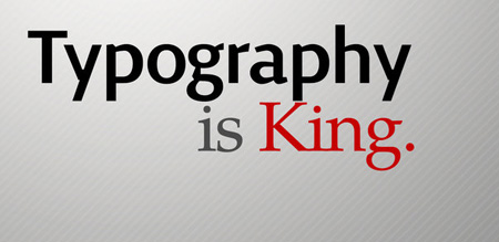
Whether it’s the iconic, calligraphic font of Coca-Cola or the famous juxtaposition of type into the shape of a suitcase for the “Pulp Fiction” movie poster, typography can make an impact on an audience at first glance.
Website typography is no superficial thing. In addition to affecting branding and the aesthetics of a site, typography, according to numerous studies conducted since 1929, has a psychological effect on users, which can affect site traffic and product conversion rates.

Return traffic, organic linking and successful calls to action are often the result of a site’s chosen type proving effective in personality, mood influence and presentation. For websites, typography can strategically convey subconscious messages, emotion, principles and ethics, in addition to literal meaning. It may seem strange or unbelievable, but research shows that people can have their moods and behaviors manipulated by the sight of certain font and icons. All this can play a role in bounce rates and length of visits on a website, depending on if the font attracts or repels.
Choosing typography is, therefore, one of the most fateful decisions a company and its web designers can make. Typography is more than simply the style of the font. It includes font size, font color, contrast, accents such as bold or italic lettering, spacing, juxtaposition, the addition of non-traditional characters and even logos designed to be used alongside font. All these facets merge to create a visual presence for the website that has the following consequences.
Branding

Successful companies do not change their typography on a whim. Often, the initial typography seeps into the consciousness of the market and its customers, lasting as long as the business itself. Web designers and website owners should take heed, selecting typography that is crafted to endure so that readers begin to identity with a reliable and unshifting brand. Changing typography in the midst of a popular run with visitors can be unsettling and ruin a website experience for loyalists; it can make some readers question whether they still identify with the site or get the same “feeling” from the site as they once did. In the Web world, the digital atmosphere is everything. Designers can’t provide readers or customers with physical atmosphere marked by carpet, drapery or lighting, but they can provide the illusion of atmosphere through site design and brand typography, hopefully styled with such impact that it evokes the true spirit of the company.
Typography as Psychology

The reason is typography works so well to create atmosphere and convey messages to readers is first and foremost because letters and characters on a page affect legibility and readability. Not all type is easy to decipher and read. If a website provokes eye strain or requires too much effort from readers, they might leave the site and associate negative feelings with that website, according to typography researcher and Microsoft psychologist Kevin Larson.
If readers find the type pleasant, Larson believes, they might become so engaged in what they are reading that they spend more time on the website than intended. Think of what that could mean in terms of increased exposure to company products, services, articles and advertising.
In addition to just staying on the site longer, clicking more pages and reading more, typography even affects readers after they leave, Larson found. He reported that people can walk away from a website elevated in mood or creativity and associate those positive reactions with the site. Conceivably, visiting a site daily could provide a habitual fix for a reader as strong as caffeine or as unpleasant as bitter vinegar.
The Duty of the Web Designer to Test Typography
Since typography can be so powerful, finding the right stylistic type can be overwhelming. Unfortunately, there’s no one formula that proves successful always — and even if there were, it would be useless because branding relies on distinctiveness not mimicry and formula. Designers wanting to be successful with typography should assemble a small group of test readers who can give feedback on any new type or original type being chosen for a web client.


