Prior to starting the design of your website there are a series of tasks that you can do off page so that your design can provide your visitors a great user experience and regardless of whether you are going to use online website building tools like Squarespace and Breezi or manually code the design of your website with programs like Dreamweaver, Notepad++ you can begin planning your navigation beforehand. Planning your navigation in advance can help you in a wide variety of terms and steps to organize your website and improve your design by taking a few steps and considerations.
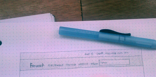
The way that your users navigate through your site can help you improve usability, providing a better user experience and keeping users focused on what they are looking for. Once your navigation becomes an implicit part of your page and is properly structured and design, users will have no problem finding what they need if everything has been set up properly.
Organizing Your Website Provides Hierarchy and Better Usability
Once the content of your website has been gathered and defined it´s time to add hierarchy and organization to it by providing navigation. Content needs to be discerned and structured, that way pages needed to be created can be defined.
We tend to have a certain need to correlate things to others that are similar to each other and separate the ones that fall into a different category (a category being a social structure and not an organic one) thus it is no wonder that organizing content and navigation helps you construct a better website.
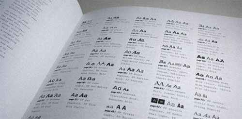
Let Users Organize Your Navigation
One way to organize your navigation is by using a simple method called Card Sorting. This allows you to use a logic and simple way to set your navigation by replacing the method of thinking how the information was structured and just thinking about the simple and logical ways to navigate your site.
Write in a bunch of cards all the links (and sub links if necessary) or themes that users would regularly like to see and use on your website, start by having regular clients and people who would enter your site accommodate and place the cards into hierarchies and categories.
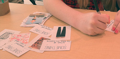
You can do this in two different ways. Letting users decide order and hierarchy including categories and placing no limitations on the way they want the navigation placed or you can have them follow a certain order and specific categories and place cards into their respective ones.
Navigations Bars, Call to Action Buttons and Search Boxes
Content is defined and organized. Navigation structure and order has been implemented it is time to think how your website navigation architecture will function. When someone enters onto your website for a certain reason or looking for something, chances are they want to find this as soon as possible, so providing a good way of navigating through your site will help them achieve this in a very efficient manner.
Navigation Menu
There are several ways to set up navigation on your site. Horizontal and vertical navigation for your mains links and sections are the usual and preferred ways to help users browse through your site.
Having a way of coming back to your homepage is another usual and expected action and anticipating your users’ needs is vital to comply with a good user experience. Make your website logo (usually placed at the top left corner of your website) go back to your main page when clicked and/or placing a “Home” link on your navigation menu is also expected.
In this screenshot courtesy of Amanda & David Wedding Website we see how there is a heart logo that if clicked, will take you to the main section of the page again.
![]()
All the content on your website has to be one or two clicks away at most. If users have to proactively search for content on your website and have a hard time finding it then they would probably not like spending time on it.
Search Boxes
If your website content is updated constantly and it’s too large to make it fit on a simple navigation menu add a search box to your website. Search boxes are usually placed on the right side of your website.

Call to Action Buttons
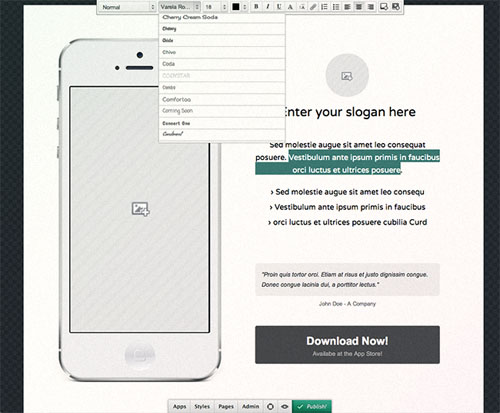
For some sites where there is intent for users to take and expected action like landing pages or e commerce sites there may be buttons around the page. Place these buttons on the right side of your page and make them distinguishable enough but still harmonious with your website.
In this image courtesy of Breezi we see how while you’re constructing the website they’ve added a call to action button at the right side of the page.
Improve user experience by anticipating their actions. If users want a website logo on the left top corner of your site that redirects them to your home page, give it to them. If they want the navigation bar to always be sticky and show on every page, do it, that’s one way to keep users content and improve usability. Doing this does not mean you need to sacrifice your creativity and view of your site. Implement a creative process while at the same time following user expectations.
The Beginning of Wisdom Is To Call Things by Name
Naming the links on your navigation must be an easy and logical task. Avoid using company or designer argot since this can confuse users. Take a look at other website pages and see how most of the usual links have the same name. Information about the website it’s called “About Us”, the homepage link must read “Home”. Use names that are usual like Portfolio, Contact, Home, About Us, etc. Names must be short and logical.
See on picture below how sections have been named simple and sub links are explaining a little bit more about each section.

Test your navigation names by asking users what they expect to find in a specific page based on what it’s name is. If there is good correlation between the name of the link and that link’s content then successful is ensured.
Horizontal vs. Vertical Navigation
Choosing the way your navigation menu will look depends not only on aesthetic taste but also on the quantity of elements and links that need to be placed on a page. What you choose depends on density of content, aesthetic choices and improving user experience and usability.
Choosing a horizontal navigation menu is optimal when you are looking for a small quantity of links to be displayed and you want navigation to be present at all times. Links can be displayed as tabs, separators, containers or nothing at all.

Vertical navigations are better used when your page is big on content and needs a lot of links to be displayed. Be really careful about using this kind of navigation since it can take a lot of screen space and limit your work.
There are some basic concepts and ideas you can follow that are really easy to achieve and will improve the way users feel and will provide better navigation to them. Make the logo on your site take the user to the homepage, allow every menu item to be clickable, use drop down navigation in case there are sub links or sub categories and keep link names logical and short.
Now that you know this, it will be really simple to avoid usual errors and by practicing you will be getting better at improving user experience within a short amount of time. Follow this basic advice and you’ll see how planning navigation in advance can help smooth out the website creation process.


