Because you are young and new to this trade we call web design, chances are you’re going to make many mistakes. Some of these mistakes are about you making bad decisions and doing reckless actions. In some other cases, however, the mistake is not what you did, but what you did NOT do.
With a lot going on even with the simplest web design project, some important details may have been completely left out from the start or have just been forgotten in the last minute before the deadline. Some are little and mendable;some are huge and irrevocable.
Taking away the clutter
Many take simplicity for granted. Most amateur web designers put everything they know in one project, like flash animation, colorful backgrounds, stylistic fonts, and loud images. Sometimes, impressive flairs are bothersome and can hinder the browsing experience of the visitor. The more intricate the design, the more likely it will become messy and incomprehensible.
Web Analytics

Some amateur web designers think that what is important is only monitoring the rise of “hit” numbers. Web Analytics can offer more than measuring the influx of unique visitors in your site. Overall, it provides statistical information about the website and its users like popular articles and most-searched words. Web Analytics track the trend of user activities in your website and may help you change or develop a particular area in the future.
Search Field
Some of the information in your site may not come out in popular web search engines like Google, Bing, or Yahoo. In-depth searches may help your users with what they are looking for, and in effect, will help you gain their confidence.
Images
Most of the users nowadays are image-oriented. Every article and even every section of an article need a corresponding image to help users with their reading and browsing experience. As a web designer, make your own favicon and logo, make your signature designs and illustrations, make drawings and characters, make your own comic strip series. Some artists disguise themselves as web designers.
Status Page

In recent times, making status code page like the 404 page has become an art in itself. Sometimes, these pages become synonymous with sites, becoming their own character and empire, like Twitter’s Fail Whale.
It is not merely making status pages look pretty, but making users feel that a site is thoughtful enough to make a cute and gracious 404 page.
Double Checking Links
Over time and over a hundred changes, websites remove and move their pages elsewhere, leaving the old URL behind. Double check links, especially outbound links, to make sure the links are still relevant to the article. Nothing is more frustrating than a broken link.
Contact Info and Contact Form

Communicating with the users is an essential component in business transaction that some websites do not feature. Some think that putting up a website is in itself the communication between the customers and the company.
Provide contact info complete with necessary email addresses, Facebook and Twitter addresses, and many more. Also, provide a contact form for the users to fill in.
Spell Check
Always check the spelling: before launching the site, after launching the site, when writing an article, after posting an article. Check every now and then for misspells and typographical errors.
Mobile Site

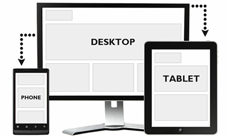
As everything now goes mobile, some sites forget to configure their sites to accommodate their mobile users. Sites like Google provide a service in configuring sites into mobile formats: white background, the texts of the articles, and sometimes no images. Though that is courteous of Google, it is still better to have your own mobile site.
Gracious to Ads Spaces
Though ads are important for the upkeep of the site, be gracious enough to both your advertisers and users about the ad placements. Advertisers want the appropriate attention they paid for the ads, but users do want to be constantly bugged with pop-ups and blinking advertisements. Be subtle with the placements but be direct in emphasizing that an area is an ad space.
Cross Checking
After everything else, check the website how it would look in different browsers. Check the design and its components for errors. Check the images, links, pop ups, animations for compatibility with other operating systems and their browsers, in Mac, Windows, Linux, Android, iOS. Check how it would look in Chrome, Firefox, Safari, Opera, and Internet Explorer.
Warnings and precautions for links and downloads
Users do not like it when they are surprised with the link they have just clicked. Put a warning sign, either a pop-up or a red text beside a link, if they going to be re-directed to another site or downloading a file.


