More often than not, it has been observed that people fail to plan and implement a good call to action strategy. Now this may not sound too much of a drawback but actually an improper call to action plan might decrease the possible number of conversion a website can achieve. Therefore, it is of paramount importance to plan a good and effective call to action strategy. At the same time, it is also important to know how to place them purposefully and at the right places. By working on these two things, one can effectively enhance the conversions. Read on.
Call to action plays a very important role in generating a conversion for a site. One of the main tasks of CTA is to make a visitor do some action. It could be anything like downloading something, or making a purchase. Thus, call to action buttons have a very significant role to play. However, most of the websites make no good use of them and have their call to action buttons either at wrong places or randomly everywhere.
What not to do?
One of the most common mistakes committed by many is the over stuffing of the web pages with a huge number of CTA buttons. While the fact is that even a small number of CTA can fetch good results and accomplish the set task. But people somehow fail to realize this. It is always better to have something good rather than everything bad. It is also not a good idea to make use of every social networking site available. The focus should be on making the optimum use of the best resources available.
By stuffing too many call to action buttons on a web page, you are actually sending the wrong message to the visitors. They would get the impression that you are only interested in attracting customer any how and are not bothered about what interests the customers or buyers. There is no dearth of websites which have plenty of video transcriptions, Twitter and Facebook links. It is important to realize that most of the visitors are interested in content and visit a site only if they find the content relevant and interesting. And if you will keep providing them with only ‘follow me’, they will certainly not be interested in your site no matter how many call to action buttons you may install.
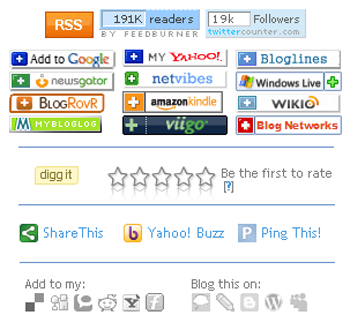 (Too many call to action buttons may confuse your visitors)
What to do?
It should be your focus to limit your network to those places from where you are getting good traffic. It is important to analyze and select what works for you. It could be social networking sites, or emails as well. However, resist the temptation of placing Facebook and Twitter buttons at too many places. All in all, make a good use of various social networking sites like Facebook, Twitter, Linkedin etc. Also, podcasting can prove to be an effective strategy in making your visitors return to the site.
You should work out a good strategy. It would be really nice if you offer a real value to your visitors
When they click a call to action button. This can do a lot of good for your business. It is the information which makes most of the visitors land on a site, and they will definitely come back if they like it. So make sure that once the visitor has landed on your site, you have something relevant and captivating to offer them.
 ( An attractive button perfectly placed below those impressive bullet points, with a picture of the book aside making the button even more attractive, moreover its free of cost )
You can also ask your visitors to opt in an instant access to the main page. However, make sure that it is done at the bottom of the page. Most of the visitors will subscribe. It is just that you should not force it on them at the very top of the page itself. Another very important thing to keep in mind is that you should just let your visitors know how they can subscribe. Do not make it look like you are dying to have them subscribed to your site. Your focus should be on making your site so compelling and captivating that visitors automatically feel like subscribing to you.
Design them well
Now let us talk about another important thing, ie the features of the call to action button. It is not just the right place which matters, but you should also make sure that your call to action buttons are well designed and are visually appealing. Everything matters like size, shape, color etc. When it comes to a web page, the size of an element indicates its importance. The larger the size, the more important an element is. The size of a call to action button should be large enough to catch the attention of visitors. A too small button may not serve its purpose. Hence, size is an important aspect and should be taken care of. Moreover, if you are using many call to action buttons on a web page, you should vary the size of every button to enhance their visibility.
 ( Size of the button increases the chance of more clicks )
How to color and shape your revenue generators?
Select such a color for a call to action button that it makes it stand out from other elements on the page. This will increase the chances of visitors clicking on the button. The color of the button should be in contrast to the color of the background. Also, make sure that the color is such that it does not clash with the overall design of the site. Next comes the shape. You do not really have to go with those every day boring shapes for your call to action buttons. In fact, you can opt for something unique and interesting. This will not only amuse the visitors but will also add to the variety. Instead of those regular rectangular shaped buttons, you can try something unconventional. You can very well pick shapes like oval, stars etc for your call to action buttons.
 (A bright green button with a white backgroud stands out, moreover ‘ 10% off ‘ written on it makes it more appealing )
Where to place them?
Last but not the least, positioning of the buttons matters a lot. You can not just place call to action buttons any where on the web page. In fact, it takes a good amount of research to find out which are the best places for the buttons to be placed. You can place the buttons above the fold of the web page. This is one of the best positions and helps in attracting visitors’ attention. Depending on the content on your web page, you can also place the buttons in the right or in the left.

Conclusion
We hope the above mentioned points can help you plan an effective and result-oriented call to action strategy for your site . And you can always get back to us with your thoughts on effective call to action strategy here through the comment section below.
Mark Wilston is a Content Writer and marketing professional working with PixelCrayons, a reputed Custom web design & development company India offering offshore cms, ecommerce and mobile apps development services. For more information about PixelCrayons, visit at http://www.pixelcrayons.com/


