There are several success factors in online business and promotion of a website to Google’s TOP-10: good site (web design), good contents, white hat SEO methods and helpful information/products/services for visitors. A website with an attractive and functional design, informative and SEO friendly content, as well as popular products and services offered, will certainly flourish. However, lots of site owners and webmasters fail to find the golden mean, i.e. focus on tech details that all in all, make a website totally unusable for ordinary people who came to a site not to evaluate design elements SEO-friendliness of content.
For example, a dentist creating their online site may focus on PPC for dentists, which can be a great tool to pull in traffic while a long-term strategy like SEO works. That gets people on your site, and functionality and design keeps them there. But how do you keep visitors coming back to your site? Sometimes, it’s important to consider the human element, not just the algorithm.
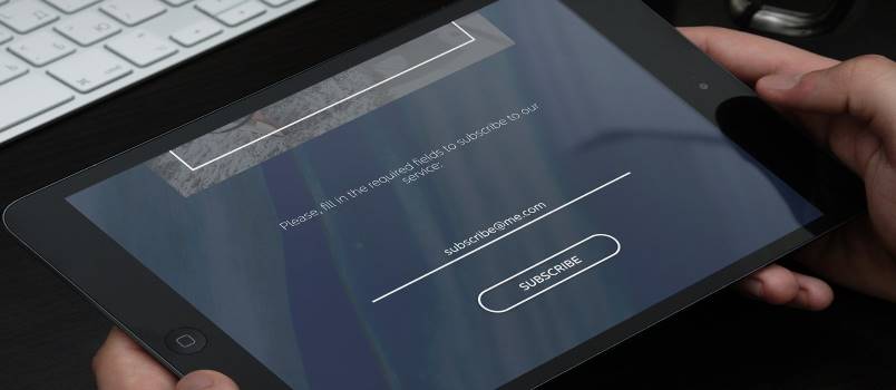
It is not a secret that the goal of all webmasters and site owners is to receive traffic from search engines, social networks etc. However, the just having folks visiting the site is not enough. Web traffic is then converted into registrations, sales, subscriptions and so on. In other words, it is imperative to force visitors stay at the site and make them love it. Using the right web design software or web design featured features are both one of the methods for persuading visitors to register or even buy a product. Sure, having appealing content is a must as well, however, suitable and effective web design still plays its role. Listed below are web design elements that may inspire visitors to register and even place orders.
Promotion Elements

For instance, a visitor may locate the site in search engines for a particular keyword. There might be many web pages designed for different keywords, still the site may have one goal – to make visitors register or buy a product. Thus, posting a banner with some catchy phrase and description of the offer will do the trick. This is a common marketing technique, although is it realized graphically.
A visitor may click on it or bookmark the site to have a look at this offer later on. Be reasonable, since an excessive number of banners will definitely scare potential customers off. One or two banners is enough. Even if the site earns money through advertizing (for example, getting commission for clicks), misuse of banners and pop-ups will negatively impact users’ surfing experience, and consequently, decrease the number of registrations.
Site Navigation
Users love websites with easy to understand menus and sections. Sometimes, an excessive number of pages and menus makes visitors leave the site. Nobody wants to waste time looking for necessary information. Thus, no matter what design scheme is used, it is important to make a site user friendly. Make sure, all important features of the site are visible and can be found with ease (for example, search boxes, polls, latest news, best offers etc). If you don’t want your users to have to navigate much you can use a whiteboard animation company to produce an explainer video for your home page. Whiteboard animations are easy to understand and are very effective at holding users’ attention.
Colors

Today’s development of the Internet and e-commerce proved that commercially successful sites do not necessarily need to have a fancy design with lots of multimedia features. Well, of course, having a multimedia introduction with flash videos and picture gallery may seem cool, however, more than 70% of potential customers will simply close the page in their browsers and continue searching for simpler sites. The fact that you love your site does not mean everyone else finds it usable and appealing. There are lots of web stores and sites that have thousands of visitors daily just because they have great SEO content and simple design. These days web designers may offer expensive solutions that will not add to site’s usability and popularity with users. Thus, choosing color schemes that comfort the eye is the number one step! Also, the site should not be too heavy, despite the skyrocketing speed of Internet connection.
Although this may not really apply to web design, but offering some freebies for registration will also increase site’s popularity. At that, it is important to create an appealing banner saying something like “Register now and get a free e-book.”
There is also something that websites owners and webmasters should avoid, namely:
Too large or too small fonts. This decreases readability of text, besides, it irritates the majority of visitors. You will agree that using size 6 or 20 fonts for a great sales proposal is definitely a bad idea.
Background music and annoying popups. The most effective ways to scare visitors off the site is to have background music (often visitors may not figure out ways to turn it off), while pop-ups drive the majority of people nuts

