Interested in creating a useful and creative way for your web visitors to easily locate information on your website? While basic HTML sitemaps do the trick in many cases, sometimes giving your sitemap a creative edge can make a real difference in your bounce rate and visitor experience.
What is a sitemap?
A sitemap is a page on a website dedicated to providing one-click access to every part of the site – even every page, depending on the size of the site in question. While the same term is used to describe an XML output of a site’s content for use with search engine spiders, when we refer to a “sitemap” here we mean, instead, a visual map of your website’s content developed to engage and assist your real life visitors, typically in simple HTML.
Check out these creative ideas and websites for sitemap design inspiration!
Utilize color, graphics and video!

If you’re wanting to create a sitemap that excels in getting your visitors where they want to go while also presenting something more visually appealing than a simple list of links, consider adding simple CSS and web elements to the page to give it a bit of flair. Graphics can showcase header titles or highlight important pages, videos can be used to give on-page information or more detailed instructions to visitors looking for something in particular and colors can be used throughout to create a beautiful HTML sitemap with minimal hassle.
Get fancy…but not too fancy.

While websites focusing strictly on reference material may wish to stick to an absolutely bare bones sitemap for the purpose of simplicity and ease of use, most websites would do well to add a bit of flair to their sitemap. You can make something highly fun and interactive, simply use images and color to accentuate text or anything in between, but always be careful to keep your visitor’s experience and ease of use in mind.
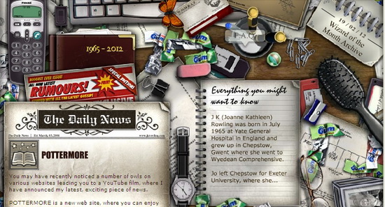
Maximum Interactivity: JK Rowling

Focusing on not only beautiful design but also creative interaction is the official site of J.K. Rowling, creator of the Harry Potter series of books. The engaging qualities encourage a user to investigate the page further with one-click access, while hindered for those in a rush, still available to every area of the website.
Make Your Sitemap a Map: SeussVille

The “map” in sitemap literally refers to the fact that your sitemap is a source of directions for your visitors, so why not take that concept to its logical next step? The official site of Dr. Seuss, the children’s brand of books and toys, does just that, giving users an evolving interactive map to navigate. Again, this doesn’t do the best job of presenting links and information easily but, with the intended audience in mind, this sitemap design is sure to keep its visitors interested and moving about the site.
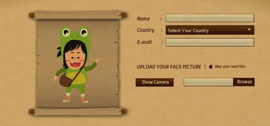
Simple and Fun: Madison World Communications

When your website is limited in size and you can allow your creative flights of fancy to take precedence over the need to display endless information, consider making your visitor sitemap fun to look at, just for the sake of fun itself. This example from Indian firm Madison World Communications includes music and fun visual effects not to add to available information, but simply to amuse the user and to portray the company as fun and hip.
Ultra Creative: Magnivate

This boutique web design and solution firm offers their clients more than just a sitemap, making the entire web experience a unique, interactive affair. While this level of creative freedom simply isn’t possible for many sites, businesses wanting to combine direct access to information with the opportunity to show potential clients just what they can do can benefit from such an idea.
Conclusion
[alert-success]No matter what approach you take to designing your sitemap, be sure that your visitors are able to utilize it in a meaningful way. The right mix of beauty and brains may be difficult to find, so consider obtaining user feedback throughout the design process in order to be sure that your ducks are in a row before making your new sitemap live to the world.[/alert-success]


