With the Internet being one of the biggest marketing platforms from small to large businesses, there is a new trend emerging with logo design. This trend is animated gifs being used in place of the traditional, stationary images. We are seeing them everywhere now, and yet they are still controversial with graphic designers.
Some say that they are the way of the future, giving more dynamic means of conveying a brand to the customer. Others aren’t so sure. Let’s look at some of the pros and cons of gif logos, as well as examples of how it can be used to create interesting designs that can then be adapted for icon use.
Pros
- They catch the eye immediately, whereas some logos can be passed over with a glance.
- You can get really creative with 3-D design.
- While the main design is animated you can use a standard image for a stationary logo built from the same image.
- An animated logo stands out more, even among other animations.
Modern editing software makes animation more polished and smooth, providing a sleeker look.
Cons
- Not all sites or media support animated logos.
- They can look a little cheesy if you can’t find the proper balance in the image.
- You might find them too busy for certain web layouts.
- Examples of Inspirational GIF Animations
David Ope
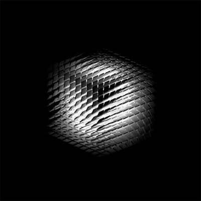
DVDP is the website owned by graphic designer David Ope. His gifs are inspiring for any kind of project, each one showing how to create dynamic visual teasers. Many of them could easily be adapted to a logo design. Anything that is centered around a single moving shape could spark an idea on how to create a clean animated brand logo for a website or product. Though the background gifs that are very busy might not work so well.
CyberChaos
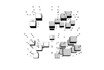
Flickr member CyberChaos has a number of inspiring images, but this is the first I have seen where I could actually imagine the same movement and idea being used to create a shifting logo. Complex and a little trippy, it is nevertheless a gorgeous piece of work that will be sure to spark a number of concepts in your mind while you view it moving on your screen.
Pace Cleaning Company
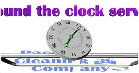
If you are looking for an example of how a multi-moving animated image can be used for a company, this is a great one. The logo itself could use some polishing, admittedly, but the design is good, and it is rather simple considering how much movement is happening in the image. For a more professional look, they might have only had the clock moving, showing the stationary words behind coming into focus behind it.
Logo Animated

This is a simple but really cool little logo that shows the world cut in half and resting on a white background, made into a pulsing speaker with sound waves being pushed from it. They don’t specify what they made it for, but it is a good example of a memorable image within a potential niche.
Eternal Lobby Lounge
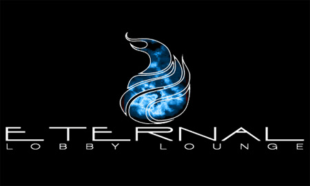
Instead of using a full moving image, this logo has a traditional logo against a black background, but uses the center for the animation. Sleek and trendy looking, it finds that perfect balance for a gif logo. Everything from the colors used to the shape of the fire and how it is so well contained are gorgeous. Plus, you can easily use the same image without the animation for a traditional logo.
Conclusion
[alert-success]I don’t think it is an issue of a gif logos being either good or bad. There are both pros and cons to the issue, so it is more a matter of personal preference. The real trick is making sure you create one correctly, handling it in a professional manner for an attractive and effective image. If you can do, the pros and cons mean nothing.[/alert-success]


