Establishing a visual representation of a company name is a great idea for a logo design. It is simple, to the point and creative while immediately branding an image of the business or product into the mind of the consumer. That’s not to mention the functionality for promotional purposes, like posters, T-shirts, websites, coffee mugs, etc.
But you have to find that fine line between making a good render and one that forces the point with too little finesse. That is why being clever is the name of the game, and less is almost always more.
Check out these 10 smart, interesting examples of logos that use visual workups of the company name:
Killed Productions
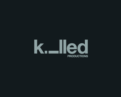
What better way to show Killed than by killing off one of the letters? Using the lowercase so that “I” becomes a person lying dead in the logo is a great idea and very clever. It is also the perfect theme for using promotional items, as there is something almost trendy in the design.
Wrong / Right
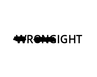
It might lack elegance, but the idea is so smart that it is just too cool not to like. The way they use the thick marker for the cross-outs is even better, as it gives it a fun, quirky look that overrides the simplicity of the black text on white.
Twins

Twins obviously imply two of something. So, when this company used a number two in place of its “N,” it was really on the ball. The effect is twofold: it is clever, and also it jolts the mind as the eye rests on it and, therefore, makes it memorable.
TicToc Clocks

This is a personal favorite of mine. The “I” and “O” make up a ticking clock, made in the old, grandfather style. But it has a touch of sophistication to the entire logo that immediately makes you think of classic timepieces.
Artists United

It might take a moment, but look at this logo – what do you notice about it? By now, you probably see the “A” and “U” making a writing utensil, which could either be a pencil or a calligraphy pen – another very cool idea that I wish I had thought of.
Snap
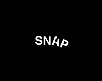
This logo is a little plain, but interesting. The way that the “A” and “P” genuinely look like they are falling off into darkness is pretty cool. I would have liked to see the lettering a bit bigger, maybe with a little more for the eye to rest on. But the concept is great.
Shift
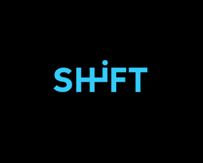
Think of a gear shift, either in between the front seats or an automatic with the stick behind the steering wheel. Either way, this logo fits. I like the color, which adds something a little more than if it were just in white against black. It is also sporty looking, making it perfect for promotional items like T-shirts or even sports products like water bottles.
Time Watch
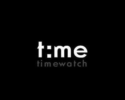
Not enough people use a digital look for clock logos. Time Watch looks like an alarm clock, with the colon in place of the “I.” I love the font that was used, as it reminds me of those sporty designer watches that were so popular in the ’90s and are making a reappearance now.
Upside Down Productions
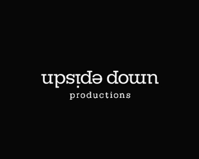
How cool is this? The letters spell out the name, but upon closer inspection you will notice that each one is a different letter, upside-down. It is clear but interesting, and very smart.
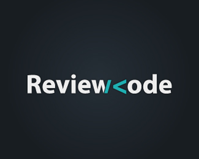
Review Code
Anyone who knows even the most basic HTML will see how awesome this logo really is. Even the colors remind me of coding, and the entire concept is pretty great. A more standard font might have been better, but otherwise, awesome idea!

