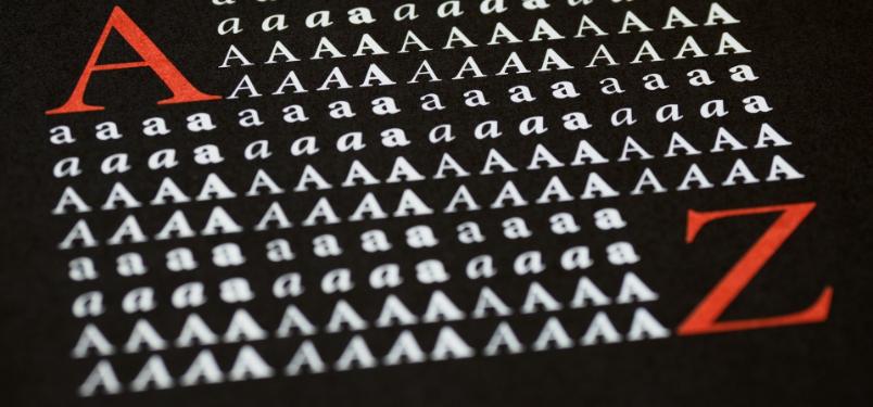
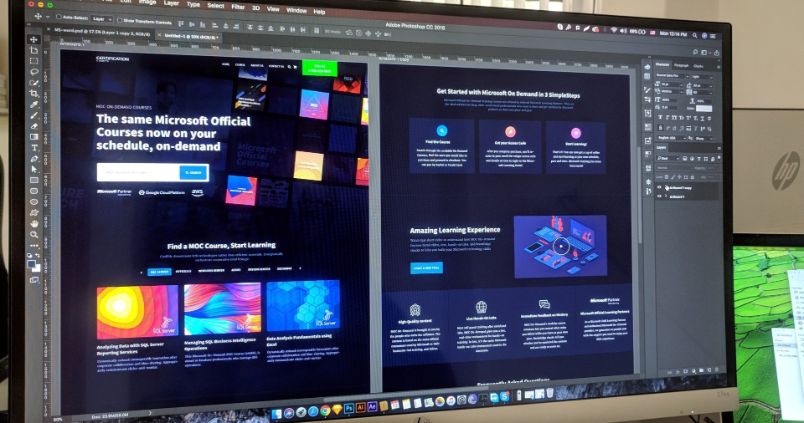
Typography has plenty of fans. But that number is ever increasing, thanks to the Internet and the whole new world it has opened up for designers and artists. One of those newer versions of this old practice is kinetic typography, which takes advantage of computer graphics and allows people to make their own movies using nothing but fonts or effects.
Kinetic typography takes a lot of practice, but it is fun and very educational. That is why so many graphic design courses make it a mandatory project for their students, in order to introduce them to both typography through movement and creative processes that turn lettering into special effects or representative objects.
These 10 videos are a good example of how it can be used to generate a full image and convey an idea. Each one is based off of a hit Hollywood film.
1. Transformers
I have to admit that I wasn’t especially impressed with “Transformers.” While I was a serious fan of the old cartoon in my youth, the movie fell short. But the scene that shows an attempted customer service call in the middle of a battle is hilarious enough to make up for even “Transformers 2.”
The typography in this clip iss well done, with a military feel to both the font and the colors. The change in tone when you listen to the customer service agent is a nice touch, and nothing beats seeing “LEFT CHEEK!” pulsing near the middle.
2. Star Wars
One of the best typography videos I have ever seen, this one takes us back a long time ago, to a galaxy far, far away. The X-wing battle from “A New Hope” is the topic, and the creators did an excellent job of showing everything in literal font form. My favorite part is the trenches, which remind me of the bare-bones 3-D of the old Virtual Boy failed console.
3. The Matrix
Will you take the red pill or the blue one? The first “Matrix” became one of the most celebrated science-fiction movies of all time, put right up there with “Star Wars” and “Tron.”
While the sequels were more than a little bit disappointing, the final speech made by Neo at the very end always gave me chills. That speech was made in kinetic typography form for this video. It is a little more “Ghost Writer” than anything else to me, but the text is still a better actor than Keanu Reeves.
4. Toy Story
I still remember going with my younger sister to see “Toy Story” in theaters. It was a hilarious movie and revolutionized a new style of movie design, one still used today. Anyone who has seen it will remember that scene in the parking lot of the gas station, where Woody and Buzz get left behind.
At the very least, they will remember Buzz’s line of “You are a sad, strange little man.” This video managed to capture the entire sequence very well while getting all of the funniest bits in.
5. Requiem for a Dream
One of the most depressing movies of all time, this film chronicles the fall of three friends on drugs, as well as one of the character’s mother, to prescription speed.
The final scene where you see one in prison, one high after getting into porn and the last in a hospital with an amputated arm has affected many people deeply. This scene captured here in typography is one where the mother is explaining the pills she has been given by her shady doctor. The typeface used is wonderfully simple, capturing the simple tragedy of the scene.
6. Pirates of the Caribbean
The “Pirates” movies just keep on coming, and they are huge sellers,so huge that there is no end in sight for the franchise. I don’t know anyone who doesn’t love Captain Jack, and this little video is one major reason why.
Most of you will remember the argument over a key (or lack of a key) from the film. The placement of the lettering is well done, and it is incredibly simple in the way it depicts the confusing fight.
7. Fight Club
“Fight Club” is still the ultimate Friday night movie to watch with some friends, a couple of drinks and an eagerness to see Brad Pitt without a shirt. The typography in this video seems to perfectly catch the tone of the film, and the use of the poster font for the name each time it is said in the infamous “rules” speech is a nice touch, and so are the representations for each fight end.
8. Kill Bill
Quentin Tarantino’s “Kill Bill” trilogy is about as controversial with old-school fans as his appearance on “American Idol.” But whether you love or hate the series, O-Ren’s speech about her unwillingness to hear any negative comments about her dual heritage is a winner. Between the font, the color and the blood spatter, this video is as awesome as it is foul-mouthed.
9. Iron Man
I would rather watch this minute-long typography video than subject myself to “Iron Man 2” any day. It is pretty well made, with some great typeface and even better effects. The “guarantee” stamp is a great little flourish, and of course, there is the propaganda feel to the illustrations. This is one of the better clips on YouTube, for sure.
10. Forrest Gump
If you like shrimp, hearing about shrimp, thinking about shrimp or seeing typography based on shrimp, you are in good company here. It is nice to see a kinetic type video not based around the “box of chocolates” quote or telling Forrest to run. Instead, we are treated to the diversity of these little sea delicacies.
What are your favorite typography videos based on films? Leave a link in the comments.

