Sports are all about having that competitive edge, even when it comes to logo design. Players strive to appear strong, confident, and other such values akin to the team. Unifying this message is tricky but not with the help of our animal friends!
Animals have long been a source of symbolism and it’s easy to personify and give them the desired character. Strong and cute, fast and sharp, and the list goes on.
Richmond Flying Squirrels: MLB Double-A
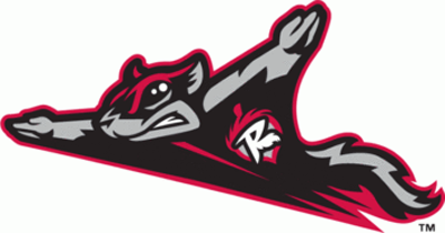
Unveiled on December 1, 2009, this logo makes it with flying colors to our list. It is a black, red, and grey flying squirrel with a patch in the shape of an “R” (for Richmond) on top of an acorn over its heart. This design is the perfect example of how animals can easily depict actions such as flying while exuding character and branding all at the same time.
Coastal Carolina Chanticleers: NCAA
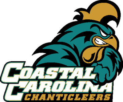
The Chanticleer is a proud and fierce rooster who dominates the barnyard. No wonder this logo is oozing with macho. The feathers look and feel like 100% flexed muscles, giving the logo splendor and great looks. This is a good example of how details and facial expression can be used on animal logos.
Iowa Hawkeyes: NCAA
Intimidating and scary, this black and gold stencil logo is a no frills symbol of testosterone. The silhouette of this black hawk is simply mysterious and even a bit scary.
Alabama Crimson Tide: NCAA
Elephantastic! This giant creature, even bigger than capital A is mighty scary. In fact, the team it represents was once described as coming out like a herd of elephants into the field. Here, the characteristic of the elephant creature is effortlessly emulated.
San Jose Sharks: NHL
This shark is part of a professional ice hockey team and that’s a swift and sharp animal! This logo has it all: action, facial expression, and character. It is the only item on our list that holds (bites) a sports accessory.
Charlotte Bobcats: NBA

How can you argue with an angry bob cat? This logo is sleek and simple but does not let the animal rule the brand with its effective typography right above the kitty.
Quad Cities River Bandits: MLB Class A

This design is so awesome that it can make for a great Disney movie poster. The hat, scarf, baseball, and the bridge in the background seamlessly work with the typography that brings all the elements together.
Charlotte Stone Crabs: MLB Class A Advanced
This crab crawls to our cool list because who would have ever thought of using a stone crab as a logo? Only Charlotte, and look how they’ve made this creature so michevious looking like it can claw anyone out of its way!Â
Vancouver/Memphis Grizzlies: NBA 1995-2004
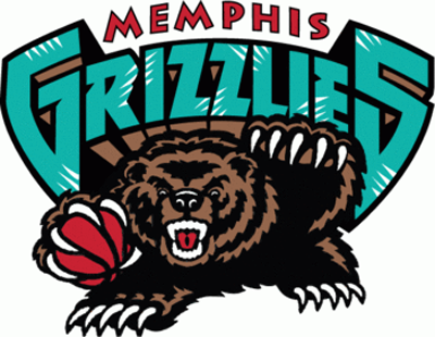
Okay so maybe this grizzly bear’s claws can beat Mr. Crabs anytime but see, this logo only lasted up to 2004. Look closer and you’ll find how the animalistic element was worked into the typography.
Kitchener Panthers: Intercounty Baseball League
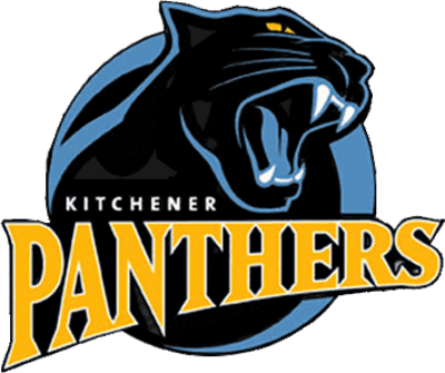
Last but certainly not the least is the Kitchener Panthers logo. Colors associated with midnight such as blue, black, and yellow bring the panther forward as a terrifying fanged creature.
Any more examples of smart use of animal image for logo design? Please share them in the comments!


