A person visits a website. This website is cluttered with links, moving ads, and to make matters worse the content of the website that the user is trying to access is dim, unimaginative, and takes clicking through a few links to access. This type of website will not win visitors over and will definitely not get visitors coming back. A great website should be clean, to the point, with visually stimulating content that makes people want to come back again and again.
We are a people who are on information overload. We don’t have the time to spend at boring, spamming, pushy websites. The websites we need to visit in today’s world must be both aesthetically pleasing as well as intellectually acceptable. In order for this to happen, a website needs to have key characteristics not only to keep a visitors attention, but to keep them coming back. These key characteristics include being visually pleasurable, and being relevant and informative to the visitors needs, and having straight and to the point navigation.
Winning with the Words
It is how you say it, what you say, and how fast you can say it. As a human race, we are quicker to react and read words that evoke strong emotions inside of us.
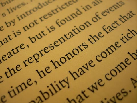 Image Credit
Words like love, hate, laughter, war, and so on carry strong ties to our inner selves and our basic human needs. Using these words in relation to what needs to be said to the person visiting a website can have profound results if done correctly. Using these words must be done in correct combination with the right type face, and size. Not only does using the correct type face help get your message across, but type faces themselves come with certain characteristics
Font
Take for example, Times New Roman. It is considered as one of the easiest to read because of the ability to follow the “feet” of each individual letter. If you look closely at the font, you can almost see a line connecting the bottom of each word. Now take something like Freestyle Script. It is elegant, soft, and feminine. Something you may want to use to attract the ladies. Are you looking for something more rugged and masculine? Try Copperplate Gothic. It’s a type face that presents sturdiness and strength. It looks timeless and metallic. Keep in mind that these type faces go best with images and headings. For paragraph and normal page formatting, keep to Sans-Serif, Times New Roman, or Cambria. These are among the most enjoyable to the eyes. What else is enjoyable for the eyes to feast upon? Color!
Color
Colored text, according to an article released by HP, increases the willingness to read by upto 80% (“The Power of Visual Communication”). Using colored text is a great way to have the important parts of your web page highlighted, which makes it easier to direct traffic to certain pages. However, a good rule of thumb is to only use one to two colored text areas in the first four to five inches of the web page. Below the four to five inches, where a visitor would have to scroll is fine to add more. Having more than two in the upper four to five inches of the web page can make the site look too cluttered and spammy. It’s best to remember to keep it as clean as possible with color and to only highlight the important words, like love, hate, sex, and so on.
Font size is another good way to differentiate the different sections of the web page. Remember to maintain a heirarchial look. That means the biggest fonts on the top, with the lower fonts descending in order from biggest to smallest. Not only will your website visitors appreciate this, but search engines will also see that you care about the appearance of your website, and thus treat the website in kind to search result rankings.
Being Relevant and Informative to Visitor Needs
It will not be likely that a website win a visitor over if the website offers things to the visitor that they are not looking for. Imagine this scenario: A person visits a custom computer website to buy a new computer. While searching this website, they get pop up ads for signing up for internet service, offered “Free” subscriptions to magazines in pop up windows, or asked to take a survey regarding the new trend of slap watches. This person is likely to begin to hate this website, and will likely leave before they get the chance to buy a product. Pop ups are generally a no-no for websites anyway, and rather anything that make a visitor wait or deferred is likely to result in a person not wanting to come back to that website. It is best advised to keep a close eye on anything being advertised on the website. If you’re using something like AdSense, make sure to be careful when selecting keywords.
Another way to attract visitors who will keep coming back is when they are attracted in the first place. Attracting customers who will keep coming back from the get go means making sure that their needs will be fulfilled by that thing which attracted them in the first place. It may seem like common sense, but many books for advertising services such as adwords have been written about this subject. The best bet is to make sure that within the short amount of time and space a potential visitor sees a link to your website, that they click on the link because it will fulfill their exact needs. Here, descriptive content is necessary over creative content. In the example of the custom computer website, one could write an ad that says “Come Here For All Your PC Needs”. So the potential visitor clicks on the link, and finds out that it’s only a link to a custom computer shop that spams them when they arrive, and that they don’t sell the perhiperals that the visitor was looking for in the first place. This visitor is likely to never come back.
On Being Navigational Friendly
Navigation is a huge factor for keeping the same people wanting to come back. These days, virtually every professional website makes it easy for visitors to find what they are looking for. Search bars and site maps are great tools that make this happen. However, there are still websites out there that don’t take full advantage of these tools.
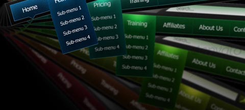
Not only does having easy navigation help visitors, but having organized and easy to follow navigation helps search engine crawlers index the website in order to rank it appropriately for search terms. It also let’s the search engine know that the website cares about the people who are visiting.
Another quick word about navigation is the question of which style of navigation to choose from? There is the ‘left column’, the ‘right column’, and ‘top navigation’. This is all preferrential, but me, being the design extraordinaire, I enjoy having extra space and choose top and horizontal navigation as my preferred navigation menu. Having a ‘left column’ or ‘right column’ enables the addition of more information. Just remember when choosing between left or right columns that people read from left to right. That means putting the more important information in the left column so the user sees it first, and any additional information in the right column, should the visitor be more curious and want to indulge a little more in the website.
Conclusion
[alert-success]When a person visits a website, the last thing they want to endure is having to get past all of the cluttered, disorganized links, popups, moving ads, and dim, unimaginative content. Wow the website visitor with a clean-cut website and include a picture (it’s worth a thousand words), or even better a video (which is worth a thousand, thousand words). And make sure the website is easy to navigate, informative and relevant, as well as convincing with the right words and font.[/alert-success]


