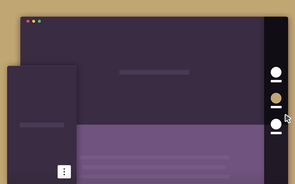
This is a smart vertical navigation tutorial with round indicators that turn into labelled icons when the user interacts with them. The basic idea behind putting round indicators on the side of a web page, is to give a hint to the user about the number of sections she/he can go through. We think of each dot as a content chapter, with its own title. Usually, users have to hover over a dot to access…
Horizontal navigation menus are mostly used in websites or blogs and i know visitors are much more familiar to horizantal navigation.Personally, i also prefer horizontal navigation bars but there are some really creative vertical navigation examples on the net.Today i want to showcase 30 very creative and inspiring vertical navigation styles.If you want to share more examples please write a comment.


