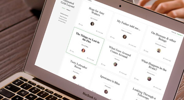
This is s responsive, magazine-like website layout with a grid item animation effect that happens when opening the content.It’s been developed by Codrops. The responsive layout has a sidebar and grid items that animate to a larger content area when clicked. In the first demo the content area fills the grid (inspired by a concept by Virgil Pana) and in the second demo, the whole layout moves to the left while the grid item is…
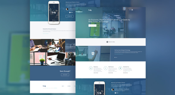
Boxify is a stylish HTML5/CSS3 template that was carefully crafted and enhanced with some smooth effects. It’s fitting for any type of portfolio or start-up website, but it’s very flexible and can be used for many other projects.This free website template has been created by Peter Finlan. The responsive template is made with the freshest web technologies and it’s build with Bootstrap Flickity fancyBox jQuery Waypoints Animate.css
Auto-hide sticky header makes site navigation easily accessible anywhere on the page and saves content space at the same. Auto-hide means hiding the header automatically when a user starts scrolling down the page and bringing the header back when a user might need it: they reach the bottom of the page or start scrolling up. There are at least two manners of hiding a header: reactive and lazy. The source of the demo consists of…
This is a slide-in filter panel powered by CSS and jQuery and created by Codyhouse.It is actually an essential feature if your website has lots of content, distributed across different categories. For an e-commerce, it is a way to increase conversion rates by reducing the time needed by the user to find what he’s looking for. It takes advantage of CSS Transitions, CSS Transformations and jQuery muscles to smoothly slide in when needed.
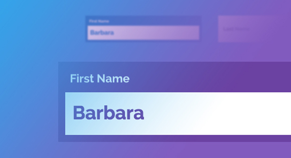
This is a tutorial of effects on text inputs using CSS transitions, animations and pseudo-elements.Form inputs offer a great opportunity to add some subtle and interesting effects to a web page. They are elements that your user will interact with at some point and making them fun to use can enhance the experience. Please note that this is for inspiration only and that we use CSS properties which only work in modern browsers.
Another great tutorial from Codyhouse.A list of split blocks that reunite on scrolling, simulating a movement along the z-axis with the help of CSS transformations and jQuery. The 2-blocks design approach is quite common nowadays. On one side the text paragraph, on the other a visual element. With this nugget Codyhouse tried to “spice-up” the transition between the sections by simulating a movement along the z-axis while the user is scrolling (or using the 2…
”Expandable Project Presentation with CSS3 & jQuery” is a gallery of project preview images that expand on click to reveal the full case study by Claudia Romano – Codyhouse. The real power of CSS Transitions is in allowing a smooth passage from point A to point B. In this example we take advantage of CSS Transitions and Transformations, and of the background-attachment CSS property to create a “diving-in” effect and reveal additional content for each…
A three dimensional and space efficient menu. Meny works best in browsers with support for CSS 3D transforms, although it falls back on 2D animation for older browsers. Supports touch events for mobile devices. Move your mouse towards the arrow — or swipe in from the arrow if you’re on a touch device Meny can be positioned on any side of the screen: top – right – bottom – left
This is a great 3D Rotating Navigation tutorial by Codyhouse.(Claudia Romano).It is powered by CSS transformations.Sometimes you just want your website navigation to be bold. Design agencies, for example, use their portfolio to show off their skills and push a little usability standards. Another good example is mobile apps: animated elements are key ingredients of the user experience. In this case a 3D menu can’t just be fun. It has to be efficient.
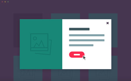
There are some patterns in the e-commerce design world aimed at increasing the conversion rate by simplifying the user experience. Other patterns try to achieve the same goal by providing additional information where needed. The product quick view modal belongs to the second category. A ‘product quick view’ modal window, animated using CSS3 and Velocity.js, that provides the user a quick access to the main product information. The end result is always a window with…


