

It only takes a fraction of a second for a visitor to form an opinion about a website. And for 88% of the visitors, a bad experience, even a brief one, will likely put them off from coming and revisiting the site ever again.
With stakes this high, it’s not surprising that website functionality and UX are a top priority for most business owners and entrepreneurs operating online.
However, even though everyone wants to provide the best possible experience for their visitors, actually making it happen is a different story. That’s why you often see sites that have obviously been worked on a lot but still don’t have the simplicity and ease-of-use that’s necessary for surviving and thriving in today’s digital marketplaces.
So what’s the secret formula to excellent website functionality? And how can you crack the code for designing a website that will please your audiences and make your website the top choice in your industry?
While each situation is unique and might require a slightly different approach, there are common trends and best practices that you can employ to find guidance in situations where you’re unsure of how to proceed.
With that in mind, let’s explore some of the most important considerations you should make when thinking about your website’s functionality.
Consider Your Audience
When making the vast majority of decisions regarding your business, you should consider your audience’s interests and preferences before committing to a specific option or approach.
It’s only natural that when designing your website usability listening to your target audience’s needs should be at the top of your priority list.
No company, no matter how small or large, is protected from blunders when it comes to the usability and convenience of their website. That’s because it’s not about the specific features or the advanced technological solutions that are employed, but about whether those tools are useful or not to the end-user.
In some instances, a simple and clean design with few features or links might work much better than a cluttered and heavy site. If your website’s primary function is simple and direct, you don’t need to add features for the sake of adding them and would probably benefit from stripping your site down to the bare essentials.
Obviously, in many instances, you will need advanced functionality, especially if you sell online and need to organize your products, provide a convenient shopping experience, and make it easy to finalize the purchase.
Still, even then, you should make the path from entering your site to making the action that you want your audience to take as short and convenient as possible. Any distraction along the way is detrimental to the goals you are trying to achieve.
The best thing about taking a user-centric approach is that it helps formulate a more specific plan of action from the start. Instead of worrying about industry trends or innovations, you can look inward first, see what your audience’s core needs are, and then build on those needs using the best tools and solutions that are available today.
If you want to gain more specific insights about what your audience prefers, you could even set up a survey and ask specific questions about what people like or dislike about your current design, and what they’d like to see implemented in the future.
Make the Structure Intuitive
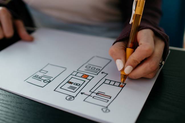
Once you understand the preferences and needs of your audience, you will have a much better understanding of what you need to prioritize and focus on.
However, even though you should use direct feedback from the users as a basis for improving your usability, there are still best practices you should employ if you want to achieve the best results.
One of the most common website functionality mistakes is trying to fit too much into the home page or the navigation, which ends up confusing and frustrating the users until they ultimately decide to leave.
No matter how complicated your website might be, there’s always a way to structure everything logically and methodically, sorting pages based on categories, tags, and user preferences.
Ideally, no important page on your website should be more than a click away at any given point. You can use slide-out navigation bars to make the process convenient and keep your design clean for visitors to consume content on a specific page.
Use the top navigation options for the most significant categories and most important pages, and then have subsections that dive deeper into specific categories, product pages, content, or anything else that is relevant.
Finally, make sure that your site doesn’t have any dead ends, error pages, or outdated navigation bars. Whenever someone visits your website, you should have a clear understanding of where you want them to end up, and try to make that journey as easy as possible.
Utilize a Responsive Design

Responsive web design is one of the most influential buzz words of the last decade, at least for digital marketers and designers. With mobile devices now accounting for the majority of the traffic online, companies of all sizes had to change how they prioritize the design elements to make the experience of their users as convenient as possible.
A large part of your audience will likely still use desktop computers, so having a traditional website is a must. But at the same time, you must have a responsive design that can adapt to different screen sizes, resolutions, device capabilities, and color scheme settings.
For one thing, your navigation should adapt to the dimensions of the device, offering easy accessibility without getting in the way of the page’s content or making it difficult to click through to the next page.
Text and images should also be adaptable and resize automatically so that they don’t take too much space but are still easy to read and see.
Having a responsive design that your users can feel comfortable with will not only ensure that your audience uses your site but will also help achieve higher rankings on Google and other search engines, as ease of use on all devices is now an important ranking factor.
Be Consistent
Each page on your website is a representation of your brand, so you want to make sure that you are projecting a consistent image that your audience can get used to and get comfortable with.
Primarily, that means carefully choosing your design elements and color schemes to reflect your brand and resonate with the people you are trying to reach.
But at the same time, it’s also about the overall experience that a visitor can expect when coming to your site, no matter what page or section they click through.
When creating pages for products or services, you should aim to have a similar structure that provides the same basic information about different parts of your business.
Your blogs should also have a standard layout, use similar headings, paragraph styles, and visual elements, which will provide consistency and help your readers consume the information more effectively.
What’s more, having a reliable layout throughout your content will also help make site search functionality more effective, as people will know what types of keywords to use in the search to find what they are looking for, and will have a better idea of the types of headlines or subheads that your site is likely to contain.
Also, make sure that the information on each page is focused and to the point. You don’t want to be vague or ramble, especially at the top of the page, because that’s an easy way to lose the reader’s attention.
Instead, try to make the information as focused and clear as possible, providing the most important details at the top, and then expanding on the topic as you go through it in a structured manner.
Make It Easy to Reach Out
No matter what type of business you run, chances are that communication with your customers is crucial to your success. Even if you have a funnel you want people to go through, many of your prospects will have questions or want to talk directly before committing, so you must make sure that they don’t have to struggle with finding a way to reach you.
Therefore, prominently displaying contact information is one of the top priorities you should focus on when thinking about your website functionality.
Have an email address and a phone number visible at the top of your website at all times and create a prominently-visible contact page where visitors can click for more options for reaching out.
Contact forms are a great way to capture prospective customers, as they allow people to fill out the information in a few seconds instead of having to log into their email and out of your page.
However, for contact forms to be effective, you should try to minimize the amount of information that needs to be filled out. You may be tempted to collect as much info as possible, but every additional field that you require lowers the chances of people actually taking the time to complete the form, so it’s usually better to stick with a name, email, and the message that they want to send.
If you want to take the convenience of contacting you to another level, you could even consider installing a chat function, as they have a range of benefits for both your business and your visitors.
You can combine live chat and chatbot technology to provide the possibility to reach out at all times, pre-qualifying your leads, providing timely answers, and gaining valuable insights about your audience that you can use in the future.
Have a Strong Call-to-Action
When designing your website, you want to make it as functional and convenient as possible for your visitors. But even though that’s a good focus to have, your ultimate goal should still be getting them to take the action that leads to a sale.
Therefore, when thinking about functionality, don’t forget to consider the placement and the visibility of your call-to-actions (CTAs), as they can be the difference between success and failure.
A clearly visible and compelling CTA will not only help you drive sales and subscriptions, but it will also provide a better experience for your site’s visitors. Call-to-actions act as a guide, helping people understand what the next logical step is on each page and preventing them from wandering off.
Don’t be afraid to use CTA buttons more than once on your pages, especially if you know exactly where you want the readers to go next. Place one CTA near the very top, another somewhere in the middle, and one more at the bottom part of your content, giving a relevant and compelling reason to click through and setting clear expectations of what they can expect.
Make sure to use the best practices of CTA design and use contrasting colors and fonts, white space, and urgency to get as many people clicking through as possible.
When it comes to call-to-actions, you will likely need to refine your approach at least a few times before you dial in the offer and the design to produce the best results.
Tracking and analyzing results can be a pain, but getting that bump in conversions will help every part of your business, allowing you to grow faster and improving the experience of your target audience in the process.


