

Low-cost web solutions often have uninspiring or even, to put it mildly, primitive design. By looking at this kind of an interface, users would rather have a nap than commit themselves to work. Nevertheless, several decision-makers prefer to rely on the solution’s functionalities, which is surely wise. But at the same time, they miss the point by not paying much attention to sufficient design quality. It’s often thought to be unimportant or elusive in so-called budget-oriented business apps.
Inexpensive and simple doesn’t always have to be dull and uninteresting. A customer can get a well-performing app with attractive and catchy design, albeit with a small number of elements. Check out the examples of such solutions below. Programmers can design apps like these very quickly, especially if they have ready-made components form a JS UI library at hand.
Appointment scheduling app
This app can considerably facilitate appointment scheduling for both doctors and patients. The solution allows staff in medical institutions to streamline appointments processing. Designers and programmers created its interface with the “all-important info is at your fingertips” principle in mind. Healthcare professionals have trouble-free access to their patients’ contact details, information about diagnoses, and treatments. Patients can look through doctors’ biographies, learn about their qualification and visiting hours. And of course, they can register in the app to make an appointment.
As you can see, the solution’s design is nice-looking and light but doesn’t include any complicated elements. In the image below, you can see the doctor’s dashboard. The data table with the list of patients shows information about their last visit. There are columns with diagnoses and symptoms, so a doctor can straight away see the medical information about a person being under treatment. It is also possible to immediately contact a patient if it’s needed thanks to the email column. A colorful chart shows the statistics on diagnoses of both inpatients and outpatients.
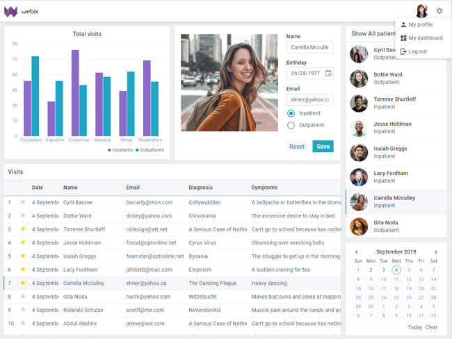
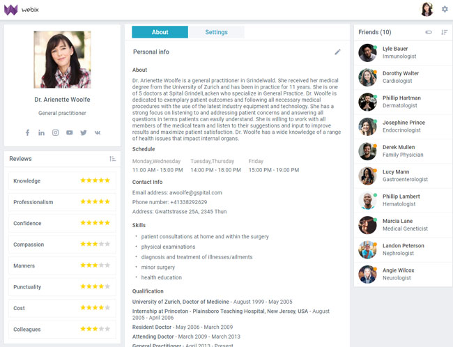
The doctor profile presents a doctor’s biography, schedule, skills, qualification, contact info, reviews from patients and colleagues. It means that patients have comprehensive information about specialists and can effortlessly decide which particular doctor suits them most of all. A sidebar with colleague contacts enables smooth communication between different medical professionals. It’s very convenient to be able to consult other healthcare specialists at any time.
Team progress app
The app allows identifying the weak and strong points of the company’s workflow. A user can follow the status of the assigned tickets. Notifications allow always staying informed about all the updates. Toolbar ensures convenient navigation and search. Users can also effortlessly add new tasks and select a different theme or a language.
Various types of charts play an essential role here. They show statistics and allow comparing achievements. Thanks to them, it’s possible to monitor the number of tasks completed by employees, hours spent on various projects, and types of work. Hence, charts provide an appealing visualization of the statistics becoming the main peculiarity of the app’s design.

QA Dashboard app
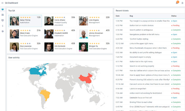
This app can considerably facilitate quality assurance management. How to evaluate employees’ performance? How long does it take to manage this or that user request? The app gives a manager the answers to these questions. It’s possible to learn the number of tasks completed by every team member and monitor user activity.
The app has a bright but simple design with minimum components. Note, how just three basic widgets can make a web solution which looks great. The design is minimalistic, but on the other hand, it has several refreshing elements as employees’ images, a colored map, inscriptions, and yellow estimation stars. The most necessary data is visible. There is no need for tiresome searching. The most important information is highlighted either with color or bold letters allowing QA specialists to save time and nerves.
Bank app
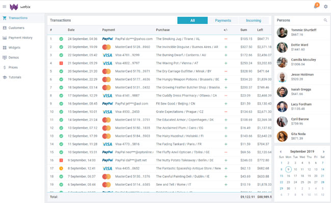
The app allows viewing, editing, and analyzing financial data. This app’s strongest point is the colorful icons. Owing to them, a bank specialist can immediately learn about how a customer made a payment, e.g., via PayPal or a credit card. It’s also possible to sort and filter Payment history in DataTable. Well-designed Form provides users with customer details.
The app’s base components are a table, two sidebars, and a calendar. Transaction status can be seen very distinctly, as well as incoming and outcoming payments. They are marked with a green plus if it’s incoming and a red minus if it’s outgoing. Such a simple detail allows making types of payments visible.
Bottom line
Simple is not a synonym to primitive in case of web app design. A couple of JavaScript components, two or three bright color accents, ability to add images, emphasis on certain information can be enough for giving an excellent visual impression and creating great user experience.


