

What does the Conversion Rate mean?
In the broadest sense, the conversion rate is the percentage of users that take the desired action. Depending on your goal, the desired action could represent visitors that subscribe to your newsletter, follow you on social media, or buy your product. Therefore, if you had 100 visitors during your daily campaign where you aimed to convert visitors into followers, and 20 of those 100 visitors started following you, then your conversion rate is 20 percent.
How to Improve Conversion Rate on Your Website
There are various methods in which you can improve the results of your conversion strategy. The universal first step should be the use of an seo analyzer tool because being visible on Google is the best way to get organic visitors, and it tells you a lot about your website performance.
More in-depth methods may differ simply because not all industries or different segments of the same industry have the exact target audience. Some gamers prefer First person shooters, while others like to play sports games, which keeps them within the same industry but not attracted to the same content.
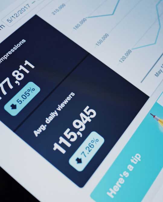
You can use the data that you already have in order to define your target audience and their behavior on your website. Google Analytics is the most basic tool that you can use in order to acquire information that will help you boost your conversion rate. You can see which pages are keeping the visitors interested the most, which aren’t interesting to your target audience.
Another good way to improve your conversion rate is to optimize your conversion funnel. If you don’t know what this means, here’s an explanation:
· Your target audience shares the same interest, which is your product or service. In order to turn them into customers, you should let them know about your brand in the first place. Therefore, the first segment would be raising awareness through social media, content marketing, or some other strategy.
· Raising interest in your product or service is most effective with an amazing content marketing. You should create all sorts of content that would build up the interest with your target audience. That’s the second segment of your conversion funnel.
· The third step is pretty much like the second, and it’s all about making people WANT what you have to offer. This is the evaluation phase of the buying process, which means you shout emphasize the advantages of your brand in comparison to other options on the market.
· The final stage is to make sure the people buy from you. Sure, you can lead your visitor up until the point where they place your product in the shopping cart but never finalize the purchase. Your mission is to optimize the final stage of the funnel by analyzing what keeps the audience from finalizing the purchase.
Way back in 2012 Google conducted a study that showed the connection between the website design and the audience reaction to it. According to Google, your web design solution is important for your conversion rate.
Optimize your pages’ design:
Optimizing your page design holds multiple benefits for your business, most importantly, according to Stanford scholars, it builds trust. The first impression is important for the bounce rate, which is the number of time people stay on a page before leaving it. Furthermore, the layout of your page can facilitate or make the navigation through your website a real challenge. The visitors should have access to content that’s most attractive to them, use all of the features without any issues, and finally be able to buy your product or service in the easiest way possible.
Here are a few things you can do in order to optimize your page design for maximum conversion:
Try to use various form styles
Let’s say you want people to subscribe to your newsletter so you could send them regular updates, news, reminders of upcoming sales, overall-things that might be of interest to your prospects. If you are not getting the conversion rate you desired, try changing the style of your form; customize it so that your visitors would not hesitate to fill in the required information. You can eliminate unnecessary fields, or turn some fields into a checkbox, also you can allow “auto fill” to make the process even easier.
UI/UX Design
Your website should provide the best user experience, which means it should look good to your audience, it should work smoothly, and the visitors should feel comfortable while navigating your page. We already mentioned the first impression, which is the main responsibility of user interface-oriented design. Keep your layout focused on your user, make all the features easily accessible, and content attractive and interesting.
· According to ClickTale, people use scroll with 76 percent of all websites. However, people will scroll down only if the above fold content is compelling. Therefore, improving the upper section of your content should keep the audience open to read on.
· Use visual clues to point out the important segments of your website. These visuals should engage the user in interaction such as playing a certain video or scrolling down to access more content or visit a certain page.
Stick to Hick’s Law
The choices we make are connected with the way our mind operates. According to Hick’s law, the amount of time we need in order to make a decision increases with the number of choices we have in front of us. It’s also possible for a person to give up on a purchasing decision if there are too many different choices. Therefore, when creating your menu or forming content that offers multiple choices, make sure you reduce it to an optimal amount of available options to make the visitors’ decision-making process faster and easier.
Follow the Rule of Thirds
This is an old photography rule that claims how images should be sectioned into nine parts, divided by two horizontal and vertical lines, thus creating a 3 by 3 box. The most important elements of the image should be placed along the dividing lines or their intersections for the best impact on the viewer.
Use Negative Space
Your page design should be easy on the eye and able to convey the content message clearly, visitors shouldn’t combat with focusing on any element of your website. Negative space is all the space that is not filled with content; it’s also referred to as “white space”. You can use Apple’s website as a source of inspiration for the effective use of negative space.
Use K.I.S.S.
This doesn’t mean you should paint your website black and white and play “I was made for lovin’ you” but rather keep it simple stupid, which is what the acronym stands for. Your visitors should be able to perform any activity seamlessly, without too many useless steps. Make your page intuitive, content easier to read, and keep the visuals suggestive. People should know what a certain button does without explanation.
Remember to the 8-Second Rule
This rule applies to new visitors, people who didn’t come to your page intentionally as a recurring visitor. It appears that the human attention span is just 8 seconds, which is a short time to keep a person interested. However, if you don’t wish to lose 50 percent of your audience right of the bat, then it’s best to keep your content interesting, short and sweet, and able to hook the viewer in just 8 seconds.
Use Faces
People relate to people very easy, which is why placing humans on your website triggers an emotional response with the audience. Of course, one of the most important aspects of this technique is to make sure that the images are related to your brand. Therefore, you can have people using your products or service while smiling and being happy.
Choose the Right Colors
According to research conducted at Winnipeg University, Canada, we make our decisions regarding certain products in 90 seconds. The colors impact from 60 to 90 percent of the decision-making process, which tells a lot about how color can influence the behavior of your website visitor.
Wrap Up
We’ve learned what conversion rate represents, how it can help us determine the success of our efforts, and what influences the conversion rate of a website. The improvement of the conversion strategy demands time and dedication, but it promises great results. It’s important to remember that reshaping your website design in order to maximize conversion rate should focus on your target audience, as there are no universal solutions. Be effective and authentic, maintain your brand identity, and innovate!


