
Creating the perfect landing page can be a complex process that requires the expertise of web designers, professional copywriters and SEO experts, but the effort is worth it. An effective call-to-action page not only draws more visitors to your site, but also boosts conversion rates and sales.
The ultimate goal of a landing page is to introduce people to your business and encourage them to take action and buy your products. How do you do this? Many marketers believe that the secret lies in a flawlessly written web copy and it is true that a copywriter’s expertise makes a huge difference, but, before you start thinking about text, you need to make sure your landing page has all the design fundamentals for success.
As part of the Persuasive Technology Lab, Stanford University conducted a web credibility study to find out what exactly makes user trust a website and the results reveal that design is a key element: 46% of participants replied that they look at the design first and, if the website looks shabby and outdated, they close the tab. Next on the list are information structure (29%) and information usefulness (15%).
So, what is the secret recipe for creating beautiful landing pages that work?
Less is more
When it comes to landing page design, minimalism is more than a trend. It’s actually a requirement. The design itself shouldn’t be the focus on the landing page, but rather it should be an element that helps the text stand out. The design shouldn’t be pompous and cluttered, because it distracts potential customers from reading more about your product.
Don’t try to fill the page with every visual element you can think of and don’t be afraid to use negative space to create impactful messages.
Think of the landing page as the equivalent of a salesperson. Would a professional salesperson talk without pauses, overwhelming the client with information and not giving them time to ask questions or process everything? Probably not. The same applies to a landing page. Don’t add every visual element you can think of, such as bold text, flashing ads and floating images, because it will confuse visitors and they will not have the patience to decipher the message behind the graphics. Design your landing page based on the 15-second rule. If visitors need more than 15 seconds to figure out what you do and how you can help them, they are likely to walk away.
Be informative, but don’t include any links other than a contact form. At best, visitors will ignore them. At worst, they will click on them and leave the landing page without placing an order.
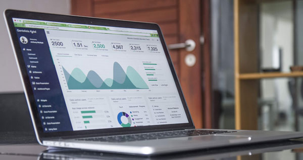
Use striking images, but don’t forget to resize
An image is worth a thousand words, but it won’t help you too much if the visitor needs to wait forever for it to load. In fact, one single second of delay can bring by your conversion rate down by 7%. So, after choosing the right images to spruce up your landing page, resize them so that they don’t take up too much space on the server and slow loading time.
Ideally, you should keep your large background images under 200 Kb and your general images under 70 Kb. As far as image dimensions go, there’s no need to use images wider than 2,000 pixels, because most screen fit within the 900-pixel range.
Optimize your landing page for mobile devices
More and more Internet users rely on their phones to browse the Web and engage with business and this should reflect in your strategy. Unfortunately, according to an Adobe study, only 50% of landing pages are optimized for mobile users. The perfect landing page should look just as appealing and intuitive on a small screen as it does on a desktop, so do not skip responsive web design.
Summon PPC Agency London explain that the efficiency of PPC campaigns depends a lot on how the landing page is optimized for mobiles and tablets. Even if you have a large budget and the page looks brilliant on desktop, mobile viewers will not be impressed if they have to zoom in to see the text and click on buttons.
Use color to spark an emotion
What emotion do you want your visitors to feel when coming in contact with your landing page? Do you want them to feel relaxed, inspired and calm, or the opposite, alert, energetic and happy? No matter what the answer is, use the power of colors to design for emotion.
In general, colors such as red, orange and yellow inspire passion and are often used in web design to make call to action statements, but keep in mind that these aren’t the only universally accepted options. In fact, it all depends on the message your business wants to send and the target audience of the landing page.
For example, if you are designing a landing page for a gym membership, then bold, black text against a red background is a fantastic choice, but the same combination would be a disaster if you were trying to design a landing page for a lifestyle or meditation app.
Also, factor in the age, occupation and gender of the target audience, because not everyone prefers the same colors. Children and teenagers, for instance, associate brown, purple and blue with sadness and negativity, so you might want to use red, orange, pink or yellow instead.
Preferences also vary across genders: while men are more include towards black + color combinations, women prefer landing pages that combine white space with colors, so make sure you create a nice balance.
