
The presentation is a convenient way to provide a short yet concise information about any of your projects whether you are a student, office manager, businessman, startupper, or financial advisor. Sad to say but bad presentation happens oftener than the good one. As a result, your audience gets bored and want the presentation to be finished as soon as possible. If you feel that all your previous presentations have sucked and you want to change this chain of failures, check out the list of recommendations we’ve gathered for you and follow some tips when creating a new deck.
How To Determine That Presentation Sucks?
Imagine that you are at a conference or lecture room presenting your project to an audience. At some point, you start understanding that the presentation is going on forever, there are 5-6 more slides till the end of the deck, you are dying a slow death, and your audience is getting bored starring in smartphones, at the same point on the ceiling, whispering with the others, and making notes in the notebooks. Have you ever found yourself in such a situation? Yes? Congrats! Your presentation has definitely sucked.
Alright, don’t worry. Yesterday you prepared a presentation that sucked but tomorrow you’ll exceed your audience expectations and present a top-notch deck that works and can draw the attention to the main idea of your project. It’s not that hard to learn how to design a striking presentation. PowerPoint Themes that can be found on TemplateMonster.com will help you. Besides, today we are also going to provide you with the tips and recommendations that better to be followed if you want to succeed.
Reasons Your PowerPoint Presentation Sucks And How To Fix Them
In this paragraph, we are going to cover some mistakes commonly made by presenters and solutions on how to avoid them.
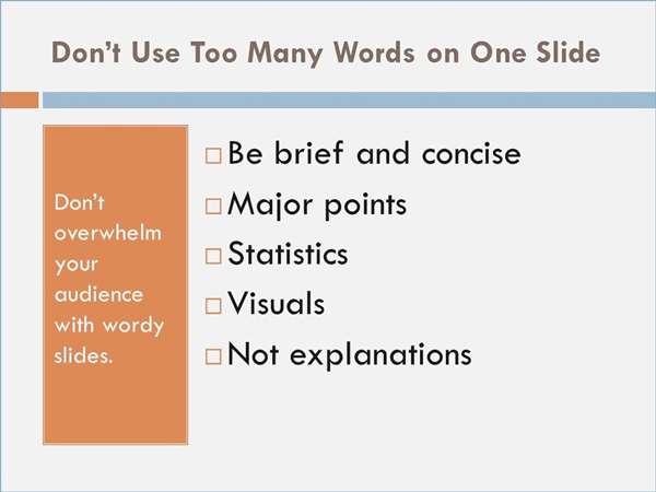
Too much text and ideas on one slide
It is a widespread error in the presentation when the authors put as much information on one slide as possible. They hope all the details will help them remember what they need to say. We recommend simplifying the process and covering one idea per slide. You’d better spend more time to prepare for commenting your slides to provide more detailed information. Besides, the audience wants to focus on your voice and what you are saying more than on reading.
Cliche images and concepts
When people are limited in time, they use everything they have at hand including cliches and clipart. Yet, the quality presentations require less automatic and trivial thinking. If you roll back to the first thing that comes to mind, you have to remember that your competitors will obviously do the same. If you are hard to think out of the box, start brainstorming with others to find a more smart way to convey your ideas.

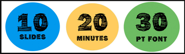
Too many slides
Too many slides used for a presentation is one more common mistake. Too long speech is something everyone complains about. Try to limit your deck to the smallest number of slides as possible. Learn more about 10-20-30 rule by Guy Kawasaki. He insists on including 10 slides, presenting your project for 20 minutes, and using 30+ font, not smaller. This rule is a secret of successful presentations.
No flow
Any presentation even if it is data-centric has a story. If your PowerPoint deck is lousy and does not flow, you make your listeners feel like they are at the market without a shopping list and do not know what section they should go to at first. And vice versa, a well-structured presentation will navigate them through each section one by one and get what they need. Telling a story is always a good idea and it makes any presentation alive, while communication becomes more interactive and engaging.

No message to your audience
If your PowerPoint deck has no message that your listeners can connect to, its best design ever will not save the day. The main goal of the presentation is to build a bridge between your audience and the main idea of the deck. Develop empathy for the audience and answer the question ‘what’s in it for me?’ prior to creating your presentation.

Tips For Designing Presentations That Don’t Suck
Except for useful recommendations, we’ve decided to pick the most popular tips for you as well.
– Pay attention to details: the images of the same resolution and size, the same header fonts on each slide, the same black color text, properly aligned slide objects, enough breathing room on the slide etc.
– Avoid using PowerPoint default templates. Better use PowerPoint themes gathered on TemplateMonster.com. They are developed by professional designers and corresponds to all necessary requirements.
– Experiment with a strong palette of solid colors which can make your presentation look professional and stylish.
– Typography should be acceptable for the message you try to convey. Avoid using the coolest font, instead, use the font that would emphasize the message. Furthermore, watch the typography readability which is essential for a good PowerPoint deck.
– Avoid using a surplus of bullet points.
– Experiment with your cover. Even though it is usually skipped or showed for a few seconds, its fascinating design can still set a tone for the whole presentation.
– The portion of a good appropriate humor may help ease the pressure of the overall process and win over the audience.
– Utilize only high-quality and professionally-built animation and transitions. If you doubt about their quality, skip this paragraph and leave your PP deck without animations. Moreover, Seth Godin votes for not using them at all.
– Learn to speak with confidence, clarity, and conviction when you attend one of their presentation workshops. Visit Training Connection and sign up for a live face to face instructor-led training!
Conclusion
The above-mentioned recommendations and short tips should become your secret weapon in building winning and striking presentations. Following them, you will never face sucky deck again. And remember that you do not have to be a professional designer to create a steep and effective PowerPoint presentation. If you’ve found this article useful, share it with your friends. In case you have your own tips for better slide design, feel free to share them in the comment below.
