

If you want a corporate identity then it’s important that you nail the corporate design. After all, this is what your clients and customers are going to see every time you communicate with them via email, letter, social media, invoice, order forms etc. Here are 10 examples of corporate design which you’ll struggle to ignore.
Dubai Police
In January 2018 the Dubai Police wanted a new logo to reflect 3x principles: security, communication and innovation. Replacing the previous red logo, in came a green logo with cleaner lines and a smoother look featuring a boat on calm waters surrounded by branches on each side reflecting safety and security. An awareness campaign came hand-in-hand with the change as well as events and a new uniform.
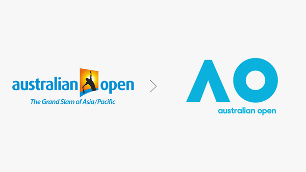
Australian Open
Landor Australia took on the rebrand of The Australian Open in 2016, bringing the logo into the modern era and taking away any visual reference to tennis. It resulted in something which could be used across all branding and looked like something from a decade of Facebook and Twitter as opposed to Thatcher and Reagan.
Deliveroo
UK restaurant delivery firm Deliveroo embarked on a new brand to communicate its spirit, vibrancy and energy. The typography, illustration and the Roo mark all worked together to create a distinctive graphic language. As the firm had progressed from just servicing the UK to 7 other European countries as well as Australia, Singapore, Dubai and Hong Kong. in came a quirky, bold kangaroo with a permanent engagement status.
Zendesk
Zendesk helps companies everywhere provide quick solutions to their customers. All carried out through help desk software, the logo placed a happy headset wearing buddha with the sun in the background. However, this could have been grabbed from the 70s or 80s and the replacement couldn’t have looked any different. In its place came a logo with simple shapes which were brought to life with motion graphics.
Casumo
Casumo are a great example of enticing corporate design with its vibrant and fun branding reflecting that they are more focused on gamification rather than gambling. It also reflects the type of workforce that they are building, and you can read about being part of it at Casumocareers.com and their about page.
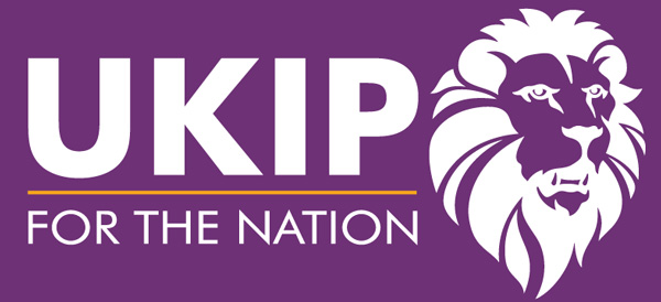
UKIP
At their annual conference in September 2017, UKIP announced a rebrand including a revamped logo. Although mocked on social media for the logo’s similarities to that of the English Premier League, it highlights how corporate design can bring you into alignment with other brands. Whether or not the purple lion logo was too similar to the Premier League, UKIP ditched their long standing yellow and purple pound and accompanied the lion with the text “UKIP, for the nation”.
YouTube
After a successful first decade, YouTube unveiled their first new logo in 12 years in 2017. Reflecting the change in devices of internet consumption, the new logo had to be more adaptable for different screen sizes from mobile and desktop through to various apps. Retaining the red, black and white of the previous logo, YouTube incorporated a play button which perhaps, 12 years earlier, wouldn’t have been so synonymous with globally sharing your own videos.
Doctor Who
Sometimes circumstances require a change of logo, at other times the stars align screaming for a new corporate design. After 12 men had previously played the Doctor, Jodie Whittaker became the thirteenth Doctor at the end of the 2017 Christmas special. A new logo swiftly followed 2 months later.
Nandos
When you think of Nandos you think of chicken. Unsurprisingly, since 1987, whenever Nandos have subtly changed their design they’ve always retained the image of the chicken. Over the years they’ve kept the same colours but progressed to less wording and less background with bigger chicken, bigger font and less clutter.
Leeds United FC
A football club’s badge is a big part of its identity and something which generations of fans can relate to. Leeds United, one of England’s most famous clubs, have regularly changed and replaced their badge every 10-15 years since their initial offering in 1934. However, in January 2018 they announced their latest replacement to coincide with their centenary year. It’s safe to say that the badge which depicted the “Leeds Salute” didn’t go down well, an online petition collecting over 77,000 signatures led the club to re-open the consultation process.


