

Graphic designers use typography as a form of communication. Both the appearance of text and the readability of this text in a visual product have an impact on user experience.
Typography speaks to users, and may, therefore, be considered the voice of design. This is because typography sets a mood for a website and shares a message.
How can designers use typography in a way which creates a maximum impact? The following tips and tricks will assist you:
Work with hierarchy
In order for readers to find a site easy and clear to understand, it should be well organized and easy to navigate. When designers are using typography or copy, this copy should be divided up in a way which is easy to understand.
Internet viewers are impatient, so text which uses headings, subheadings, short paragraphs, and captions enable a user to easily digest a message. Varying a font (depending on size, width, colors, use of bolds or italics) help the viewer to grasp the essence of a page.
Designers, therefore, use text to highlight important aspects of a page, direct the attention of visitors, and guide them towards a specific action.
Take your audience into consideration

When you’re choosing your font or layout, take your audience into account. Fonts can be playful, funny, friendly, serious or businesslike.
Your choice would depend on your client’s goals as well as the audience you want to attract to your site. Fonts create a first impression which can show viewers that they have come to the right place.
The correct font, which connects to the message or culture of a company, creates a sense of trust in viewers. A business site which uses a professional looking font and logo would feel comfortable for viewers. Likewise, a fun and playful font used for a teenage party site would feel interesting and high spirited.
For some audiences, a sans serif is the thing to use. For other, even script fonts can do wonders (at least for some sections).
Take mobile devices into consideration
When you’re creating a font take into consideration how many people use mobile devices. Mobile devices such as phones offer little space for typography.
This is a new challenge for designers, who cope with restrictions around legibility and functionality. Working with mobile typography means taking font size and line length into careful consideration.
In addition, designers have to take into account screen use. Smartphones often mean that users click on a screen. Font size and spacing are therefore very important in order to create a pleasant user experience.
Taking these small details into account can create an intuitive and effective experience for users.
Minimalism helps direct focus

When designers try to show too many features of a product or use too many different styles of font, the result is often confusing. This impacts on user experience.
Try to limit your fonts, in order to create a contrast between headings and copy. Keep font styles such as bolds or italics to a minimum too, as this will keep the page clean looking and easy to understand.
Keep the copy to a minimum, so that users are not presented with complicated information which becomes hard to understand.
Consider measure
When you’re working with typography, the measure will make all the difference to your site design. Don’t worry about grabbing a ruler and working with complicated formulas though.
Measure refers to line length. Acknowledging measure simply means acknowledging that the longer the length of your line, the more difficult your reader’s experience will be.
Try to keep your lines between 40 and 80 characters long. If you’re using a single column, then using 60 -65 characters is perfect.
If you’re looking for a formula, Robert Bringhurst advises you to measure the size of your font by 30. This means that if the font is a size 12, the type would be set on a measure of 360 points. 72 points equals one inch of text.
Use hanging quotes
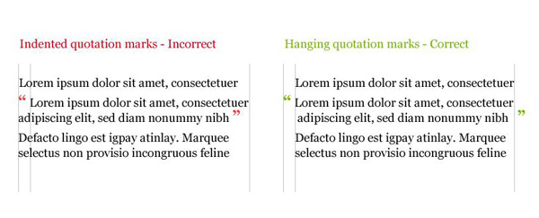
When you are designing your page, keeping your left margins neat or clean creates an orderly effect for readers.
When using quotes, designers sometimes place the quotation mark against the left margin. However, this can make the lettering seem as though it is out of line. This makes the text feel disjointed for the reader.
Instead, using hanging quotes, which are embedded in the margins of the page. The text will remain aligned against the left margin, and this creates a sense of rhythm on the page for the reader.
Take care of widows and orphans
Widows are those lost words or short lines which remain at the end of a paragraph, on their own, after the body of work has been completed. Orphans are left at the top of a column. Take care of your widows and orphans! You can do this by focusing on either type or content.
Adjusting the size of your type, the space between words, measure, or letter spacing will help you to get rid of widows and orphans. Alternatively, you could try editing your text, removing any surplus words.
Space your words
Kerning focuses on spaces between letters, but as a designer, the spaces between words will add visual impact as well.
This is important when you are working with fonts which may not have been well designed in terms of word spacing.
Rent your Fonts
Not all fonts are equally easy to work with. Many websites allow you the opportunity to try out fonts online before making a purchase, but this doesn’t always give you the time you need to see how a font will work with your design or application.
Font gives such a clear visual message to your viewers, that you really want to know what it is about before making a purchase.
This will give you the time you need to see how a font works for your design or application. As a designer, you know that fonts send out a message and make a big difference to a design.
Renting your font gives you the opportunity to see how it works when applied to your project or website without making a definite commitment.
Summary

When working with typography, apply these tips and tricks to your work. You can go through them one by one, building your work one step at a time.
Eventually, you’ll find they’ve become intuitive, and you’ve mastered the art of typography. This will add a new dimension to your work as a designer. As well as improving reader experience, typography adds an aesthetic and atmospheric message to your designs.


