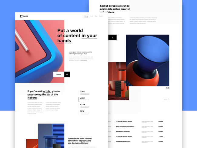
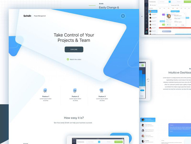
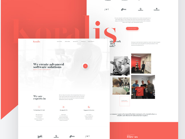
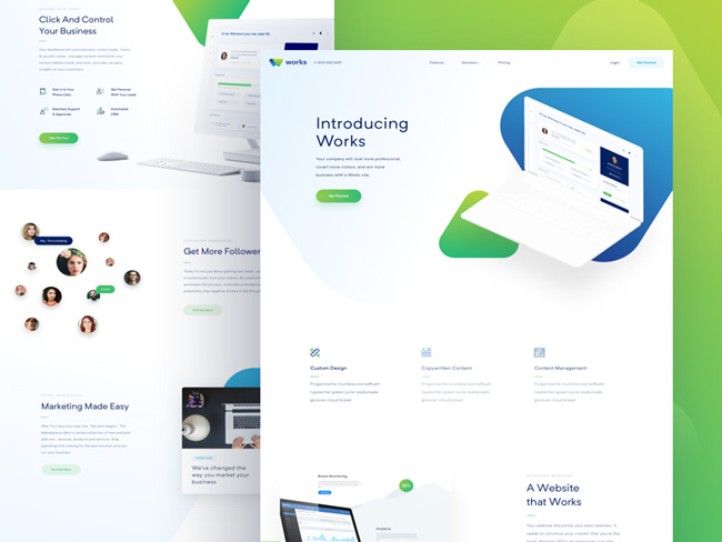
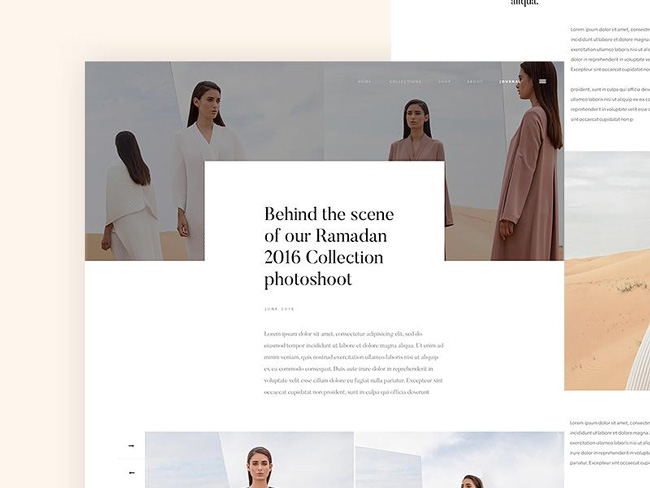
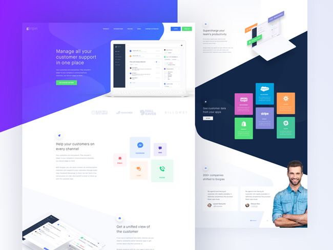
While a simple, clean website design might seem easy at first, the fact of the matter is the process is a lot more complex than you think.
There’s a lot of stuff going on underneath the surface that makes the clean website functional. Most people don’t need or care about that makes these sites function, they simply care that they work, but as a designer, you need to know about them. A lot of thought goes into these sleek site design choices.
You’re not looking to strip your design down to the bone with these minimalistic styles. Rather, you’re looking to make it distraction-free and accessible. Website minimalism is also more than a utilitarian design aesthetic.
There’s room for touches of modern style. If you are designing a clean website, don’t feel trapped by it. There’s plenty of room for creativity. You’re not keeping the info to a minimum. Instead, you are streamlining the content.
The key elements of clean website design are as simple as these websites themselves. They make navigation throughout the site easier while offering full functionality.
Keep It Neutral
Make sure the content makes sense for viewers. An excess of personality can get in the way of this, especially in website designs meant to be simplistic and clean.
You can still add some touches of personality, but you have to remember that the main goal of the site is to get information to the user in as quick, simple, and uncluttered a way as possible.
Keep It Honest
Make sure the design is clear and honest about its intent. Avoid anything gimmicky or obscure. You don’t need tricks or flashy additions.
Users should be able to pick up on what the site is trying to say almost immediately. If they don’t, your design has failed. It’s not honest enough. A lack of honesty will drive users away from the site.
Try to Be Timeless
You can’t really say what will be timeless right now, but if you follow certain rules you can make sure your clean website design does not become dated.
Fad and trends have a limited shelf life. Following them will likely destroy the design’s longevity. Features that seem like trends or fads probably are.
The best thing to help keep your site from becoming dated is sticking to the core fundamentals of design.
These principles are so important that they are printed in books and referred to not just by designers across the years, but are also taught to new website designers. There’s a reason they are taught the basics of design work.
Sticking to these basic, “classical” design principles doesn’t mean you have to be boring. A lot of techniques and design features simply work better than others.
That’s why they are used in many successful clean website designs. You can still add a lot of touches that make the design more creative. Remember, designs that seem contemporary now may turn into “classics” in another ten years.
Details Matter
Minimalistic web design is refined to near perfection down to the pixel. The text is uncluttered and graphics are not crammed claustrophobically together.
Proper use of kerning and leading is important to make sure the letter and line spacing are just right. Check your margins to make sure they improve readability and usability. Padding will offer needed visual breaks between blocks of text.
Blank space is a very helpful tool to focus and optimize the site. The overall feel should feel balanced and focused. User experience is your primary concern, so if something disrupts the cleanliness of the site design, modify it or get rid of it.
Think About Typography
Keep your font choices simple. Too many kinds of fonts, certain font styles, and certain text effects are distracting and obnoxious. Since you want an overall clean site design, select clean looking fonts.
Sans Serif will work better than Serif (true for almost all forms of web design). Avoid selecting too many different kinds of font, even if they are all clean looking because it is distracting for users.
It also looks very unprofessional and sloppy, two things you don’t want in a clean website design.
Conversion Elements
Your calls to action are just as important on a clean site as they are in more complex designs. As tempting as it is to make calls to action stand out to a jarring degree, they should still be integrated into the overall clean aesthetic.
Use the colors that fit in and keep any effects from becoming distractingly out of place. They should still be obvious and attention-grabbing, but in a way that fits in with the minimalist web design.
Don’t Overdo It
Your design should not be ornamented. Rather, think of it as something you are assembling. This doesn’t mean it is bare bones or full of clunky utilitarian angles.
Instead, it can be very elegant in its simple practicality. You can assemble your website in a variety of ways, so don’t feel like it’s a limitation to your creativity.
Rather, the concept of clean design provides you a framework. Think of it as a recipe. There are all sorts of little touches you can add to make a unique finished product.
Take Your Time
As easy it might seem to build a clean website, you shouldn’t rush the process. Think through every element and analyze its place in the design.
It may come out looking clean and simple, but every aspect of it is a planned, thoughtful addition.
Usability is the Final Goal
Ultimately, you want a website that is very easy to use. It should be very easy to navigate without too much thinking.
Make sure you don’t reinvent the wheel when it comes to important features, like navigation. Make the design intuitive.
Also, make sure you check all links and pages. Broken links run counter to usability and make your high tech clean website design seem half-hearted.
Conclusion
Clean website design is far more thoughtful than you want users to guess at. The end result is an easily navigated website with a pleasantly clean aesthetic. This look will last years without major updates and help people heed the call to action.


