So, let’s start off at the beginning! What is a landing page and what purpose does it serve?
Well, in brief, it’s the first port of call after a consumer click through on a link, or ad for the product or service they are searching. This is your big chance, that opportunity you have been waiting for. So, if your landing page structure inspirational? It must be, or you will squander the opportunity if the consumer believes this landing page is not compelling enough to complete the call to action (CTA). It’s worth noting at this stage that the attention span of an online consumer is seconds not minutes. A minimalist, straight talking, content focused offer landing page with a simple call to action will succeed every time.
Landing pages are designed for one purpose only; to convert visitors that have clicked through, which means they need to be more persuasive than any of the other pages on your website. Consumers who land on these pages have one clear focus. They’re there because you have something of interest to them and they are checking out your credibility. They are certainly not seeking out your team or about page, but make no mistake they will be looking for qualification from social media and reviews in general.
Regardless of any other factor, your conversion rate will improve by focusing the important primary content of the landing page to the CTA.
What is the difference between a landing page and pages on a website?
Most businesses have a website with standard pages like Our Services, Our Products, Our Work, About Us and a page dedicated to News and Testimonials. All this is useful information, and it’s there for a reason; to educate consumers all about you, your product or service offer, your culture, and history.
Landing pages are designed specifically to convert visitors into leads or customers, which means they need to be more convincing with clear concise detail and a focus on the CTA compared to any other pages on your website. Remember, consumers have clicked through because they’ve been lured by your promotion and want to appraise what you’re offering.
So, let’s make it simple by providing you ten essential tips to an unusual landing page structure:
Starting at the top of the landing page:
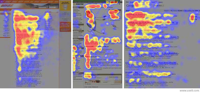
Always note the reading direction of the target audience you wish to reach as this is a key factor when formulating the structure of your landing page for maximum effect. Always keep in mind you have seconds not minutes to impress.

1. Placing your Logo: For languages reading from left to right it is recommended that the logo is positioned in the upper left-hand corner of the landing page, but make sure all your logo placements are consistent on all your landing pages. While it doesn’t need to be overly prominent, it needs to consistent to avoid your visitor thinking it’s spam. They must know where they are especially if they have clicked through from a social media site or another site you have a back link too.
2. Navigation is not required: Having carefully captured a visitor the last thing you want to give them is an easy escape route. The whole purpose of a landing page is based on the ethos that they are there for a genuine reason, and you want them to convert. This is a single promotional page with a call to action, not a facility to browse. It’s a proven fact that a navigation bar will reduce your ability to convert.
3. Compelling Headline: Use all formatting features to make your headline interesting as time isn’t on your side. You need to grab attention early in the process. A good headline generally compliments a good visual which we will come to later. Be specific, make it easy to read and get to the point quickly. Evidence suggests that your visitors will not read the entire page if there is too much content, they prefer to hunt for the key points that satisfy their inquisitiveness.
4. Pictures not Text: from early childhood reading comes after the ability to recognize images. So, carry on this phenomenon by showing not telling on your landing pages. The quickest, most efficient way to get information across is to show, not tell on your landing page. Don’t rely on text to get your visitors to convert because they won’t read it.
5. Simple Contact Form: Balancing between a simple form which may compromise lead quality and a more complicated structure that may reduce leads is the most crucial point to consider. Take time to consider these options and then create a form that best suits your goal from the landing page. It’s worth noting that you can always gather more information once you have the basics.
6. Persuasive Call to Action (CTA) Button: get this wrong, and the landing page is destined to be a flop. You cannot spend enough time on this point as this is the whole focus of getting your prospective customer to engage by clicking on the button to convert. Where possible avoid generic terms like SUBMIT or DOWNLOAD and get creative by using a term for the button title that is more in line with your offer. Create a button title in the first person. This gives a prospect a “feel good factor” as they subconsciously engage for something that they want. The word “MY” is always a good term to use for the first person. It’s more personal, and it gives the message that you are thinking of them and putting them first. Secondly, avoid words that could be perceived as a prospect having to do something themselves. An example; use “Send My…..” instead of “Prepare My…..”. Always position your CTA button below your form, but if your page is longer than one screen or below the fold, then consider the second button at the bottom of the landing page, rather than relying on the prospect to scroll upwards to find the original CTA button higher up the landing page. Prospects will often read on but only if you have failed to convert them from the first view of the landing page.
7. Brief, Benefit Driven Copy Content: putting yourself in the position of your prospect is an effective way to look at this section of the landing page. What would you like to benefit from if you were the prospect? Why should I spend my hard-earned money with this company? Be direct, get to the point early and don’t fall into the trap of thinking that you need to give chapter and verse to convince the prospect to engage. Easy to read, significant impact headlines are preferred than block text which is proven to be not a popular format to read in this instance.
8. Social Proofing: a prospect who is unsure of your product or service will automatically turn to social feeds and reviews for clarification that they are making the right choice. Making it easy for prospects to carry out this function is a smart move on your landing page. Social feeds always work the best, but reviews are a close second place to look. So, make sure both aspects of verification are as healthy as they can be to help with prospect engagement. Another excellent way of getting your message across is to add testimonials from existing satisfied customers who have taken the time to comment on their experience of dealing with you. This aspect of your landing page is extremely persuasive when it comes to engaging with the prospect so put the effort in and reap the rewards. According to research as high as 95 percent of internet users make a purchase based on the quality of the online reviews and 79 percent trust them as much as a personal recommendation from a friend or family member.
9. Minimal Footer Content: do not include a Sitemap, other promotions or offers, and links to social media pages. Remember earlier in this article we spoke about no navigation away from this landing page other than CTA or browser exit. In your footer only include terms and conditions if appropriate, copyright information and privacy information which prospects will want to be reassured exactly what you intend to do with the information they are giving you. This all adds to the credibility of your landing page, and more importantly, they can build trust in your governance. It is important to remember any link or escape route other than a CTA means your prospect is being given a big opportunity not to convert.
10. Contact Information: don’t forget the old saying “it’s good to talk” Considering all these points raised in this article your landing page should achieve your desired result. However, giving a prospect an opportunity to speak with you is also good practice especially if it’s a high-value offer. Occasionally, your candidate will want to talk personally to you if they have any questions or reservations about converting. Make contact numbers available in the footer for example.
Now with the confidence, we have given you go ahead and present a professional landing page. Good Luck!
For further information contact visit our website at:
We have the experience you may be looking for.


