Choosing a color scheme for your website may not seem a time-consuming enterprise. However, if you truly understand the importance of making this choice, you may be rather puzzled and lurk in hesitation for a pretty long time.
To go for the color scheme that would be the best match for your website, you should have some basic understanding of color theory, know what color schemes are currently trendy, and which ones are effective for the type of the website you create.
In this article, I’ll teach you the very basics of color theory, show you some of the rocking color schemes of this year, and exemplify to more traditional color combinations that are bulletproof solutions for different branches of industry.
Let’s start our journey!
The Tree Pillars of Right Color Choice
The three pillars of color theory are complementation, contrast and vibrancy. Let’s see what these three terms mean and in what way you should keep them in mind when choosing the color scheme for your website.
– Complementation is the way colors interact with each other. Here you should keep in mind the well-known color wheel and know which colors play well together and which colors clash.
I guess it’s not a secret for you that every color has not a single meaning, but the whole array for meanings. Color combinations make this or that meaning of the color more prominent. For instance, take red and combine it with rosy shades. This color combination evokes notions of love, affection and romance. Now, take red again and combine it with black. This will turn it into the color of blood, war and fear.

– Contrast is the difference in color and light between the parts of a whole. High contrast is important for ensuring readability of the text. The best way here is to go for light background colors and for dark shades for the main content. An alternative way to achieve high contrast is by using dark shades of blue, gray or brown for background and very light shades for the main text. Remember that analogous (similar) shades kill contrast. So, never use them both for background and main text.
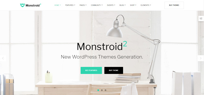
One of the minimal WordPress themes, this template is a true king of well-delivered contrast. It’s filled with light, freedom and balance, and ensures perfect readability of black text on white background.
– Vibrancy guides the emotions of your website guests. Bright shades tune up for positive interaction, energize and motivate. Go for bright colors to get more conversions and purchases. Cool colors, on the other hand, help users relax and get focused on your website content.

Upbeat colors of this Magento store boost shoppers’ mood and turn shopping into a fun process that’s rather a pleasure than a necessity.
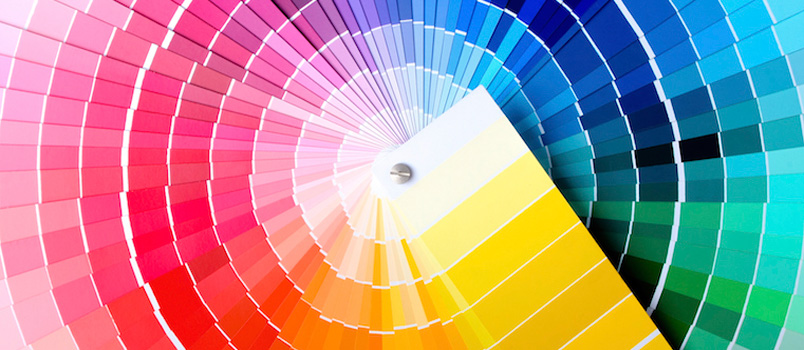
Lessons of the Color Wheel
Color wheel is the ultimate tool that helps you build successful color schemes. You can choose one of the three approaches to create your color scheme. These approaches are referred to as triadic, compound, and analogous. Let’s see what they mean:
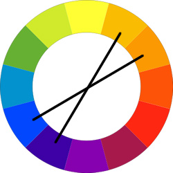
– Triadic color scheme is composed of three colors that reside on the summits of an equilateral triangle. If you use it, you get three colors that are equal in vibrancy and go well with each other.

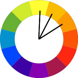
– Compound color scheme makes use of the complimentary colors. If you go for this color scheme, you can choose two pairs of complimentary colors (i.e. of the colors that reside on the opposite sides of the color wheel) and play with 4 main colors of your color scheme. Compound color scheme allows you to achieve the desired balance and diversity.
– Analogous color scheme plays with the shades of the same primary color and lets you create a more tender, balanced and harmonious feel. To go for this color scheme, you just need to choose three (or four) colors that go side-by-side on the color wheel.
On top of working with the color wheel yourself, you can use a number of color scheme generators. Here you can read about the one that I love – Coolors Color Scheme Generator.
Color schemes of 2017
As you can understand, the color choice of modern web design is not limited to colors that are represented on the color wheel. To build a top-notch crispy website that won’t age for a couple of years, you should know the color schemes that are currently popular. So, let’s see what they are:
Neon Glow
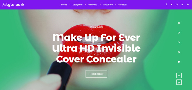 Glowing neon colors are rocking this year, especially when it comes to such state-of-art industries as fashion, makeup and beauty. Here you can go for triadic color scheme and choose from neon shades of glowing blue, fuchsia pink and mushroom green. Make sure that you mind the brightness of the colors you use, otherwise the eyes of your site guests will get tired too quickly.
Bright & Upbeat
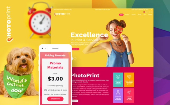 Bright and upbeat colors are definitely favorites of this year. In this case, I suggest that you go for warm shades of matte color palette. These shades please visitors’ eyes and create a sunny mood of your website. Upbeat color schemes prove successful both for blogs and online shops and are not about losing their appeal in the near future.
Blue & White for Business Websites
 There is no need to reinvent the wheel when it comes to business websites. Blue color stands for reliability and professionalism, while white ensures good contrast and perfect readability of your website content. The blue & white team still wins all the gold prizes for websites that provide business, accounting and financial advice services. You can add a third color (either a shade of red or yellow). It’ll serve the role of an accent color of your website. Color your CTA buttons with it, and you’ll definitely get more conversions.
Conclusions
Color scheme choice can either make your website a king or ruin it. If colors of your website clash with its content, this is likely to result in high bounce rate. Double think of the color scheme that you choose for your website and make sure that you stick with the three main principles of color theory: complementation, contrast and vibrancy. Make friends with the color wheel and go for something fresh and trendy to reach new heights with your website this year!
Have I missed something out? Let me know by dropping a line in the Comments section. I’m always happy to see the feedback.
Stay tuned!
