

In the mobile era, where mobile internet usage has already surpassed desktop usage and with drastic change in user behavior and habits happening in the recent times, delivering a great user experience to your website or app visitors is highly important than ever before. Mobile users are impatient and quick – bad UX increases bounce rate and pogo sticking.
In today’s scenario, if you want users to stay on your website or app/product for a longer time, use it effectively and take the desired actions – you need to deliver a great user experience (UX). One of the core components of UX is user on-boarding.
This article will help you to understand the nitty-gritty of user on-boarding and it also gives some valuable tips on how to deliver a great user on-boarding experience with examples. Also, you will get to know the best practices followed by brands.
Let me first quickly explain the term ‘user on-boarding’ for those who do not know or haven’t heard of it before – user on-boarding is the process of introducing new users to a product, application or UI (website, app, software etc.) and guide them effectively throughout the user journey till successful adoption.
It is like an induction programme where a new employee is introduced to an organizational set up and work environment and prepared for his/her new role. It also involves making the employee feel comfortable and motivated in the new work environment.
Delivering Great User On-boarding Experience
Audience Analysis and Clearly Defined User Flow – On-boarding design should be based on data collected on your target audience/potential users. Does your audience have experience using similar products before? How complex is your product? What level of complexity in the user interface can they handle? Asking questions like these help you to create your audience profile.
User on-boarding design should be created based on a clearly worked out user flow chart – A good user on-boarding will facilitate user journey towards getting the core benefit/value and take the desired actions ( CTAs) on his/her way without any difficulty – in fact, it should be a pleasant experience. The points below throw more light on the user on-boarding design process.
Kick-Start Right Away! – Draw the new user’s attention to a clear call to action to get him/her started. What core value/benefit does this app or website provide? Where to start? – These are the basic questions which need to be answered effectively on a new user’s arrival.

Duolingo.com is a one of the best examples of great on-boarding experience. If you look at screenshot of their website above, you can see a large space around the call to action that makes it easier to for the user to quickly notice it. Above the button, the core benefit is mentioned upfront – ‘Learn a language for free’. It is a simple yet powerful way to drive your new user to get started immediately.
Avoid Confusing CTAs – Do not confuse users with multiple/different CTAs on the same page. Based on user segmentation, if you want to have different CTAs and defined paths for different audience then make sure to explain the difference clearly.
Make sure that the text for CTAs clearly conveys what can be expected next and let it be persuasive. Offer a great value proposition in order to drive user to take action – combine the core benefit with an additional value – limited period discount, limited period free trial, more benefits for the same price etc.
User-friendly sign up option or postpone signup – One of the important steps in the user on-boarding process is the form fill up – complex, unpleasant forms often result in high user abandonment rate. There are different ways to reduce friction in the sign up phase – auto-form fill up and social logins ensure easy sign ups.
Providing formats (how to enter data) below the form fields helps users to enter data without difficulty. E.g. user name suggestions, date format, website URL format etc.
There are brands that go the extra mile to make the sign up process an enjoyable one. For example – Duolingo allow users to even explore their platforms or try their respective products a bit before asking users to sign up. This is a great way to make the user on-boarding experience a pleasant one.
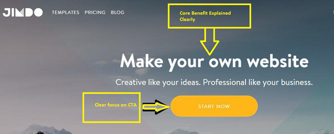
Here is a another great example – Jimdo.com lets the user know the core benefit clearly on his/her visit, it’s there right at the top and a bright yellow CTA (‘Start Now’ button) below the text with a lot of space around draws the users’ attention quickly ( see the screenshot below ).
Once you hit the ‘Start Now’ button, instead of asking you to sign up, it takes you to a page where you can choose a template from a huge and beautiful collection of templates for your website you are going to create on Jimdo. This is a fantastic way to make the user feel comfortable and explore a bit before proceeding to signup – compare it with presenting the user with a sign up form immediately after visit.
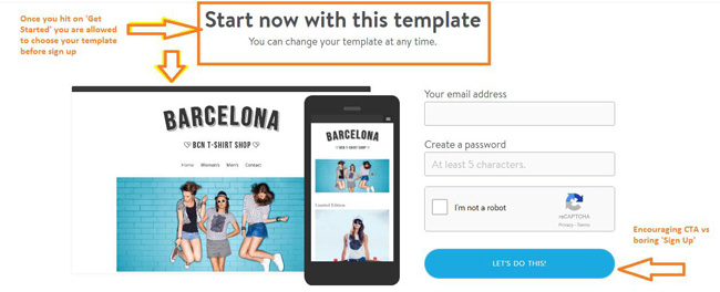
After you choose a template, you are asked to fill a quick form which has an encouraging CTA button – Let’s Do This! It sounds very easy (see the screenshot above).
Similarly, slack app does ask to enter email id but doesn’t ask the user to verify email or generate password immediately – it allows user to explore the platform first.
Another great way to quickly make the user go through the sign up phase comfortably is to get them to only fill the mandatory information first and rest of the information can be filled by the user later using the edit profile option or in a phased manner guided by notifications. Platforms like LinkedIn, Jimdo etc. follow the same method to give the users a pleasant user on-boarding experience.
Visuals over Texts – Keep your microcopy persuasive, short and interesting as much as possible throughout the user journey toward product adoption. Combine attractive, relevant and meaningful visuals along with texts to make the user interactions persuasive.
Short and Easy-to-understand Explainer Videos/Tutorials – When some of your product/app’s key features are hard to explain with microcopy and videos or tutorials have to be used – use short, interesting and easy-to-understand videos or tutorials. Introducing long videos, manuals or guides along the user on-boarding path kills the momentum.
Those lengthy manuals, guides, tutorials/videos, if any, can be added to, say, a knowledge resource section and can be introduced to experienced users who may want to upgrade their knowledge and move to the next level in case your product involves usage at different levels ( e.g. beginner, intermediate, proficient, advanced, expert etc. )
Pleasant User Journey – How it Works
One of the best ways to guide the users through the UI and familiarize them with the key features of your product/app is to introduce the features step by step throughout the user journey via notifications, drop-downs, buttons and pop-ups. Advantage of using this method is that it will not overwhelm the users with too much information/CTAs. This method makes the user comfortable on-board and will allow him to learn things subsequently.
Make the learning process fun and interesting – appreciate the user on completion of tasks. Use of great and user-friendly visuals combined with persuasive microcopy will make a great impression and contribute to user retention. Leverage storytelling effectively to make the instructions/tutorials look interesting rather than boring. In short, keep the users totally engaged creatively so that they don’t feel like the process is taking too long and abandon it.
You can also use progress indicator to show at which stage of the process the user is in. Moreover, progress indicator helps the user to anticipate what’s coming next or what he is supposed to do next. It reduces anxiety and stress.
Start with the progress indicator showing some level of process completion (as the user has already started his exploration journey) even before user goes through the process – it motivates the user to get going.
Providing incentives (freebies, discount, and points) to encourage users to take desired actions is also one of the best practices. E.g. many platforms give points to users for certain task completions.
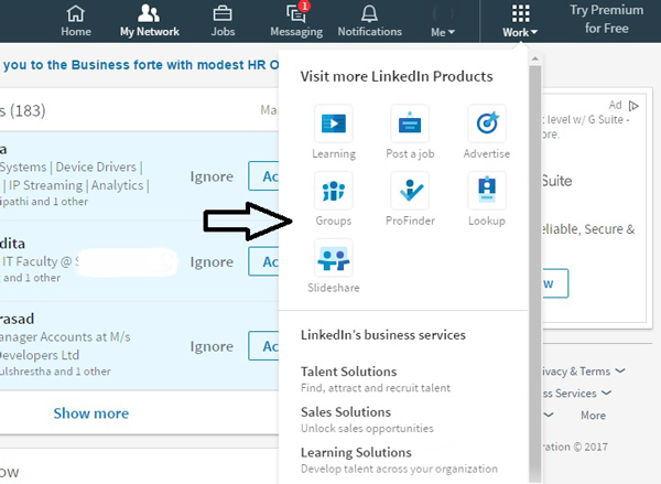
LinkedIn is one the best examples of step by step introduction of the user interface and features/benefits to the users. It also explains the key features subsequently one step at a time via notifications, Pop-ups, drop-down indications etc. Have a look at the screenshots below.
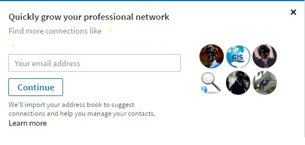 Encouraging user to do more by offering a benefit – ‘Quickly grow your professional network’
 Introduction of new sections and features via drop-down.
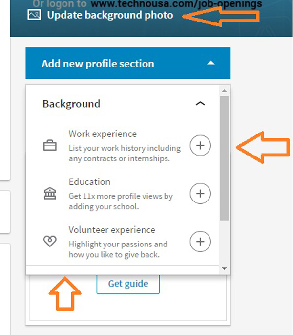 Notifications to add more details – positive messaging across the platform. E.g. ‘Get 11x more profile views by’
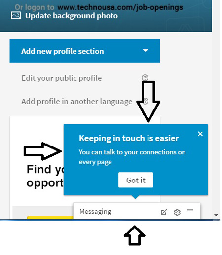 Pop-up introducing a newly added feature.
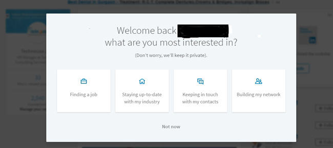 Existing (less active) user returning after a long gap is welcomed and given options to proceed further.
Personalization and Relationship Building
Collecting user preferences in the early stages of the user journey helps you to give a personalized experience to your users – it makes UI exploration interesting and results in better user retention rate.
Twitter, Quora etc. are some of the best examples of providing results/experience based on user preferences. Quora asks you to choose topics of your interest as you proceed to get on-board after a sign up. Based on your preferences, Quora shows personalized results.
 Step 1 – User is given options to choose from and at the top you can see the progress indicator.
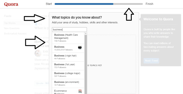 Step 2 – now you can add topics of your choice.
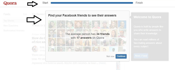 Step 3 – connecting with friends on a new platform will be a fun exercise. Isn’t it?
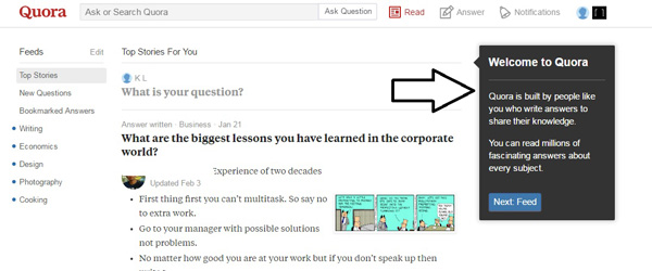 Step 4 – finally you reach the user feed and find a pleasant welcome message. Feed results are served based on the preferences you set. Sounds great? I could do all this without any email verification.
Welcoming the user by showing an encouraging message or sending persuasive introductory email and, sending subsequent emails giving valuable and personalized suggestions and tips on how to use the platform/product effectively to get the benefits that are meant for the users, will go a long way to make the users feel special. It is a great way to initiate user engagement and build relationships.
Leveraging Empty State Design
Have a look at the below screenshot – Quora collects only email id and name at the sign up stage and allows the user to add other details later. As we move to the profile page, additional information required are highlighted clearly on a minimalist design.
Tip – when new users sign up, they haven’t added content/additional information so far – so the empty screens like the one below should be effectively used to draw their attention to the calls to action. Leverage empty states like the one below with a great minimalist design and clear calls to action instead of surprising the users with dead ends without a proper instruction on what to do next.
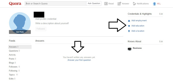
You can fill the user details when you feel comfortable or find time to do so – no rush or mandatory, long form filling process. Quora is one of the best examples of great user on-boarding experience.
Reduce Friction in the user journey – Analyze your user flow chart carefully to identify any frictions that might hinder a user to proceed further.
Once your product/app is built or when you are going to analyze your existing product/app, ask your friends, relatives, employees and/or colleagues to use it objectively and ask them to feedback.
Use analytics to study user behavior and to identify frictions. Raise objective questions and find answers to them. Which are the most used features? Which are the least used features and why? At which point/stage do majority of the users drop-off? Which pop-up is often closed and least used? Is there any mandatory field in the form that is preventing people from submitting it? Etc.
At the end of the day, feedback from real users matter more than any other sources. Hence testing, direct feedback and continuous improvement process are necessary to enhance user on-boarding experience to yield better results over time.
Testing and User Feedback
Get feedback from real users of your product/app via pop-up feedback forms (even Google does that), emails, feedback calls etc. Introduce new features to a small section of your audience, a/b test, analyze their reactions/feedback before rolling out to your entire audience base.
Based on the findings/feedback, keep improvising the UI and focus on making the user on-board experience better and better over time.
Delivering a great user on-board experience plays a crucial role in user acquisition and retention. Considering the fact that today’s internet users (majorly who access internet via their mobile devices) are quick and impatient, bad user on-boarding experience may result in increasing user abandonment rate. Working on user on-boarding should be an integral part of your UX efforts, undoubtedly.


