Responsive web design is essential in today’s digital world. Due to the popularity of smartphones and tablets, it’s a must that every site is mobile friendly. In this way, these nifty little gadgets have changed the way that developers approach both the design and user experience.
Before the appearance of smart mobile devices, web designers were only faced with one major challenge – making sure that both their mobile sites and websites had the same look and feel. But, surfing the web on these new devices with advanced web browsing capability is not the same as doing so on a desktop computer. Factors like pixel resolution, screen size, click versus touch, optimized markup and more have become very important since we started building websites with responsive design.

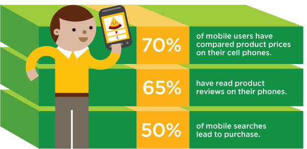
Furthermore, if SEO is an integral part of your digital marketing strategy, then it’s a must that your website be mobile friendly. Need more proof? Mobile sales have already outshined desktop sales and the same can be said for desktop internet usage and search.
There’s a lot of talk about responsive web design but everyone doesn’t know what it is. But, never fear, your lack of knowledge in this arena ends today. We aim to provide you with an informative breakdown of the responsive web design definition as well as some of the benefits that it provides.
Interested in learning more? Keep reading for enlightenment:
Responsive Web Design: What is It?
Responsive web design (or RWD) is a design technique (involving the coding and layout) that ensure that your website provides an optimal viewing experience i.e. easy to read and navigate across a wide variety of devices. So, no matter if you are using your phone, tablet, or desktop to play casino games at Royal Vegas, the experience is uniform. In this way, website owners don’t have to spend extra money and time creating and maintaining both a desktop and mobile version of your website.
Benefits of Responsive Web Design
Now, that you’ve gotten a basic understanding of responsive web design, it’s time to discuss the many advantages that this type of design provides. Some of its benefits include:
Supreme Flexibility: RWD sites are fluid. In other words, the content has freedom of movement across all devices and screen resolutions. Both the images and grids are fluid. And, just like liquid spread or draws into, RWD sites give your content the ability to fill an allotted space while retaining its appearance.

Superior User Experience: Over the years, we’ve seen many internet trends come and go. But, one thing remains the same – content is king. In fact, it’s one of the most vital success metrics for your site. Still, it’s a great user experience that gives site visitors the ability to consume the content on your sites like Royal Vegas online casino, anytime, anywhere, and on any screen they choose. In other words, RWD is about providing visitors with the best user experience possible regardless of what device you are using to view the content. No resizing or scrolling is needed for your site visitors to view your website on their favorite device.
Affordable: Having one website that can be used on all devices is significantly cheaper than the old ways of doing things – when retailers had to create two separate websites for their visitor to use.
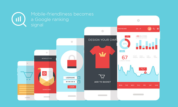
Google Recommends It: There’s no dispute – Google is one of the juggernauts in the internet industry and when this company speaks, search marketers should pay attention. And, Google only has good things to say about responsive design. In fact, Google deems it to be an industry best practice.


