

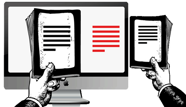
If you are a complete beginner and are unfamiliar with the term ‘responsive,’ when it comes to web design, then you are probably wondering what it means. Responsive web design is simply an approach to web design that is aimed at making sites that provide optimal viewing and an interactive experience for the user, meaning sites are easy to read, and require minimum resizing and scrolling. Responsive design typically refers to designing a website to fit a mobile device. A significant majority of web browsing is performed on mobile devices, which is why it is important to make responsive websites that will function on all devices.
Research Responsive Typographies
It is important to ensure that all the text on a website functions perfectly on every screen, large and small, mobile or desktop. If you do not ensure that the text on your website is responsive and optimized for all devices, the design of the website could be ruined. Or the website will simply not load properly on a mobile device, meaning mobile browsers will become frustrated with your website and simply stop using it. There is more information on integrating a responsive text in web design on the 1&1 Digital Guide, which is a good place to start when planning on what typography to use for your responsive website.
Next Step: Online Tutorials

In order to create a responsive web design you will need to know your way around HTML5 and CSS. If you are new to the world of web design and web development, then those can sound like scary terms, but with online tutorials you will learn all of the basics quickly and efficiently. After following one of the many online tutorials available on the internet, you should be ready to convert and create responsive websites. Once you have learnt the basics, you may even feel inspired to learn more about web development and discover even more possibilities for creating responsive websites. In which case have a look for PSD to HTML tutorials, which will give you more in-depth knowledge of the development and adaptation of responsive websites.
Adapt The Website’s Navigation
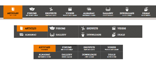
One of the main features of a non-responsive website that will have to be adapted is the navigation. This is mainly because when a non-responsive website is viewed on a mobile device it will automatically be scaled down, to the point that it becomes difficult to read. If the website is not responsive and automatically shrinks, then the user will have to zoom in to navigate, which is fiddly and frustrating. In order to prevent this, set a max-width in the CSS to stop the site scaling across large screens. To prevent the page from shrinking, set the image width to 100% in CSS. For the specific code used to prevent shrinking in navigation and to control the view point, read this useful tutorial.
Now you know the basics, you could further your learning and become an advanced web developer. But for the meantime, try making a simple responsive website and see how you get along.


