Product Comparison Layout & Effect is a basic responsive product grid layout with comparison functionality and a slide-in effect.
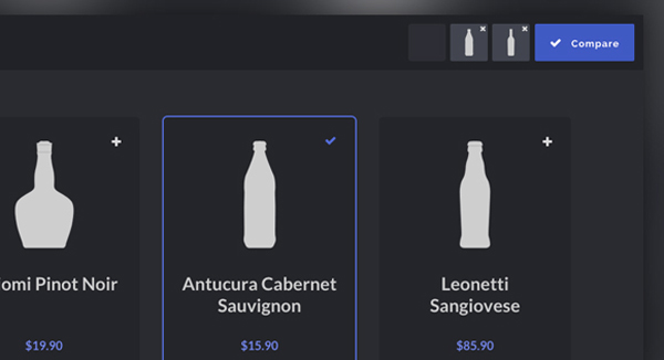
This Blueprint is a responsive product grid layout with comparison functionality. A maximum of three items can be selected for the product comparison. The comparison view shows flexbox-powered columns or rows (depending on the viewport size) that appear with a slide-in effect. There are a couple of example media queries for smaller viewports.
You can integrate or build upon it for free in your personal or commercial projects.
