No design trend has attained so much popularity as flat design in the recent years. Flat design excels in respect of focus on content rather than just aesthetic aspects. Most large companies, websites and apps today switched to flat design primarily because it is more direct, content optimized and engaging compared to other design aesthetics. Flat design emphasizes on usefulness, using white space, clutter free and clean page, contextual color hierarchy and fonts and effective 2D illustrations. The advantages and effectiveness apart, in the recent times with widespread use flat design also began to be viewed as too common by many designers and users. Though the overall appeal and usability of flat design is still awesome, it is time to look for enhancements or betterments of this design principle.
What is flat design?
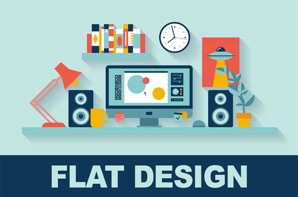
Flat interface style without any 3-dimensional element is called flat design. The design elements corresponding to flat design make a visual appearance on flat surface. Typically, shadows, glow effects and any 3 dimensional effects on the screen objects are not pertaining to flat-design.
The most beautiful and appreciable thing about flat design is that it is the simplest design interface offering a quick view of the elements on a web page or app. The beauty of flat design lies in the capability of quickly orienting the users to the content and giving the user call for action. It is a surprising thing that when the digital space is increasingly becoming complex and design technology is equipped to offer any realistic simulation and multi-dimensional effects, a simple and straightforward design concept became so popular.
Why flat design is so popular?
Stripping off a web page from the clutter of design elements and focus directly on the content and purposefulness of the content – this impelled flat design to take the imagination of developers and designers. Let us have a look at the key reasons behind the popularity of flat design.
Users are more concerned now about the purposefulness than the aesthetics.
Flat design has a focused approach towards content and readability that makes users feel contented and happy.
Flat design implements great user optimized ‘call to action’ strategy.
Most world famous ones and biggies in web space embraced flat design. Microsoft, Apple, Google are just a few names who took this design to their benefits.
With widespread use and adoption a wide array of developments have been seen in with flat design playing the key role.
With least complexity involved in flat design designers can now focus on effective layouts, navigation and other crucial elements than so called look and feel.
Key Principles of Flat Design
There are various design principles pertaining to flat design that find popularity to variant degree as per their effectiveness and aesthetic appeal. Here we would introduce the key principles of flat design.
This principle is just the opposite of skeuomorphic design and offers simplest interface with bare minimum elements. Color patterns, use of white or blank space and optimum readability of on-page content are 3 elements of this pure minimalist design principle.
Simple shapes are integrated into the interface like rectangle, circle, square, etc. For integrating different UI elements in the interface these simple shapes create a visual coherence and create useful UI.
We already know that gradients, drop shadows, glowing effects and many such strong design elements do not find a place in the flat design convention. These elements and aspects are often supplemented by vibrant and bold color palettes in the design. Focus on content is the principal element of flat design and color and typographical elements help to augment this focus.
Lack of shadows or gradients makes this often difficult to create a visual effect that can guide the users in following a navigation path or click on a ‘call to action’ button. In flat design the designer often overcomes this limitation by introducing visual hierarchy with different colors, font sizes and button shapes.
Future and flaws of Flat Design
Like all other design conventions flat design will also be replaced by another popular and effective design norms. But considering its strength in mobile friendly UI and content optimized web design, flat design is not soon going to be phenomena of past.
Irrespective of its huge popularity and widely appreciated effectiveness it has its own flaws as well. Already style experiments are widely happening by the flat designers and there are signs that flat design will incorporate an array of other design elements to offer more variety in keeping with the basic principles.
Flat design became a robust trend that swept the digital world with its effective, clean and purposeful design approach. But after ruling the design scenes for quite some time it now looks too common and invokes a visual ennui that users silently cope up with. Various stylized aspects within the flat design trend began to crop up and it seems it is not very far when new horizons


Hey Chirag–Thanks for neatly outlining the pros and cons of this design trend! One of the programmers at work tell me he personally dislikes Flat UI because it’s bland. But I personally see flat UI as the equivalent of a loud teenager “growing up”– where design isn’t a one-way “self-expression” but a way to reach out and to be understood. Hence, the simpler, stripped down approach to design.
Thanks you so much Lila for you appreciation, and its a true that designer just turned flat again because people only want to know information in a clear way and not all this craziness that other designers think is so cool.