By: Tomer Lerner
Author bio: Tomer is an award-winning designer and a UX Manager at Webydo – the code-free website design platform for professional designers – where he manages the UX development team to push beyond the limits of creativity.
On today’s Web, sites are being visited by an increasingly varied array of devices with a wide range of screen sizes. Having one website that attempts to deliver a single layout to all these different sizes, what I call the “do nothing” approach to multi-device support, simply does not work anymore. If you want to succeed online today, you need a site that works well for all screen sizes. You need a Responsive Website.
With my accumulated knowledge, both as Head of UX at Webydo and before, we will now take a look at Why Going Responsive Should Be A Priority On Your Next Website Design.
The Growth of Mobile Devices
 The rise of mobile devices, and the staggering diversity of those devices, has dramatically changed the way that people access online content. Instead of only being able to get online with desktop computers and laptops, consumers can now use tablets, smartphones, and even the latest class of online connected devices – wearables like smart watches. This variety of devices means that fewer and fewer of your traffic is coming from those traditional desktop computers. In fact, worldwide web traffic from mobile devices is already over 30% and many estimates predict that it will climb above 50% in the near future! If you are not considering mobile traffic to your websites, you are ignoring an increasingly large group of potential customers!
A website layout that looks great and works well on a large screen desktop monitor may work decently on a laptop or even on one the larger tablet devices, but if you use a smaller tablet, a phone, or a smart watch, that same layout becomes largely unusable. Yes, the website may show up on those smaller devices, but using the site becomes a challenge, one that many customers today will not be keen to struggle through.
The Bar Has Been Raised
The “do nothing” approach to device support forces a site’s large screen design, which is how most sites are initially designed, to squish down for the smallest devices. This squished design then requires visitors to pinch and zoom the screen to try to read text or tap a link. This is far from an ideal user experience and customers expect much more from websites on mobile devices today. They expect a site to be optimized for the device that they are using at that moment. They want the site to respond to their device’s screen size and deliver a layout best suited to that size.
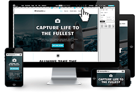
Responsive web design allows your site to change its layout based on a user’s screen size. You can have a multi-column layout for larger screens, and then change that design to a single column layout for the smallest screens. With this approach, you are creating a layout and experience suited to each different size, and letting customers know that the website will not force a large screen layout on them regardless of what size device they are using. Instead, it will meet them wherever they are and deliver the best possible experience.
It’s About More Than Just Small Screen Mobile Phones
So far we have spent a lot of time talking about mobile devices and smaller screens, but one of the best things about a responsive approach is that it will help you optimize your site for all screen sizes, from the very small to the very large! You can create layouts that are suitable for those small screen devices, but you can also stretch your site out to better optimize those super larger screens too – and with Webydo’s Pixel Perfect Responsive Editor, you have total control over the design for each of these sizes. This means that you can design your site for a wide range devices and screen sizes and you will be able to dictate the look and feel and layout for each, all without needing to write even on line of code!
The Traffic You Get Is The Traffic You Keep
Getting customers to your website is hard work. From advertising, to social media promotion, to good old fashioned word of mouth, once you have a person on your site, you want them to be able to find what they need and complete whatever action is appropriate for that site (make a purchase, request more information, read an article, etc.). If your site does not deliver a layout and experience suited to a user’s device, you risk that they will simply leave the site altogether without completing that action. In fact, a recent Google survey found that 61% of users will leave a site, and quickly move on to another, if they are on a mobile device and they hit a site that is not mobile friendly. That is lost business!
You work hard to get traffic to your website. You do not want to see that business go elsewhere because the site featured a poor mobile experience. A responsive website will help you make sure that your present a quality experience for all users so the traffic you get to your site is the traffic that you keep on your site.
Search Engine Rankings
So a responsive website will help ensure an optimal user experience for all customers on all devices, but a responsive site can also help your site with improved search engine rankings!
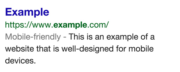
Google has long recommended responsive web design as their preferred approach to multi-device support. At the end of 2014, Google went further and announced that they would add a new designation to sites that are mobile-friendly and designed responsively. When a user conducts a Google search on a mobile device, they will now see a “Mobile-Friendly” label (see below) in front of listings that work well on those devices.
While this designation is great, it’s what Google goes on to say in their announcement that is even more interesting. They say that:
“We see these labels as a first step in helping mobile users to have a better mobile web experience. We are also experimenting with using the mobile-friendly criteria as a ranking signal.”
This means that, in the future, Google may indeed begin using mobile-friendliness to dictate actual rankings! It is entirely possible that they will deliver only mobile-friendly listings to users on mobile phones, which could be an absolute game changer when you consider how many people use mobile devices to search the Web!
In Summary
If you are working on a website in 2015, that site needs to consider users on a wide range of devices. A responsive website is the best way to support your customers – all your customers, with an experience best suited to their needs at any given time and on any given device.
