Have you seen shopping malls packed with crowds or stores brimming with traffic, except on special days and huge sales events like Black Friday? There will hardly be any of us who will answer “yes” to this question. Is it the economic concern that is increasingly creating shopping apathy among consumers? If it is, the numbers for online shoppers will also be affected. However, virtual stores are receiving traffic on a steady basis and are in fact rising in traffic every day. It would appear that consumers have shifted their attention from the brick and mortar stores to the virtual stores.

Why are customers more motivated to shop from virtual stores? The obvious reason, people are becoming more comfortable with internet shopping because it is more convenient and simple. The huge proliferation of smartphones and tablets connecting with the internet make it even easier to buy something from web stores. You can purchase products and merchandise while standing in the queue somewhere, when you are on the go, or while relaxing at your home. Still, shoppers visit stores for groceries and food items, but it is hard to say how long this trend will continue into the future. Like other non-food items, it looks probable that consumers will soon prefer to pick up their food items and groceries from online shops.
The generation glued to their smartphones find it easier to browse for needs and wants from their handheld device and to likewise buy them. But, do all the visitors of an online shopping site convert? Baymard Institute, a web research company, reported last year that 67.75% online shoppers abandon their shopping carts. A major concern and measure of inefficiency for e-commerce sites is when most of its customers abandon the site before the final checkout.
Why do most shoppers leave online stores without paying?
The top two reasons for which the shopper did not complete the checkout process are:
– Inexpected costs
– It takes too long to understand and finish the checkout process

Similar to e-commerce, the aim of any mobile commerce platform is to convert maximum customers. The greatest question before them is how to design the website so that the highest number of customers enter the checkout funnel and complete the order successfully.
When you are trying to convert mobile customers, you have to optimize your entire site so that it receives maximum traffic and ultimately most of them end up purchasing.
Here are few tips to elevate your store traffic and enhance its conversion rate:
Help the customers to have a clear idea of the product
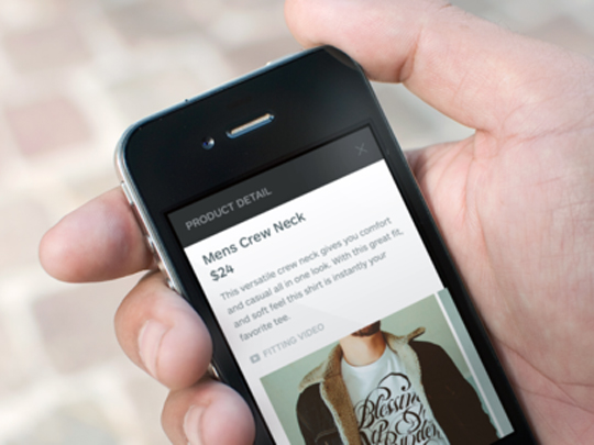
When customers are trying to purchase something from their smartphone, most of the time they find it difficult to view visual product details. The android and iOS platforms now encourage developers to utilize the entire screen to display a product’s image.
When there is too much of everything, even a wonderful picture will fail to get attention. Therefore, eliminate excess wording and try to come up with a simple clutter-free design.

Product information and available options are also significant to users. You need to present size options and color options that are available clearly. Using pull down menus will allow you to construct a clean, less crowded screen.
Always include a review section
When purchasing an item from a mobile store, there is sometimes a dilemma as to whether the item being purchased will fit a buyer’s needs in regards to performance, quality, etc. Include product reviews to reduce this uncertainty for consumers. You may also encourage shoppers to write their own feedback.
Simplify the shopping process for customers
Use auto-complete to help customers on the go find items in your store they are looking for. Another alternative is to use popular searches. Even customers not ready to purchase specific merchandise they are shopping for could be motivated to buy an item from preferred product categories.

When customers add an item in their cart they are shopping and not browsing. Now your focus will be to drive them to checkout. Designing a seamless and user friendly checkout is imperative to encourage customers to complete the purchase. Read on to see more on how to accomplish this.
Ask for vital information
When your customers proceed to the checkout page with all their preferred items in the basket, they often have to go through a lengthy registration process. Lengthy registration processes cannot be easily condensed into a single screen on your mobile device and no one really wants to flip and fill innumerable pages of registration forms from their smartphones. For this reason, many customers leave the page instantly. It is harmful as well as unnecessary to include such a lengthy registration process along with the final checkout.
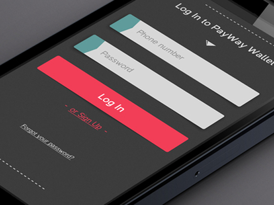
The customer’s e-mail address, name and shipping address have to be captured anyways for confirmation and delivery. Therefore, the only thing that is left out is a user password. You can ask for it from the order confirmation page. The website should be able to save this information for your repeat customers. It will save time, which is vital to shoppers.
24% of e-commerce websites do not allow check out as a guest. However, a user who has to create an account and confirm it will more likely leave the page without placing the order. You will see a leap in sales removing the required register button.
Keep the checkout simple
When the users reach the checkout you can safely assume they are ready to buy. The website that has until then performed the job of a sales person will have to help the customers fulfil their orders in the best possible way. Therefore, remove all other distractions and let the user focus exclusively on checking out.
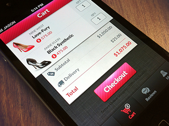
A user may have questions. Instead of providing a list of common questions and answers on the checkout page, there should be an option to easily locate common questions and answers.
Whether you are designing a mobile commerce application or an e-commerce website for your mobile users, keep these goals in mind:
– Provide clear product information and images
– Try to enrich the shopping experience for your customers
– Streamline the checkout process
These three strategies will help increase your sites’ conversion rate.


