
When it comes to establishing brand identity, nothing is more important than a company’s logo. As soon as we see the Coca Cola or the Apple logo, for instance, we know exactly what the brand is and how it makes us feel. Whilst a successful logo should be instantly recognisable, some companies decide to incorporate something a little less recognisable into the design too!
Here are 25 creative examples of hidden messages within brand logos that can be found all over the world:
Amazon
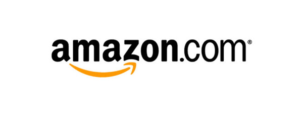
Take a close look at Amazon’s logo and you will see that the yellow underlining bears huge, albeit subtle, significance. The yellow arrow actually points from the A to the Z – which represents that they sell everything from A to Z! It has also been made to look like a smile, which represents customer satisfaction.
Tour de France

The Tour de France event always takes place during the daytime, which explains why they’ve included a sun within their logo. What you may not have realised, however, is that this yellow circle is actually twofold – it doubles up as a wheel and the letter R of Tour has been made to look like a cyclist!
FedEx

You may have only seen this logo on the side of a van as it sped past you, so you’ve probably never spotted the hidden arrow between the E and the X. The arrow symbolises FedEx’s speed and accuracy of their deliveries.
Sony Vaio
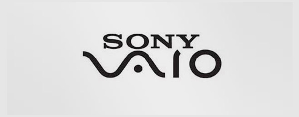
Sony’s Vaio logo is not just an awesome looking typeface – the VA has been made to look like an analogue signal, and the IO resembles the numbers 1 and 0 and represents a digital signal.
Museum of London
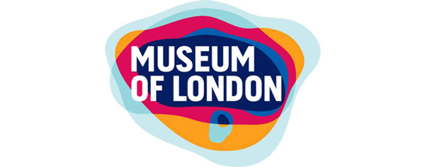
The colours behind the text in this logo mean a lot more than you might think at first glance. The pattern actually illustrates the geographical area of London as it has expanded throughout history.
Baskin Robbins
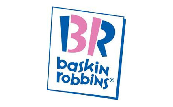
As well as making us hungry every time we see it, the Baskin Robbins logo has a hidden message that can’t be unseen once you’ve spotted it! This ice cream chain offer 31 different flavours, and they have included the number 31 within the BR initials of their brand logo.
Eighty20
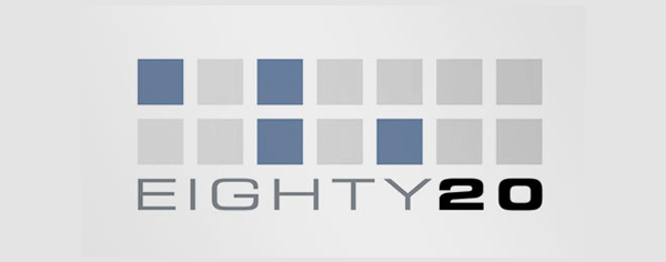
You may not have seen this logo too frequently, but it’s certainly very clever. A bit geeky, but clever. The squares display the binary pattern for 1010000 and 0010100 – or eighty and twenty (apparently).
Toblerone
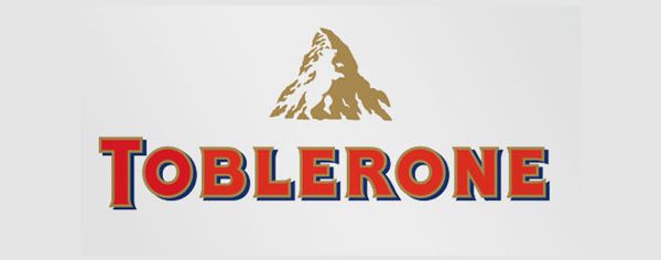
Ah, the logo we see every time a relative or friend buys us a souvenir from the airport! Toblerone comes from Bern in Switzerland – which is also known as ‘The City of Bears’. Have another look at the logo – can you see the hidden bear in the mountain?
Spartan Golf Club
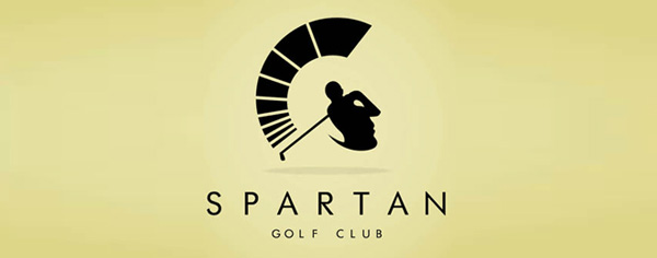
This logo of a golfer’s swing in motion is particularly creative, as it cleverly doubles up as a Spartan warrior.
Yoga Australia

This hidden message is extremely difficult to spot, but it is just brilliant! Take a look at the gap between this woman’s arm and leg. If you still can’t put a finger on it, take a look at a map of Australia and then look back at this logo!
Formula 1
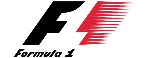
Formula 1 is commonly known simply as F1. With the F on this logo representing, well, the F and the red pattern signifying speed – where does the 1 come in? It isn’t too hidden but if you still can’t find it, have a closer look at the gap between the black F and the red pattern.
Bronx Zoo

The Bronx Zoo is set in the heart of New York. At first glance it looks as though this logo is simply two giraffes, but take a look at the creative detail of their legs. Can you see the infamous New York skyscraper skyline?
Piano Forest
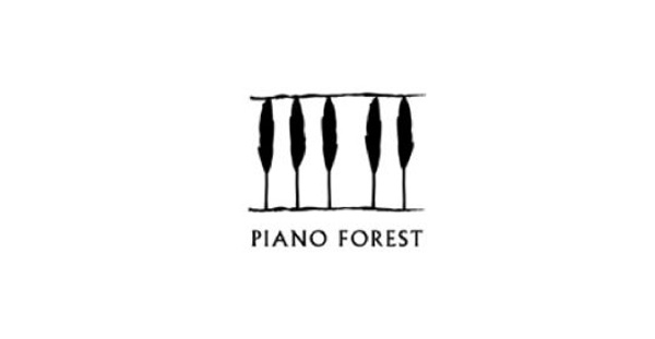
Whilst Piano Forest’s brand logo seems like nothing more than five trees representing a forest, it has actually been laid out to illustrate piano keys.
Milwaukee Brewers
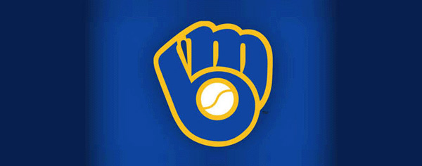
Unless you’re a baseball fan, you probably haven’t seen this logo before – but it’s fantastically creative. It looks like a baseball mitt holding a baseball, however if you look closely you can see that it is made up of the initials M and B.
Tostitos
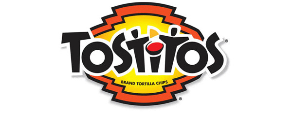
The two T’s in this creative logo look like two people, and a pot of salsa has replaced the dot of the I. This hidden scenario represents people coming together to share the tortilla chips.
London Symphony Orchestra

This cool looking typeface spells out the initials LSO, but also represents an orchestra conductor. I think it also looks like an octopus wanting to fight, but I’m not sure that’s what they were going for!
NBC
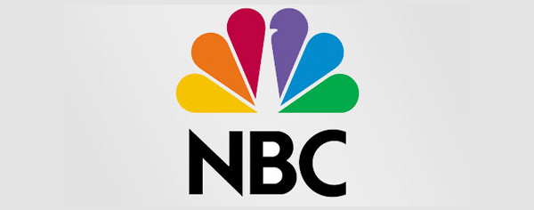
The pretty colours aren’t just there to make this an eye-catching brand logo. The white gap in the middle displays a peacock looking to the right, and the colours are the coloured feathers. This symbolises the fact that NBC are proud of the programmes they broadcast to their audience.
Treacy Shoes
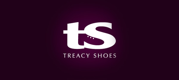
Many of the brands featured in this list have used the gap between letters to their full potential, and Treacy Shoes is no exception. Between the T and the S initials can be found an image of a shoe!
Goodwill
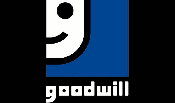
This is another hidden feature that cannot be unseen once it has been pointed out! The image of the smiley face is just a larger version of the G from Goodwill.
Newman
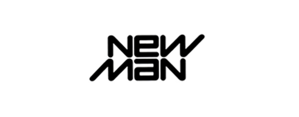
Last but not least on this list, is the incredibly creative Newman logo. The words New and Man are identical. Don’t believe it? Rotate the image upside down and it will look exactly the same!


