Many of us actually do not know the difference between responsive web design and mobile website. Well, we think there is a strong correlation between the two. However, to add to your knowledge there is some prominent differences between responsive web designs and mobile websites. And you should be aware of the differences because they are vital for your business site.
In today’s world, majority of the cell users are now using Smartphones and almost all of them have internet access. So if your website is not mobile-friendly and does not properly display the information as required by the users on their mobile devices, you automatically run the risk of your potential customers leaving your site in search for other mobile-friendly sites that can help them to search information quickly and view them easily. With your marketing plan ready for 2014, you would obviously not run the risk of losing your customers. In addition, Google is always looking at how mobile-friendly your site is and can also penalise your website for not complying with the basic requirements.

Well, if you think then where the difference is, let me give the detailed explanation. Read on. Mobile-friendly website is entirely different from mobile website.
The primary difference between mobile website and responsive web design (RWD):
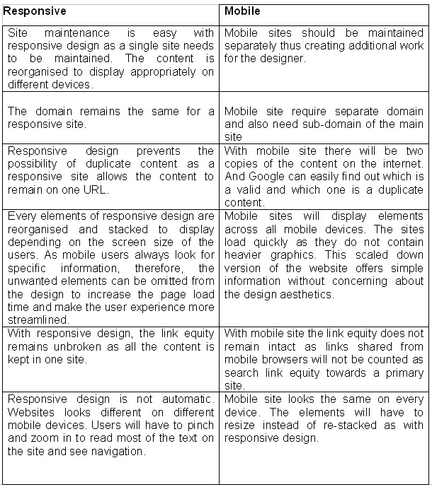
Websites built on a mobile and responsive framework operate in different ways. When a website is built with a mobile framework, it is principally a reset of the desktop version. A separate website is designed to provide the Smartphone users a unique and optimised web browsing experience. On the other hand, a website built with responsive framework reformats the information of your website according to the size of the screen and the device that is being used to view your site. The information is more fluid as the browsing window is adjusted to provide the user an optimal viewing experience across a wide range of devices.
Responsive or mobile- which is more appropriate?
Let us find out the individualities and see which one is best to be adopted:
When is responsive framework a better option?
When a site needs consistency across multiple devices, responsive framework is perfect
If your site technically needs portrait and landscape layouts, it better to use RWD as they are fluid
If SEO is a core component of your digital marketing strategy, mobile friendly website becomes an essential since 67 percent of users claim they use mobile instead of desktop to search information
If you want your site to load faster with minimal interactive components, RWD is ideal if designed correctly.
When is mobile site a better option?
When a site is highly dependent on interactive components, mobile site is always a better option
When a web needs complete redesigning, rebranding and repurposing, it is better to opt for mobile website
When you want to streamline content and avoid additional code to reposition excess elements mobile site works perfectly.
However, choosing a responsive design over a mobile site always give a better ROI and provides an easy way to update your mobile-friendly site without the need for updating two sites. But no matter how you go about it, you need to make sure that you are designing for mobile first and engage your customers to search your business.
