Everyone hates filling forms. And mobile users with typing constraints hate it more than anyone else. Here, we see how you can provide a better mobile browsing experience on your mobile website through modern mobile form solutions.
Little changes can make a big difference to the browsing experience of your mobile visitors. We have previously talked of little details that can make it easier for users to fill web forms. But when the visitors are browsing your mobile website, you need to do a lot more to offer a smooth and hassle-free experience. Mobile users face too many constraints:
- Slow internet connections
- Small screen sizes
- Smaller, difficult to operate keypads
What should a mobile web designer do when creating forms or checkboxes for the mobile users? The best practice is to eliminate mobile web forms wherever possible. But if getting text inputs from the clients is unavoidable, you need to innovate. Here are a few revolutionary techniques used by mobile developers and designers to create mobile web forms that are easier to fill.
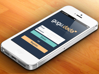
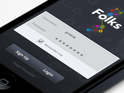
Protect the Password – But without Completely Masking it
 Typing one’s password on a desktop can be annoying as you cannot see what you are writing. This increases the chances of a spelling error. For mobile users, the problems are compounded. Not only can they not see the values that they are entering, but they are trying to type on a digital keyboard that is a bit too small.
For most web forms, the password is a mandatory detail – the users have to fill it. As most password fields obscure the values entered in the box, users have no way of knowing whether they are typing in the correct password or not. You can get around this problem by displaying the value that has been entered last. This means that all the other characters will appear as bullets or asterisks, but the character entered last will be displayed as it. Thus, you will reduce the chances of users filling the wrong password again and again without realizing what errors they are committing.
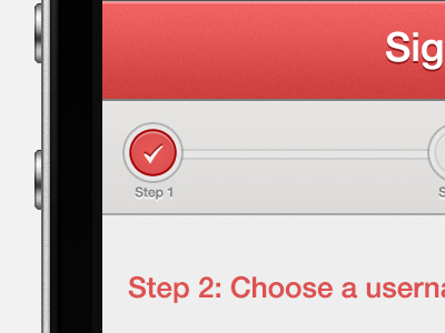
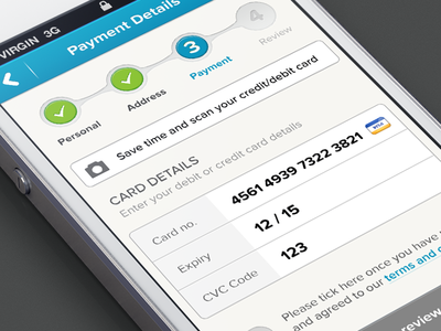
Break down Long Forms and Provide Progress Trackers
 At times, it is impossible to avoid using long forms. If users choose to fill such forms on the mobile, they are very likely to go through a harrowing experience. If you place a long form in a single page, the user has to scroll too much and if you place parts of the form in different pages, the user doesn’t get an idea of how long the form it.
By placing a progress marker at the top of the screen, you clearly show the user how many steps he needs to take, and you also help the user work out how long the process is. Apart from indicating the progress, the trackers can also function as navigation and enable the users to switch seamlessly from one part of the form to another without too much hassle.
Please, Give Larger Pop Up Menu Buttons
 Most savvy mobile website designers want to give options to users to choose. So, we have drop down menus that enable the users to select one alternative from a large number of alternatives. The system works fine when there are just 3-4 options to choose from, but in case there are many, there is a problem – the user is forced to scroll a lot to find the right one.
But that is a necessary evil – the bigger problem is the small size of the menu buttons. After the users scroll to get the correct option from the drop down menu button on the screen, they need to tap on them. Most button sizes are kept small to minimize the need for scrolling. This makes it difficult for the users to hit the right alternative. By using larger buttons, this problem can be solved. Remember: a little more scrolling won’t hurt anyone, but smaller buttons make the whole process irritating and troublesome.

Summing up
Filling up forms on the mobile doesn’t have to be a nightmarish experience. The smaller mobile screen has forced mobile web designers to be more innovative and there are several techniques that we can use to create better mobile web forms. The techniques mentioned here help in certain circumstances, but you need to exercise your ingenuity to create unique design solutions to resolve the specific problems that you encounter.
Have you faced annoying problems while designing web forms? Please share the problems that you have faced performing this task and let us know how you solved the designing puzzle.
