Grid Layout Shock was launched a few weeks ago. It is a plugin for WordPress for those who like Pinterest and WordPress and are looking ways to have that popular layout on their site. Grid layout Shock takes the particular style of Pinterest, dynamic grids falling in cascade, and makes it available for WordPress; the coding skills that are required to use other jquery plugins like masonry.js and isotope is not necessary.
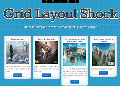
The ease of use is demonstrated in the Grid Layout Sock page, where a demo grid appears along with a menu to look at the different screen sizes into which the grid can fit; the tool seems to be highly responsive. Not only that, the page also has a ”Build your own” option that shows a console with a lot of personalization alternatives to make an ideal grid.
Features:
- Several skins for grid boxes
- Several fonts available
- Control over boxes width
- Pagination options (the grid can have several pages)
- Control boxes content to show (title, picture, excerpt text)
- Availability of more than one grid per area
The plugin also has other features like box responsiveness to look good in any device, a control panel available in 5 languages: English, Spanish, German, French and Portuguese; and the ability to display content from any RSS feed.
WordPress users will also find very useful in this plugin the options to display in the grid, all the posts for a particular category, post type or taxonomy. The plugin is in general very adjustable, just like the Jquery Slider Shock plugin, (from the same Shock team,) which is a thorough one. a good alternative to create responsive grids without jquery knowledge to apply in your WordPress site to make it look awesome.
