
Marketing is an audience-centric kind of communication. Therefore, you need to know how your target market or audience thinks, what attracts them, and what makes them react. That is why we can say that psychology plays a good role in marketing a brand. In what other ways can you apply psychology in business? In your brand positioning of course!
Color plays a big role in positioning your product or service brand in the market. Every color has a unique and distinct effect on people. So when you’re looking at the website remember that those website design colors were picked for a reason. Depending on their current state, color may amplify certain feelings in them or may intimidate a starting sensation. Understanding the nature and effects of color will help you get the response you want from your target market.
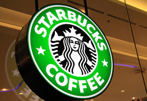
There are a lot of companies that made good use of color in their branding. For example, when you think of coffee and brand, it’s not brown or black; it’s the color green that first comes to mind. Starbucks used green to its full potential in brand positioning. They use recycled paper cups, launched pro-green campaigns and tree planting. Their store architecture is even based on their green branding. They positioned themselves as earth-friendly, youthful, a 3rd place in between home and school or home and office where you can relax and bond with your friends.
However, too much of a certain color may also imply negative connotations. That is why you need to achieve the right balance that is perfect for your positioning need. Let us start looking at some prominent colors that we usually see and identify what response these colors trigger.
Green
This color is associated mainly with growth and vitality. That is why green is the color choice for brands that usually cater to the youth. It also signifies freshness, calm, balance, and nurturing. Usually associated with restoration and rebirth, most earth-friendly drive and campaigns use a splash of green on their logos, banners, websites, and other marketing materials. Green is also affiliated with profit and production. That’s why most charts and line graphs that shows an increase in sale is in green.
On the other hand, too much of green may imply possessiveness and materialism. It can also evoke the feeling of greed, envy, selfishness, and indifference. Be sure to balance green with a good amount of white background, or use a lighter shade of green. Darker shades of green and too much of it may imply the love of money and greediness.
Like our early example, Starbucks pegs itself as a place in between home and either office or school where you can relax. They are also earth friendly. They encourage bonding and rapport. This is such warm way to position your brand in the market.
Red
 It is the color of excitement, power, energy, passion, desire, strength, drive, and confidence among everything else. It is very good for catching the attention, hence most street and road signage are in red. Since it signifies passion, power, and strength, ads that are leaning towards being active like for sports gears and some services has a good amount of red in them.
However, red may also incite aggression and anger. It may also imply a sense of danger in the audience. Make sure to balance it out with other colors. You can use green which promotes relaxation or blue which incites thinking logically.
There are a number of powerful companies that use the color red. One that is most prominent is Coca Cola. Red is also popular among food brands because the color promotes appetite and energy. Red has a strong tendency to elicit response; however your market’s reaction will of course vary.
Blue
 Blue is a calming color. It is the safest color because of being favored by many. It is affiliated to trust, confidence, dependability, reliability, and wisdom. It encourages productivity and logical thinking. It slows down pulse rate and reduces appetite in contrary to the color red. It works well with the much more traditional corporate world especially in the field of accounting, banking and finance, and some insurance companies.
Too much of blue may imply boredom, being too conservative, rigid, and unforgiving. When using blue, make sure to throw in a color that would give life to the atmosphere. Add a color that would neutralize boredom or the feeling of conservatism. A dash of red or black may just do the trick.
Most social media companies use blue for their websites since this color promotes productivity and engagement. Because it reduces appetite, people tend to stay focused on such platforms longer.
Yellow
 Yellow is a cheerful and playful color. It stirs up the feeling of happiness and optimism. It also promotes bonding and friendliness to other people. It inspires creativity and proficiency. It helps activate logical thinking and reason especially on decision making.
Too much yellow however may cause anxiety and hesitation, sometimes it even encourage confrontation to people who are in too much stress. It can also cause a person to be overly analytical and critical, and impatient.
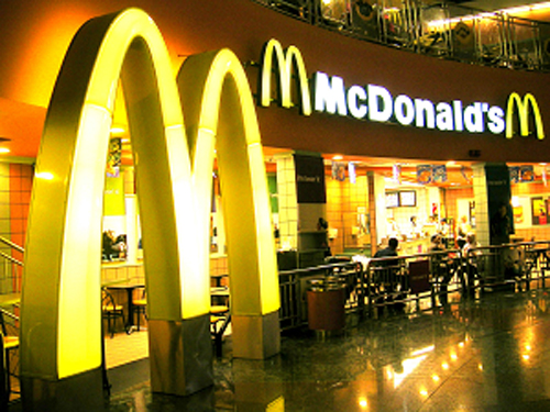
McDonald’s is a brand that use yellow in its logo with a big bright yellow “M”. It promotes bonding with friends and eating happy. It also expresses the feeling of fun and creativity.
Purple
 Purple suggests royal authority, extravagance, sophistication, style, and class. It is also inclined with wealth and power that is why it is common to see a dash of purple in the robes or royalties. It also heightens the awareness of people to aesthetic beauty and reaction to creativity. The use of purple can also mean quality and prestige.
Overuse of purple may denote being impractical, arrogant, and immature. Since it’s usually affiliated to extravagance, a brand in purple would usually flash “expensive” to people. It can also become uninviting and aloof to causing people to not even dare to touch products in such packaging.
The purple color in the brand of Cadbury chocolates positions it as luxurious and elegant. Some academic institutions use a shade of purple to convey academic excellence and achievement. Make up products who use purple denote sexy and rebellious.


