Today’s businesses are presented with the dual problem of handling diverse customers spread across different device base. Responsive web design and a mobile site are the two solutions businesses have at their disposal. This article gives insights into the two web design strategies and helps businesses make a decision for their business.
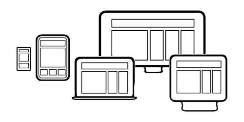
The growing number of fragmented user base is pushing industries to re-work their web design strategies. Responsive design and mobile website have emerged as the two new advancements in web design approaches. Each one has its own share of advantages and disadvantages.
According to a February 2012 study, done by Localeze and 15miles, 92% of US smartphone users look up information about local businesses on their mobile devices. The same report shows that 86% of the local searches on tablets and almost 75% of mobile phone searches resulted in a purchase. With such decisive figures the choice between responsive and a mobile site has become a tricky subject for businesses.
Let’s delve deeper into a responsive design and mobile website to help brands make a smart choice:
Understanding Responsive Design
Responsive design is in general terms a layout design which can easily run on multiple devices. Once developed this layout automatically adopts to various screen sizes and resolutions depending on the device. You can serve the same content, graphics and videos on various platforms for your diverse users. Responsive designs are like on-the-go solutions for users where they can access information from anywhere and everywhere. You can design different styles for various screen sizes thus giving your user ease of usability. There is no room for content redundancy, leading to search-engine friendly content, at all times.
Why do you need a Mobile Website?
A mobile website is the one that your users can access with their mobile phones. The design layout automatically detects the screen size of the phone, to provide an engaging user experience. Such sites can also be hosted on their own domain. Mobile websites are designed to basically generate higher revenues for businesses and to build more traffic from multiple sources. For instance, e-commerce mobile sites let its users shop or browse its products while on the go and it caters to visitors far and wide. Sometimes companies may just re-design a part of their website for mobile which is also a thoughtful approach. This method helps to build instant brand recognition and brand recall amongst its target group.
Benefits of Responsive Design
2013 is the age of the responsive web. Let’s take a look at the pronounced benefits of responsive web design:
Responsive designs keep the content, graphics, video and sometime even URL same even while being designed for multiple platforms like computer, tablet, laptop, iPad, mobile and TV. Each new platform does not require separate codes, so if you make any changes to the site in one platform, it will automatically be updated in the other. Responsive designs save time and money and are highly beneficial for startups.
Responsive designs are not only device sensitive but they offer customized experiences to its users. No matter what platform it is being accessed from responsive design serves relevant content based on various user-data algorithms about the company. With responsive you can create unique layouts for various platforms which may initially take up extra time designing. However, it will be the best and safest investment for the future.
Disadvantages of Responsive Design
There are some latent drawbacks that companies must consider before heading for such approach. Let’s find out about them:
There can be some areas of the site where the CSS cannot be implemented. Hence, you may have to cut out some content or show content depending on the situation. Even if you break out such content into pieces it makes the whole process too cumbersome. Therefore some layouts will move the existing layouts to put up their content.
Since responsive design caters to a whole range of platforms with diverse users. When companies sit down for the first layout of responsive design the whole process can be mush time-consuming as a web designer shave to take into consideration different layout styles for dissimilar screen sizes.
Benefits of a Mobile Website
According to BIA/Kelsey, mobile searches will bypass desktop counterparts by 2015. Here are the benefits of a mobile website:
With a mobile site companies can easily offer a customized experience to its users. Companies can take up thorough user evaluation using surveys and interviews. This information is then implemented in their mobile sites. Users accessing a mobile site are basically interested in making quick purchase decisions or who wish to engage with the companies in a serious way. Thus brands invest a good amount of time and money to develop interactive interfaces for its new and existing users.
With a mobile site you do not have to worry about any need for legacy coding. Web designers can start afresh by including new and logical techniques to cater viable experiences to its users. Thus companies do not have to shed a lot of money in building a mobile website. Moreover, companies can use this new mobile site as a redesign of their current website.
Disadvantages of Building a Mobile website
Just like responsive designs a mobile website also has some drawbacks. Let’s look into them:
The most evident drawback is that it targets only device which is the mobile. If companies want to provide any solutions to user son other devices like say tablets, such a site will be of no use. Moreover, if companies want to build a responsive mobile site they would have to pump in extra money and time towards the process. Additionally, a different set of content is required for a mobile site to be operational. This content is very different from the main site. Changes done on the main site will not be duplicated on the mobile website. Both sites will compete for search-engine attention and may end up losing the battle.
Needless to say, a mobile website needs higher maintenance and will be a costly affair for the business. Both the two sites will require different content as well as maintenance thus resulting in grossing costs and efforts. This could in turn be annoying to the users and may lead to unstable traffic, on the two sites.
Which Solution is best for Your Business?
It is imperative for businesses to understand their needs before making a decision to go for either of the solutions. Let’s take a quick look, at the most basic yet vital business requirements for any business:
- How easy it is to update a site?
- How long does it take to create a site, for multiple platforms?
- Is the site search-engine friendly?
- How easy is it to update sites with fresh coding?
- How is the overall user experience of the site?
- Are there any DIY options available in either of the approaches?
Different businesses serve different customers. Whichever, approach the businesses choose to adopt they must make sure that they not only ensure consistent traffic but stable or higher revenue generation for them. Responsive design or a mobile website must lead to comprehensive experiences for its users and businesses, even in the future.
