
These days, hundreds and thousands of infographics are produced every year but truthfully, most of them don’t tend to offer much quality in terms of their design. Often, they’ll contain a lot of good information but because the design tends to be cluttered and over thought, the information isn’t communicated very efficiently.
The whole point of using an infographic is to visually represent data, as in theory, the human brain finds it easier to digest and retain visual information.
Although there’s a lot of low quality infographics, there’s also some extremely high quality, minimal infographics too; and here are some of our favourites.
Know Your Truck Stop
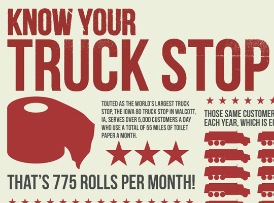 Although it might seem like a bit of a strange idea, this infographic from FindATruckingJob.com explores some pretty mindboggling facts associated with truck stops. Notice that the design is very simple and uses only three colours throughout.
View Infographic
A Brief History Of YouTube
 In celebration of YouTube’s eighth birthday, the guys over at ShortyMedia produced an infographic documenting the history of the site. It takes us on a journey from zero to four billion video views a day and unlike most “timeline” style infographics, it’s very clean and minimal.
View Infographic
A Simple (visual) Guide To Eggs
 Eggs; traditionally not the most interesting of subjects but somehow, this minimal infographic manages to present some unique stats in a clean and concise way. Did you know white and brown eggs were nutritionally equal?
View Infographic
Inception – Explained
 Inception is a pretty complicated film and for those that struggled, this infographic is for you. This has to be one of the cleanest, most well thought-out, well designed infographics ever; take a look for yourself.
View Infographic
World Population Density
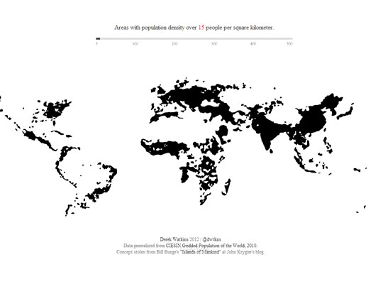 The world’s population is growing every single day but some areas are far more densely populated than others, as this extremely minimal infographic depicts.
View Infographic
Life
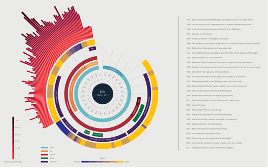 Ben Willers; a freelance graphic designer from the UK, created this infographic to give a visual representation of his life so far. It’s a couple of years out-of-date now, but still, it’s a great example of a creative and minimal infographic.
View Infographic
The Perfect Pour: A Citizen’s Guide
 Love coffee? Then this infographic from Plaid-Creative is for you as it explores the composition of 20 of the world’s favourite coffee drinks in a clever, minimalistic design.
View Infographic
Social Media In Business
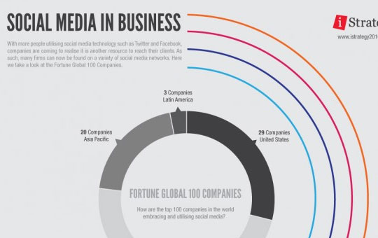 Social media is a big part of many companies marketing strategy these days and to prove it, this infographic from iStrategy2010 visualises the Fortune Global 100 companies’ use of various social media platforms including Facebook, Twitter and YouTube.
View Infographic
Death By Disease
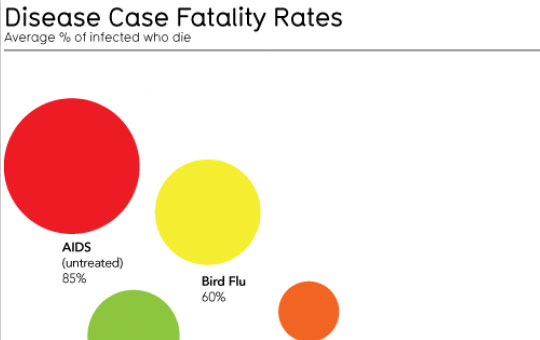 It might not be a nice subject to think about but nonetheless, this infographic does a great job of providing a visual comparison of various disease fatality rates.
View Infographic
A Taxonomy Of Ideas
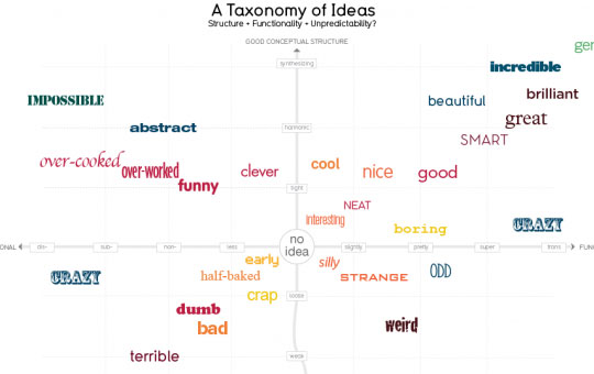 Here’s another extremely minimal infographic from InformationIsBeautiful.net that gives a visual representation of the taxonomy of ideas. Essentially, it’s just a graph, but it works well.
View Infographic
Kitchen Volume Conversion Aid
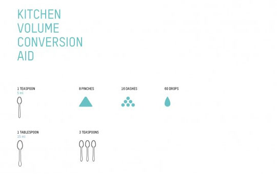 Have you ever wondered exactly how to measure out various ingredients in the kitchen? If so, then take a look at this infographic from Plainworks. It might be hugely minimal, but it’s one of the most beautiful infographics we’ve ever come across.
View Infographic
How Would You Like Your Graphic Design
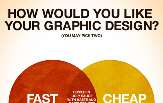 This infographic makes use of a venn diagram to explore various outcomes of a graphic design project depending on your priorities. Do you always demand great work at a low cost? Take a look at the infographic to find out what to expect.
View Infographic
10 Artists, 10 Years: Color Palettes
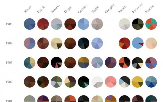 This infographic takes us through ten years of art history across ten different artists. It’s clean, well-organised, informative and minimal.
View Infographic
Wine Pairing Chart
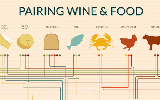 Ever wondered what wine to pair with your meal? This infographic will answer your question as it pairs various foods with various wines. It’s simple yet very informational.
View Infographic
The Apple Tree
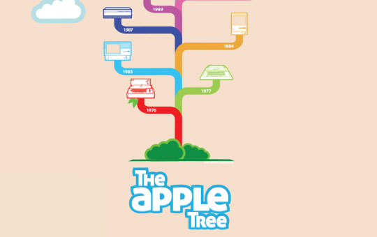 Apple infographics are plentiful but this one from Mashable is certainly one of the best. It takes us on a journey through the various products released by Apple over the years in a minimalistic, tree-format.
View Infographic
Are You Happy?
 Are you happy? Not sure? Find out with this smart, yet minimalistic infographic from Typcut.com. We should all look at this every morning when we wake up.
View Infographic
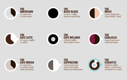
An Illustrated Guide To Coffee Drinks
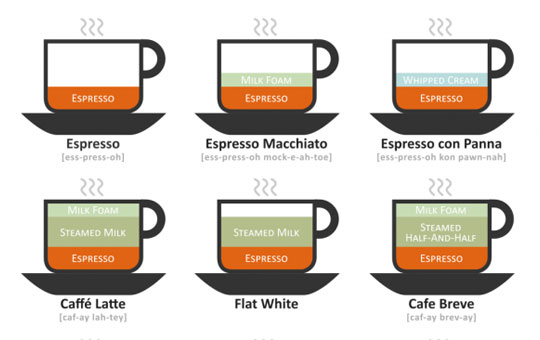 Ever wondered what the difference is between all those coffee’s down at your local Starbuck’s? If so, take a look at this infographic and you’ll soon find out.
View Infographic


