
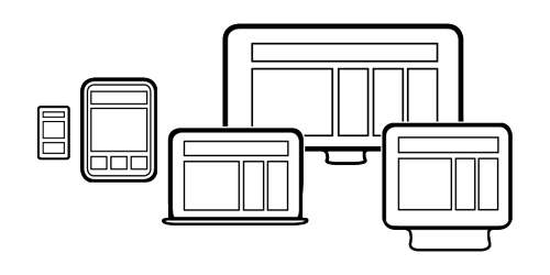
There is a huge talk on responsive web design going around the world of web development. Every business is looking to make their website responsive. But what does a responsive design mean? Is it merely a method of designing a website which renders on different devices? You have designed a great website which looks great on the desktop or laptop and takes minutes to load on a phone browser. Can you term this as responsive? No, this will not serve your purpose as the mobile users are unlikely to return to your website.
A true responsive website is one which not only renders on different devices but offers enthralling experience to all users. This doesn’t mean you are taking away anything from the desktop/laptop users which many developers do while creating responsive websites! Let’s take a look at some of the things which you can do to offer optimal experience to all your users.
Performance Is Key
It happens quite often that we launch a website which is responsive in true sense and then get carried away while adding functionalities. Little do we realize that the mobile version suffers when the size of the page or the number of elements increase. Now to deal with such situations you need to always prioritize performance over features. If you want to add a new future, try removing one which isn’t adding value to your website. Doing so, you won’t have to compromise with the performance of the website.
Optimize Images
This is one of the biggest problem areas when it comes to designing a responsive website. The images which look great on the desktops can often slow down a mobile website. So avoid high resolution images in the content pages. If your website needs high res images you can create a separate gallery and link it to the content pages thus solving both your problem areas. You can also make use of tools such as Adaptive Images or src.sencha.io which ensure only appropriate sized images are rendered on the devices.
Don’t Overdo Media Queries
 Media queries do add a lot of excitement to your website and makes it look highly attractive. But when it comes to responsive websites overuse of media queries might make your website trail. Ask yourself do you need so many queries to actually serve your purpose? If no, just do away with their and your website will still continue to rock the show.
Do You Need a Framework?
Use of Framework while developing has become more of a norm rather than a choice for most developers. Some are even scared to venture outside the world of frameworks. The only problem is that most frameworks tend to slow down the website especially on mobile devices. So just spare a moment and see what are the cons of not using framework and in many cases you will clearly see the pros outnumbering the cons.
Test It!
As developers most of us are used to testing the website on fast Internet connections and 3G networks. But you never know which part of the world your visitor comes from and what is the speed at their end. So it is wise to test the site in slow Internet connection and 2G networks for mobile devices. This will help you target all categories of Internet users. If you can’t find a crawling Internet connection you can easily simulate such conditions using online tools such as Slowy, Throttle or the Network Conditioner.
Usage Patterns
Once the website has been launched it is very important that you need to keep track of the usage patterns of the website. Compare the bounce rates of your mobile and desktop users. Normally the bounce rate for mobile users is slightly higher than the desktop users. If it is abnormally high you have to rework on the site design as it may not be catering to the interest of the users on the mobile devices. Also see if the returning visitors are coming through mobile devices. If not, the site isn’t truly responsive.
All these steps will lead you to a website which is truly responsive and caters to the needs of a mass audience.


