When it comes to resume design, it can be hard to stand out from the crowd while remaining succinct and clear. A set of bold and attractive visuals can take you to the next level, but they also take the space that should probably be devoted to information. So why not combine the two?
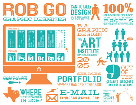
Infographic resumes can be a sophisticated way to show off your abilities and give yourself an edge over the competition. Infographics might not be your forté, but only a few considerations distance them from other kinds of design. Just keep a few things in mind:
Get inspiration from others

Look at other resumes: There are a lot of examples of infographic resumes floating around on the web; take a look, note what you like, and apply to your own. You can also turn to other infographics for ideas on style. Many of them rely on the same tired trend of condensed block caps with flat vector graphics; knowing what’s out there lets you spot and avoid these design clichés.
Try out apps: Another good source of inspiration can come from looking at infographics apps, like Visualize.me, Re.vu, and Kinzaa. All three draw data from public sources, like your LinkedIn and Facebook accounts, to make data visualizations that are all about you. None of them will have the personalized touch that making one yourself will yield, but they can give you a good start.
Use the resources that work for you

Illustrator is your friend: There are a lot of different ways to get an infographic resume on the page, but Adobe Photoshop or Illustrator are what any designer will turn to automatically. Unless you’re much more comfortable with Photoshop, Illustrator is definitely the better choice; its vector graphics are easier to reshape, and its handy graph tool will speed up your work immeasurably.
But others sources can help: If you want an even quicker shortcut, you can build your design off of generic vectors. Take a look at an online library of vector graphics. Just pick and choose the ones that will start you off on the right track, and edit for a quick and clean result.
Consider the elements of your design

Use the best visualization for the topic: Each kind of chart or graph should be particularly fitted to a different kind of information. For example, you would usually arrange your work history by time; so it makes sense to take it a step further and visualize it with a timeline graph.
But keep things consistent: While your graphs and charts should differ, remember to keep to the same color palette and general style. If everything isn’t cohesive, your end result will look sloppy to even the most undiscerning of hiring managers.
Don’t force it: Be careful not to make unnecessary visualizations. A resume should first and foremost be a presentation of your skills. If the nice set of icons you just made doesn’t actually make anything more understandable or informative, then they shouldn’t make the cut. Your resume should make a statement; don’t clutter it up with meaningless visuals, or the result will be less impressive than the text version you had in the first place.


